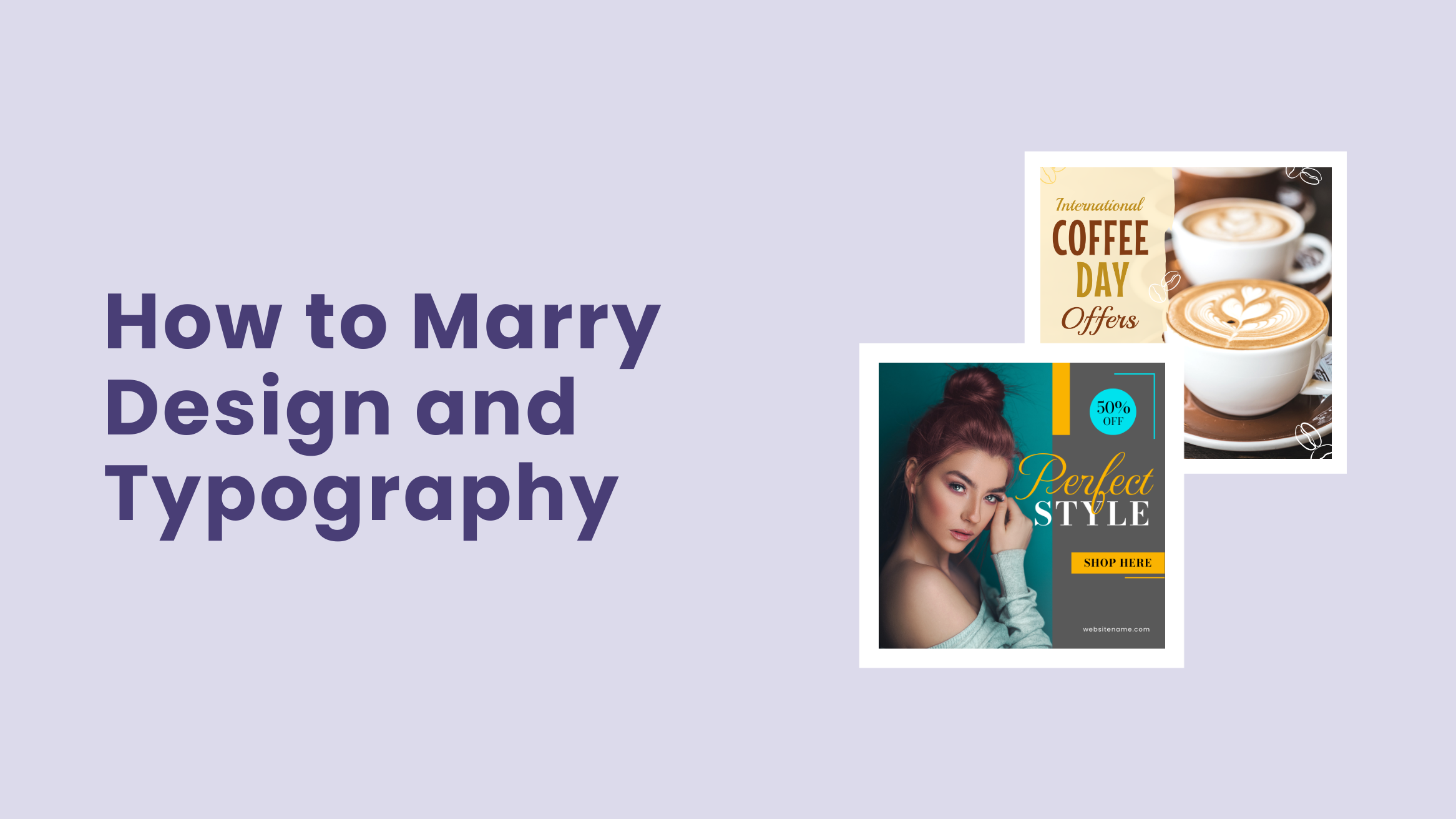
How to Marry Design and Typography: Your Competitors Wish They Knew It

Hmm, it is a difficult job indeed. Even the most celebrated designers get tired of brainstorming. Effective collaboration of design elements and typography is necessary for engaging results, from the business card to a fifteen-page presentation. If you, too, want to brew great designs, you will have to focus on layering the two smartly so that the outcome brings results. In this post, we will discuss the collaboration of design and typography.
Collaborate Design and Typography
- Design and typography composition: Only a measured amount of each element with ample whitespace in the design can make your designs win accolades.
- Images and typography integration: The mage has to communicate well with the typography, creating context, emotion, tone, and sometimes a story for your document.
- Beautiful backgrounds for design and text: Keep enough contrast between the background and typography to make your text stand out without compromising readability.
- Shape and typography integration: Strike a balance between shape and typography is crucial to creating engaging and visually pleasing designs.
So, what is it? Download an image you like. Paste a catchy phrase on That. Done…
If you think in that line, you are completely mistaken. Without spending more time convincing you, I will jump straight into logic. Let us check out how to combine design and typography with the care that people connect with them immediately.
Table of Contents
Composition with Design and Typography by Use of Whitespace
The relationship between your design and typography can make or mar your visual document. Too small a text, too busy a background, too many loud colors, and too much content are all great design elements with the potential to kill your graphics.
Remember that the different elements of design and typography complement each other. So, only a measured amount of each element can make your designs win accolades. Always ensure a clear space on that picture where you put your text.

Get This Template and More

Get This Template and More
You can have a pretty picture and a robust message. But an attractive design can never be born unless they flow together in the same direction. One way is to structure your typography and the rest of the content into columns or grids. This organized layout helps you distribute whitespace evenly throughout the design.

Get This Template and More

Get This Template and More
Whether you align your text to the left, right, center, and so on, maintaining consistent alignment throughout your design helps you strike a balance.

Get This Template and More
If your design has blocks of text that can be grouped together, group them to make them look more neat and organized.

Get This Template and More

Get This Template and More

Get This Template and More
Integrating Images and Typography in Design
Images have bigger roles than just featuring a nice background to your document. It creates context, emotion, tone, and sometimes a story for your document. If those qualities align with your text message, you will be able to connect with your readers better. So, the image has to communicate well with the typography of your design document.
If you see the below images from DocHipo, you will be able to understand how beautiful images can communicate with text. In the process, all of these documents also connect well with their targets.

Get This Template and More

Get This Template and More
Choose a contrasting color that helps your text stand out on the background.

Get This Template and More
Combining two font colors creates a beautiful design like the Motivational Instagram Post Template below.

Get This Template and More
Further Reading
Take a look at the template below. The dark overlay in a part of the Beauty Instagram Story Template acts as the background on which its text looks vibrant and perfectly legible.

Get This Template and More
Next, we have a Corporate Flyer Template in which the text is separated from the image by a semi-transparent shape used as the background. In this template, the typeface is no less important than the image.

Get This Template and More
Similarly, we’ve used a text overlay in a minor part of the picture to highlight the college’s tagline.

Get This Template and More
Also, you can use two font colors in the text overlay, like in the Conference Poster Template below.

Get This Template and More
You can place your image in a layout that doesn’t interfere with the text. For example, look at the brilliant image and text placement in the Real Estate Flyer Template.

Get This Template and More
Let’s see another beautiful amalgamation of image and typography. The headline text’s orientation follows the tower’s image in the Travel Instagram Story Template.

Get This Template and More
Watch our quick tutorial on arranging design elements easily.
Beautiful Backgrounds for the Marriage of Design and Text
Is that important? Absolutely… It is one of the most vibrant and beautiful document design methods. It can be anything from an image, single color, multi-color, gradient, or pattern as a background. Just keep in mind that the background must be commensurate with the whole idea of the document.
Keep enough contrast between the background and typography to make your text stand out without compromising the readability. For example, you can achieve this contrast by using light-colored text on dark background and vice versa.

Get This Template and More

Get This Template and More
You can experiment with the font weight to make your text stand out in a background like the below one.

Get This Template and More
Check out how to choose fonts for your design to create a visual symphony.
A poor combination created with a huge dose of text and background can nip your design. If you have much to convey through text, please settle for a minimalistic background. For example, look at the Real Estate Instagram Post Template for an eye-soothing seamless pairing of background and typography. Also, notice the typography hierarchy that directs the text flow.

Get This Template and More
But, if you think you have a lot of graphical elements or a busy background to work with, keep the text part subtle and light. You can gauge the balance well-measured in the Travel YouTube Banner Template below.

Get This Template and More
Creating transparent shapes or blocks of color as overlay is also a great way of designing beautiful text backgrounds. They help you rely on a design that is visually more uniform. The crux of the story is you can create a document with a single image. As a result, your document is graphically clutter-free. You can add an opaque shape or semi-transparent overlay to balance the background and typography.

Get This Template and More

Get This Template and More

Get This Template and More

Get This Template and More

Get This Template and More
You can experiment with the opacity of the text overlay to make it pop up.

Get This Template and More
On the other hand, you can make your text overlay more transparent.

Get This Template and More
You can experiment with different layouts for the overlay to attract people’s attention.

Get This Template and More
Further Reading
Sometimes, it works if you lighten or darken your image. I should explain it a bit. You can put your text message right on top of the image background by just increasing or decreasing the brightness of your image background. This way, you save space for placing an important text message on your visual document. The theory behind this action is simple. You increase color contrasts of text and image. Visibility increases by controlling the brightness of images. See the templates below, and you will eventually understand what I am trying to say.

Get This Template and More
Watch our demo below to enhance pictures with DocHipo filters to improve text readability eventually.
The Art of Shape and Typography Integration
You can incorporate shapes into your design to enhance your message uniquely and memorably. And striking a balance between shape and typography is crucial to create engaging and visually pleasing designs.
Make sure you have enough whitespace both around your text and the shape to provide them room for breathing. For example, doesn’t the Beauty Instagram Story Template look gorgeous and sophisticated?

Get This Template and More
You can skillfully overlap shapes to give your design a refreshing look and feel. Just ensure the overlapping shapes don’t dominate the typography hampering its readability.

Get This Template and More
Play around with common and unconventional shapes to complement the typography.

Get This Template and More

Get This Template and More

Get This Template and More
You can not only use shapes as background elements but also as elements that support the image in your design in a thoughtful way. For example, the brilliant pairing of shape and typography adds to the meaning of the design in the below DocHipo templates.

Get This Template and More

Get This Template and More

Get This Template and More
Further Reading
Take a Sip from Your Tea and Play with Your Design
Was all this information a little overwhelming? Nah… Rather, I tried to help you create a visual repository of beautiful visual documents. Trust me; they will all be very helpful for your year-long marketing efforts.
For more ideas, sign up for DocHipo and enjoy creating magic with graphics. Till then, goodbye.

