How to Create Stunning Background

A beautiful image or design has many elements to it. But from all the elements, the most important one is the background.
A background is crucial for defining the context of the image and buttressing the overall design. What’s more is that without a suitable background, your image might look dull and non-engaging.
How to Create a Stunning Background
- Simple Background Vs. Patterned/Multi-Colored Background: A simple background heightens the foreground visuals, making certain elements more prominent, whereas patterned/multi-colored backgrounds are used for expressing with overall design.
- Color Combinations: You must choose the background colors that are compatible with the image and the text in the foreground.
- Negative Space: Ensure a layout that places the image and text against the background to balance the negative space.
- Designs Viewed on Screens of Different Sizes: Be ready with marketing visuals compatible with any screen size.
So, in this article, we will delve into this rarely ventured topic based on backgrounds for your design.
Don’t worry!
I will also show how you can spice up your design documents via the beautiful backgrounds available at DocHipo.
So stay with me…
Table of Contents
Importance of Backgrounds
Backgrounds are vital when you want your message in the design to be noticeable and well-understood. Especially when marketing your brand message through visuals, the right background reflects the desired understanding among the consumers.
Let me explain further.
Firstly, an ideal background acts as an enhancer, boosting the focused foreground image. The background color supporting that image automatically reflects perception and defines what the viewers should feel at their initial glance.
You can make your overall design look professional with plain backgrounds compatible with the foreground images. Not just that. A design also defines you and your business as a brand. Hence a good-looking visual is always bolstered by wisely chosen backgrounds.
Secondly, with a suitable background, you can direct your customer’s gaze toward specific elements in the design. For instance, the message reflected in the foreground will not be clear and understood in an image with a stuffy, cluttered background. But images with a light-colored background easily guide our eyes toward the pictures and messages. The clear visibility and the color combination make it easy for the viewers to understand the visual distinctly.
Tips to Create an Effective Background
Art can never be restricted by any rules or norms and is a free form of self-expression. But for creating marketing visuals, make sure that your audience understands the message of the visual. After all, artwork for marketing brands goes beyond the intellectual thirst of societal perspectives.
You might have a target audience, but you want all your prospective customers to engage with the design. So let’s create designs that can be understood by our mass audience, not specific individuals.
I will talk about four important factors you should remember while creating a background for your designs.
1. Simple Background Vs Patterned/Multi-Colored Background
It all depends on the foreground image and where you want your audience to focus upon.
A simple background heightens the foreground visuals, making certain elements more prominent.
Let me show you some examples:

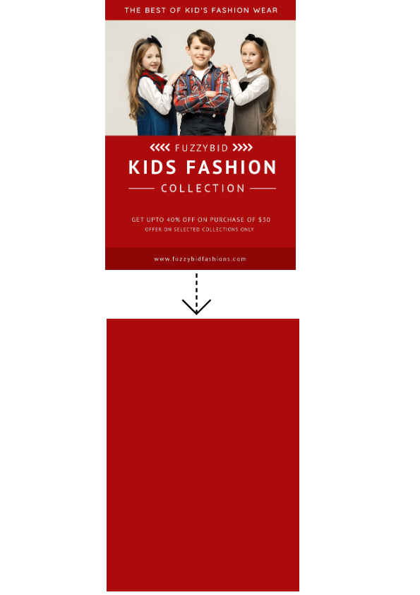
If you closely observe these designs, you’ll see that the plain backgrounds of the images make the characters and the texts very prominent. The focus in these images is always to emphasize the foreground image and use a background to ensure clarity and visibility.
On the contrary, patterned/multi-colored backgrounds are used for different purposes. Here the background becomes part of the texts and foreground visual elements.
For instance, check these designs:
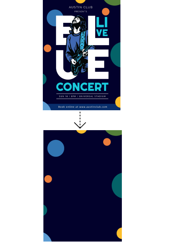
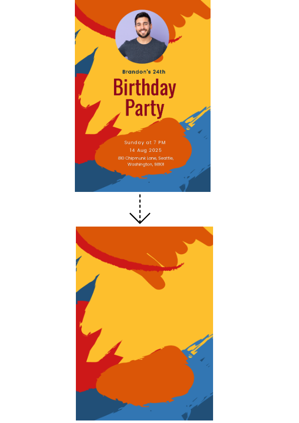
You will notice that the amalgamation creates a visual echo, giving a strong feel to the overall design.
To decide on the most appropriate background, you first need to figure out your design theme and the intended message. After that, you can start with the foreground designs and decide on the background.
2. Color Combinations
Color combinations are yet another important element when deciding your background.
To create an awe-inspiring design, make use of proper color combinations.
So you must choose the background colors compatible with the image and the text in the foreground.
Colors are directly linked to our emotions and perceptions. So make sure you have a fair knowledge of color psychology.
If not, then referring to the color wheel, remember these simple combinations that can turn your designs into mind-boggling artwork.
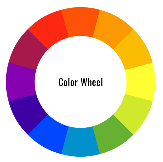
Complementary:
In this combination, you use two colors opposite to each other in the color wheel.
Like this:
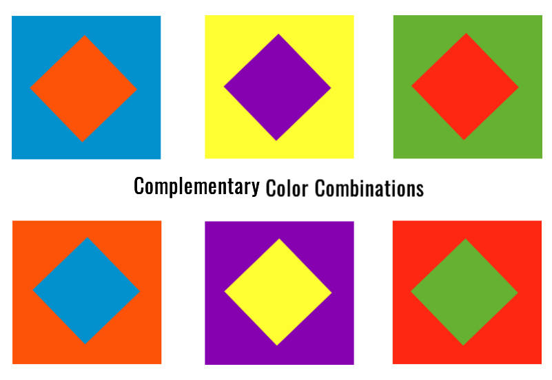
let’s see complementary colors in action!

Get This Template and More

Get This Template and More
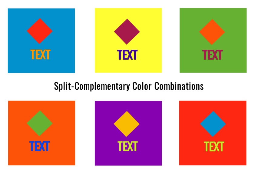
Split-Complementary:
A similar combination as above, but with a twist. In this combination, you first select a color and then combine it with two more colors adjacent to the complimentary colors. I find this combination ideal because it helps me decide on three colors for the background, foreground image, and text. This helps me to create vibrant designs.
Analogous:
This is a tricky combination to use for backgrounds. Mainly because it can affect visibility. So this might not be an ideal combination to use. But, if you are dying to use this combination (this combination tempts me as well!), then make sure you use the lighter hue in the background and the darker one in the foreground.
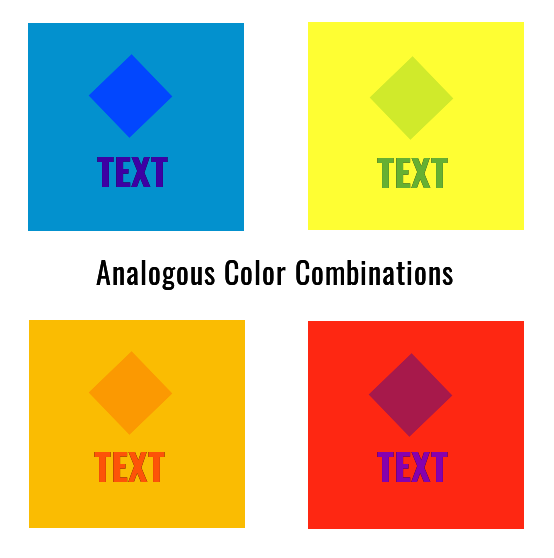
Check out the analogous color combination in the following templates

Get This Template and More

Get This Template and More
Monochromatic:
This combination is also very popular. Here you will use varying combinations of tints, shades, and tones of a particular color. This combination has always produced exceptionally well-balanced visual designs.
Let me give you a demo:
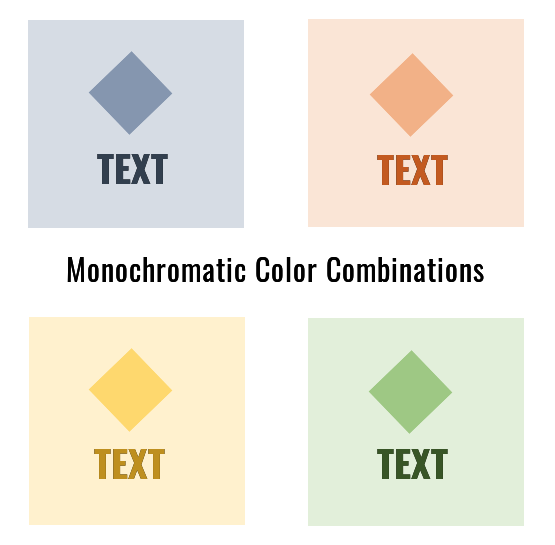
Check out the application of monochromatic colors in the templates below.

Get This Template and More

Get This Template and More
3. Negative Space
You can say that Negative space refers to the blank areas in the visual designs that do not have any patterns or other design elements. Negative space is established by the non-patterned backgrounds, as it helps the viewers focus on important design elements.
Negative spacing is very important to make the overall design aesthetically pleasing. A lack of proper placement of the foreground images against the background can make the design look cluttered. Honestly, it ruins the design.
So, you must ensure a layout that places the image and text against the background to balance the negative space with the total design.
Also, a background that is variedly colored is not suitable for establishing negative space. Plain single-colored backgrounds are ideal for this.
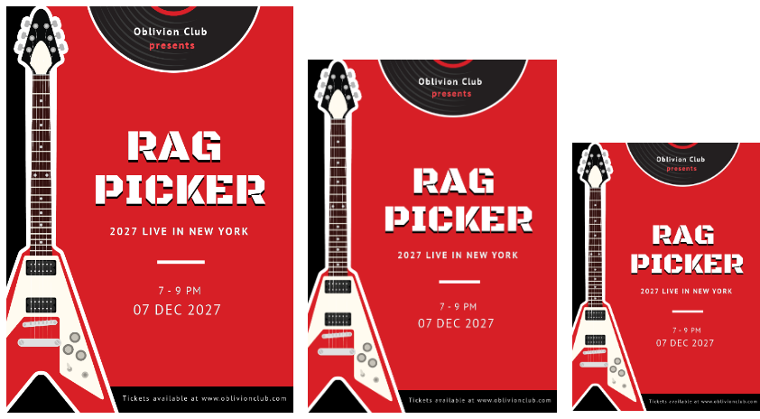
4. Designs Viewed on Screens of Different Sizes
With the constant increase in innovation in technology and electrical gadgets, we are not restricted to a desktop. We can now browse the internet on notebooks, iPad, tablets, and even mobile phones.
Studies suggest that of all the devices, mobile phones attract more traffic. According to statistics, from the period of 2015-2020, 51.53% of global traffic to different websites came from mobile phone devices alone.
So, we must be ready with marketing visuals compatible with any screen size. Here the background acts like a visibility marker, ensuring we clearly notice the foreground visual elements.
Simple backgrounds are ideal unless the background itself is the major focus.
Create Stunning Backgrounds in DocHipo
Once you sign up to DocHipo, you will get tons of amazing backgrounds for your design. Let me select a template from the Instagram Story Templates category.
If you are designing any other document, select a template or a blank template from the desired document type.
Fill in the details in the Document information. The Document owner’s name is auto-populated. But you have to provide other information like Document Name and Description.
Then click the ‘Next’ button.
Once you land on the DocHipo editor, zoom in or out of the template as needed.
You’ll find the ‘Background’ widget under the ‘Graphics and Media’ tab on the left sidebar.
The background widget is categorized into three sections for easy access- color, gradient, and pattern.
Let’s work with the color section first. Here, you’ll see the most popular background color used for different document types.
As you can see, we changed the background color to yellow, which looks stunning.
For more colors, click on the color icon and choose the custom colors option.
Now you can experiment and select the exact color and shade you want for your design.
Also, if you know the hex code of the exact color you want, place it into the box provided, and it’ll get applied to the editor.
Check out the before and after look at a glance!


Next, let’s work with a template from the Poster Templates category to understand the application of the gradient section. Here, we’ve laid out the most commonly used appealing gradient shades.
Here, we’re selecting a Car Sales Poster Template.
Once on the editor, remove the existing background from your chosen template.
Scroll down to find the perfect gradient shade for your design.
See the before and after look to feel the change!


Now let’s work with a template from the Card Templates category to see how a pattern background can change the whole look of a design. In this section, you’ll get beautiful geometric and floral patterns as your background.
This time we’re selecting a Mother’s Day Card Template.
Once you’re on the DocHipo editor, remove the unwanted design elements from the template. Next, choose the pattern you love.
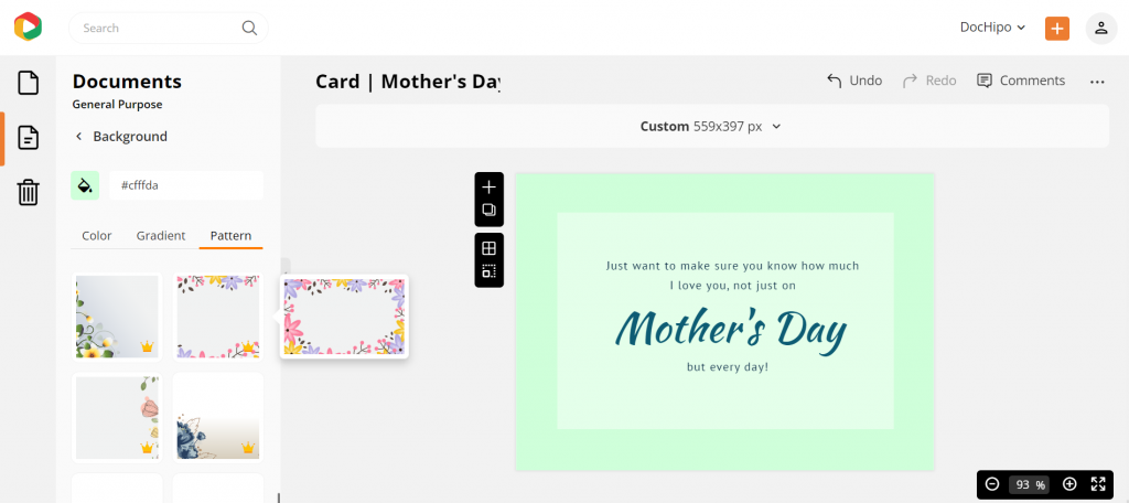
Here’s the before and after look.


Also, you can simultaneously apply color and a pattern as the background and experiment with the opacity to create the design you desire. Let’s take a template from the Instagram Post Templates category.
Let’s select the blue color.
Now change the opacity from 100 to 12.
Look at the before and after designs. Isn’t it looking beautiful?


If you want to use the same design for different document types, leverage our smart resize capability.
The patterns will automatically get adjusted when you change the document dimension. Let’s see how.
Let’s change this Instagram Post to Facebook Post and click on ‘Apply’.
Observe the design got adjusted to the Facebook Post dimensions.
Similarly, we changed it to Instagram Story.
If you want to know more about creating breath-taking backgrounds, then check this video out:
Conclusion
Backgrounds are present in all your design documents, whether a poster or a social media post. Hence, we often do not consciously observe the background of any design.
I guess that’s the success of it!
If all the design elements are noticeable (unintentionally), then probably the design is not great. The genuine success in creating a beautiful visual is to make sure that all the elements in the design fuse to form harmony, narrating a story and reflecting a message.
Hence, keep exploring and creating suitable backgrounds for your designs at DocHipo. Also, explore and venture your design skills.
DocHipo is always ready with unique templates to ensure that all your design needs are taken care of.
So hurry and sign up now for free!


