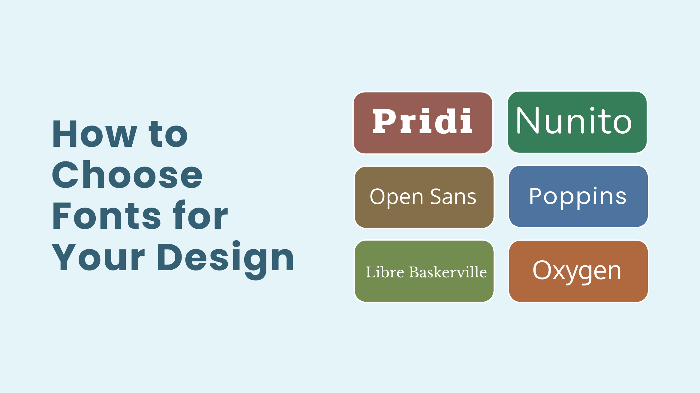
How to Choose Fonts for Your Design

When it comes to designing marketing materials, copy and design go hand in hand. And fonts play a crucial role in how people perceive your design. They can provide an attractive appearance, preserve the aesthetic value, and set the overall tone of your design. Therefore, you must learn how to choose fonts for your design.
How to Choose Fonts
- Choose Specific Purpose and Theme: Align the font with the design’s goal and message.
- Know Your Target Audience: Choose fonts that appeal to your audience’s demographics and preferences.
- Consider Font Psychology: Select fonts that evoke the desired emotions.
- Choose a Header Font: Pick bold, attention-grabbing fonts for headers.
- Choose a Body Font: Ensure body fonts are readable and less stylized.
- Create Visual Hierarchy: Use font sizes and weights to emphasize key elements.
With so many fonts available, it isn’t easy to choose the perfect ones for your design. So, we have come up with this guide to help you choose the right fonts.
Continue reading to learn how to choose fonts for your design.
Table of Contents
Importance Of Choosing The Right Fonts
If you are a non-designer, you might think that font choice doesn’t matter as long as the text is readable. This may be true to some extent, but choosing the right font is crucial if you are serious about your design.
Therefore, before we dive in, let’s know about the vital role fonts play in design.
Fonts Evoke Emotions
Believe it or not, but different fonts evoke different emotions. To communicate with your target audience effectively, you need to understand which emotion different fonts send and align it according to the meaning of your text.
So, what emotions do fonts evoke? Here are the five types of fonts and example templates from DocHipo, where these fonts were used.
Serif
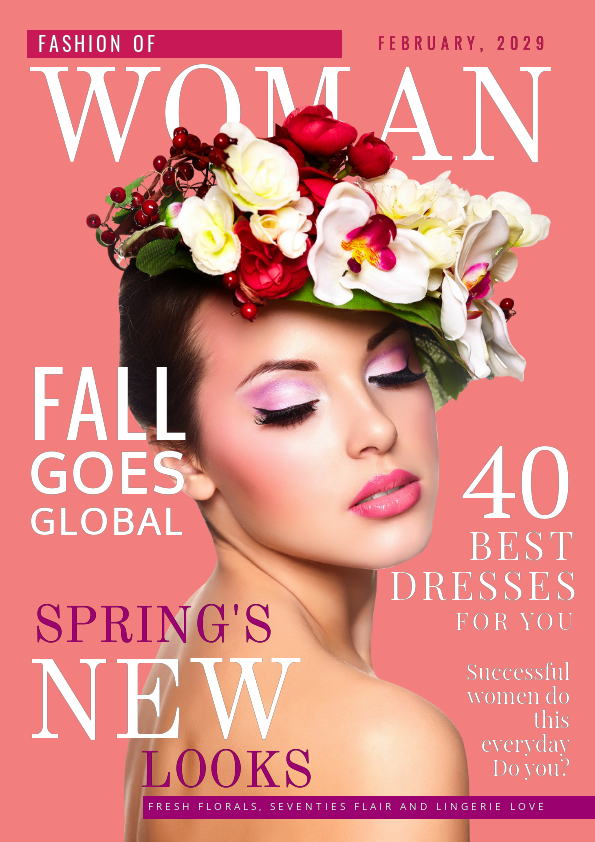
Serif fonts are identifiable by the small edges (called serifs) that increase the font’s legibility.
Serif fonts represent authority, tradition, respect, and grandeur. Some of the popular Serif fonts are Time New Roman, Baskerville, and Georgia.

Get This Template and More
Sans Serif
Sans Serif fonts don’t have small edges that give them a clean and sleek appearance. Due to its clean and minimalist nature, most brands use them for their logo to put clarity first.
Sans Serif evokes Trustworthiness, Sophistication, Tech-focused, Modernism, and Cutting edge. Some of the most used Sans Serif fonts are Poppins, Oxygen, Open Sans, and Roboto.

Get This Template and More
Slab Serif
As the name suggests, Slab Serif fonts are large and bold and look like slabs. They are a subset of slabs. Due to their bold and solid approach, they convey creativity, dependability, and confidence.
Some of the Slab Serif fonts include Alfa Slab One, Bevan, Shrikhand, and Suez One.

Get This Template and More
Script
Script fonts replicate handwriting and are a lot fancier than Serif fonts. Also, they provide a more personal touch than any other typeface. Script fonts provoke ideas of Fancy, Creativity, Elegance, Freedom, Femininity, and many others.
Grand Hotel, Dancing Script, Great Vibes, and Marck Script are some of the famous examples of script font.

Get This Template and More
Decorative
Decorative fonts are also called Display fonts. These fonts are best when you want to connect with your target audience through your design emotionally. The most common emotions they evoke are fun, creativity, originality, appeal, and unconventional.
Butterfly Kids, Flavors, Griffy, Monoton, and many others are famous examples of Decorative fonts.

Get This Template and More
Creates Harmony
People are more distracted now than they have ever been. Whether you are designing Flyers, Posters, Logos, Social Graphics, or any other marketing graphics, you have a lot of competition.
Utilizing visual harmony with compelling graphics, headlines, images, colors, and fonts can help you stand out from the crowd.
Fonts help you create harmony in your design. When appropriately incorporated, fonts can improve the effectiveness and readability of a design. Look how in the Real Estate Flyer template below, the headings and subheadings stand out and complement the overall design. It’s due to their selection of fonts.

Get This Template and More
Influences Readability and Legibility
Readability is the ease of reading larger passages of text in the design. On the other hand, legibility refers to how easy it is to make out any given letter on the design. You don’t want your audience to find the text in your design challenging to read.
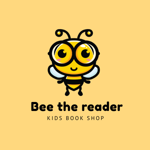
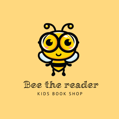
Fonts influence the readability and legibility of your design heavily. Below we have changed the fonts of the same logo template to show you how it affects the legibility. Here we have changed the font from a Sans Serif font Fedoreka One to a Decorative font Miltonian. This helps you a lot in finding out how to choose fonts for your design.

Get This Template and More

Here is another example to help you understand how fonts influence readability. In the headline of this infographic template below, we have used a script font “Parisienne” for the word “Creative”.

Get This Template and More
Then we have changed the font for the body text from Open Sans to the same font, “Parisienne”, and look how it affects the readability so badly. Now, the body text is nearly impossible to read.

Builds Brand Recognition
If you choose two or three fonts to design your marketing graphics, it will add tremendous value to your brand. Your target audience will remember the fonts that you use across all your marketing materials.
For example, brands like Coca-Cola, Dairy Milk, Google, Microsoft, Netflix, and many others use their own fonts, and you know the results. Fonts work identification for the audience, and all your design gains your brand’s presence.
How To Choose Fonts In 6 Steps
Now you know the importance of choosing the right font. So, as a marketer, business owner, or designer, you should not compromise on choosing the right font for your design.
So, let’s see how to choose fonts for your design in just seven easy steps.
#1 Define the Purpose and Theme
The first thing that you should consider is the theme and purpose of your design. The purpose of your design is more closely related to the marketing strategy than aesthetics. You might want to design marketing materials such as Flyers, Posters, Logos, or any others. And your objectives are to increase brand awareness, promote a newly launched product or service.
On the other hand, the themes refer to the various elements that make up a recurring look within your design. In other words, the theme is the message you want to convey through your design.
For example, the two Poster templates below have the same purpose but different themes. Look how the theme of the two posters influences their font choice and the overall design.

Get This Template and More

Get This Template and More
#2 Know Your Target Audience
Knowing the target audience is critical when it comes to learning how to choose fonts for a design. Understand your target audience’s demographics and psychographics. This will help you understand what kind of design will attract them, making it easier for you to choose fonts for the design.
For example, a Food YouTube Thumbnail design targeted to attract foodies will not be the same as a Business YouTube Thumbnail that targets marketers and business people.

Get This Template and More

Get This Template and More
#3 Consider Font Psychology
Once you know your target audience, the purpose, and the theme of your design, it’s time to consider the emotions you want to convey and choose a typeface accordingly. We have already mentioned the emotions each typeface evokes.
#4 Chose a Header Font
Now it’s time to choose a header font for your design. Eventually, you will have to ensure that the header font pairs well with the subheader and body fonts. However, let’s focus on finding the header font first.
The header or title text in your design should aim to catch your audience’s attention, drawing them to the graphic and encouraging them to learn more about you. Therefore, you should choose bold and large fonts for your title.
Choose two to three legible and large fonts that your think might fit your design as headers. Your goal here is to find a few fonts that you can try out in your design before finalizing onto one font.

Get This Template and More
#5 Choose A Body Font
Now, keeping your header and subheader font in mind, pick a body font for the body text. Your readers will be getting the most of their information from the body text. So, besides considering the header and subheader font, consider the following points while choosing a body font.
- Choose highly readable and legible fonts even at a small size
- Ensure the body fonts are less stylized than header and subheader
- Body fonts should have multiple weights
- Don’t make your body fonts all caps

Get This Template and More
#6 Consider Font Size and Weight to Create Visual Hierarchy
Once you have your font pairs that work well with your design, use your fonts to create a visual hierarchy. To do that, you need to play with size and weight to emphasize and de-emphasize texts.
Use a typographic scale tool like Modular Scale to determine the size of your fonts. You can choose an ideal ratio for your font size and weight. For example, if you select a 2:3 ratio for your font size, it means if your Body text is 12pt, the subheadings will be 18pt, and the heading will be 27pt.
Additionally, read the article about Typography Hierarchy to learn more about the same.
That’s it! You’ve learned how to choose fonts for your design.
Here is a video explaining how to add, edit, or delete text and how to choose fonts for your design in DocHipo.
Additionally, you can use some helpful font pairing tools like Font Joy, Font Combination Library, Font Pair, Mixfont, and others to generate font pairs and simplify the font selection process.
Conclusion…
Some fonts are relevant for your design, and some are not, but you can not categorize fonts as good or bad. Instead, you can categorize them as appropriate or inappropriate.
The primary objective of choosing the right font is to engage the audience. Hence, before settling down with a font, always make sure who will be reading the text and what message is being conveyed.
Now that you know how to choose fonts for your design, creating beautiful documents will become even easier for you. So, choose a template in DocHipo and experiment with what you have learned from this article.
Sign-up today and explore the magical world of DocHipo.


