Brand Symbols and Their Importance to Make Your Brand Iconic

Symbols are age-old. It is as old as Homo sapiens’ first attempt to communicate with their other counterparts. After all, what are the cave paintings all about?
Explaining Brand Symbols
- Definition: A brand symbol is a visual representation of a company that can replace the company’s name or logo in various media.
- Types of Brand Symbols: Logos, icons, packaging designs.
You can say that communication via pictures and letters has all emerged from symbols and symbolic interpretations. We gather, integrate, and perceive a message through symbols. This interpretation is more enhanced by the cultural and emotional associations we have with a particular symbol. We really cannot do much about the automated internal thought synthesis that occurs within us when we see a symbol. All the more because we have inherited this ability from our primitive ancestors.
In this era of innovation and commercialization, the use of symbols has taken a more advanced leap. You can see this through the emergence of brand identity and its impact on consumers.
So, in this article, we will explore the different facets of using symbols for branding. We will also check out the awesome tools and widgets present in DocHipo that will enable you to create a symbol for your brand.
But let us first understand the true definition of brand symbols and their difference from a logo when used for branding.
Table of Contents
Brand Symbols Definition
There is a common misconception that brand symbols and logos are the same. No! They are not the same. So it should not be used as a synonym of the other. But they are interrelated.
Before explaining the difference between the two, let me first share with you the story of Coca-Cola. This story will help you to understand the difference between a brand symbol and a logo.
The Coca-Cola Story
Coca-Cola was first established on 29th January 1892, situated in Atlanta, Georgia. Like any other inspiring story, even they started out small and were conceptualized in a dainty laboratory by a pharmacist. It all happened when the concept was spotted by an American Businessman named Asa G. Candler. The businessman purchased the Coca-Cola formula from the original creator, John Stith Pemberton, who is a pharmacist. He launched the Coca-Cola Company and started out with a bang.
The business was brewing in profits and recognition that distinguished them from others. They also had a very unique logo. But as they expanded, they realized that the future would procure similar companies. They understood that a logo was not sufficient to keep them apart and visible to their customers.
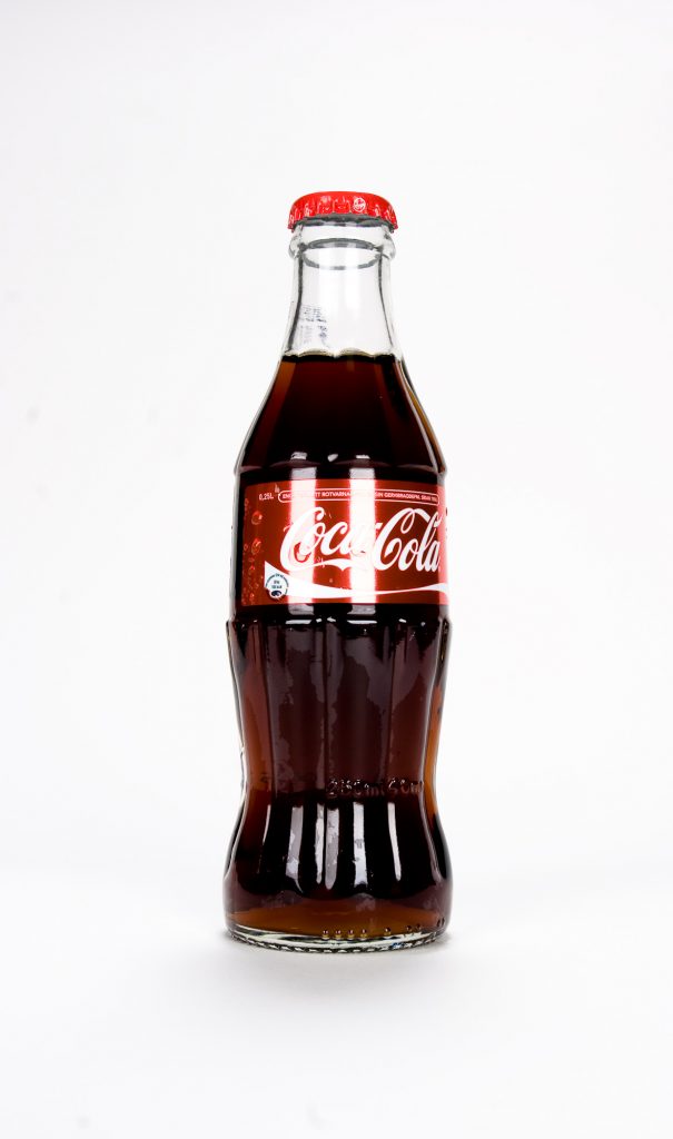
It was in the year 1912 that the lead attorney of the company, Harold Hirsch, proposed a new shape of the Coca-Cola bottle that would also be symbolic of the company’s identity along with the logo. They wanted a distinctive package that could be felt in the dark when touched and recognized when broken on the ground.
Hence, we can now see how the shape of the Coca-Cola bottle, together with the logo, forms a powerful symbol. The total package strongly represents the company, symbolizing its product. The mere shape of the bottle will immediately create an instant association with the drink within the viewer’s head.
Brand Symbols Meaning
So, what did you understand from the Coca-Cola story?
Yes, the logo is a part of a symbol, but not the symbol itself. A Brand symbol is more linked with a human’s perceptive abilities. It takes place when a consumer associates certain emotions and ideas with the brand elements.
So every aspect included in your brand identity amalgamates to form a symbol. Symbols are mainly intangible factors through which we perceive a notion when we see a brand element. Like icons, unique typographic design, colors, massage taglines, and even the packaging of the product, along with the logos.
Although corporate logos first started as a symbol in the 1880s, later the definition of symbols expanded beyond logos. Logos now are more about a company’s representation. However, symbols are more about the immediate thought process and perceptions that an image can bring into the minds of the consumers. It is more about meaning-making.
Let us see which commonly used branding elements join to form a symbol.
Elements of a Brand Symbol
Coca-Cola’s conceptualization for recreating a solid brand identity was indeed interesting. Their creativity also included packaging as a part of the symbolic representation of their brand. Who would have thought that the mere shape of a bottle could make so much difference…
So, let us remember the first rule of depicting brand symbols; we will not limit our creativity when thinking about various factors through which we want to enhance our brand presence.
But for now, let’s understand brand symbols through Logos, Icons, and package design.
Logo
The logo incorporates together different symbols forming an emblem. However, the logo cannot be defined as a symbol. I know this statement is confusing! So, let me elaborate further.
It is more like different symbols form a logo; again, this logo becomes a part of a bigger symbolic representation of a company’s brand. Therefore, when a consumer views a logo, he/she will automatically evolve perceptions in their minds gained from the different symbols present in the logo, reflecting one symbolic interpretation.
Let us understand this through two examples.
Check the logo of Toblerone, a famous chocolate brand:
Look at the yellow mountain and the bulky protruding fonts. Also, if you minutely check the white space in the mountain picture, you can actually see a bear. Surprising, isn’t it?
Overall, the logo signifies the place of the product’s origin. The Mountain in the logo represents the steep Matterhorn in Switzerland, where the chocolates originated. Again the hidden picture of the Bear symbolizes the city of Bern. This city, also located in Switzerland, is famously called ‘The City of the Bear’. Here the chocolates are produced.
Now, Closely check the logo of Amazon:
This is another interesting logo. It is mainly typographic-based and is accompanied by a yellow arrow underneath. The first impression that you get from this logo is the feeling of simplicity and positivity. Mainly because the yellow arrow forms a smile.
Now that’s a perfect symbolic representation of a happy service, an arrow that you associate with a smile. But the symbolism doesn’t stop here!
Look at the placement of the arrow. It starts from the letter “a” and ends in the letter “z”. So what does that symbolize? It means that here you will get everything from A to Z.
Icons
An icon is a pictorial summary of a product’s application. It is a simplified symbolic representation of a brand. But before an Icon can be associated with its respective brand, the logo has to be well-acquainted among its consumers. After all, icons generally depict a vital element of the logo.
An Icon represents the concept and the application of the product. It is usually used as a key symbol when accessing digital applications.
To understand this, let’s check out the famous icons of world-known brands:
Look at these icons. I bet you can immediately relate the icons with the brands and their services. You automatically perceive the memories of the product experience and its associated feelings. That’s what icons of a brand do. It gives the viewers a profound sense of emotions in just seconds. This emotion, coming from the experience of using a product, is a vital element of the brand symbol.
Package Design
Honestly, I didn’t know that a product’s packaging can symbolize a brand’s identity. However, Coca-Cola expressed this through its innovative approach to creating a strong brand impression.
When trying to create a strong brand symbol through product packaging, you need to see each element that is associated with your brand. This can be the color, logo, fonts, overall design, and layout. Let us again take the example of Toblerone.
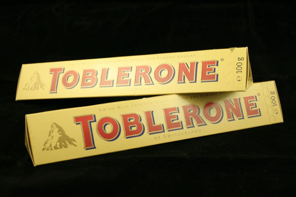
Look at the overall shape of the cover that boxes the classy triangulated chocolate slab. Along with its logo, the product takes a triangular shape, which syncs with the concept of the mountain. The triangular cover usually has a faded yellow color, with the name “Toblerone” displayed on the elongated space of the cover. We can even see the mountain logo embossed with a shiny golden tinge.
Packaging makes a huge difference, as consumers immediately relate this to their experience. Like with Coca-Cola, you immediately remember the stable grip that the bottle enables you. Similarly, with Toblerone, you instantly remember the shape and the pointy feel you get when you hold the product.
So, remember these points if you want to create a strong brand symbol that will enhance your business identity.
Create Brand Symbols to Boost your Business in DocHipo
As we now know, to create a good brand symbol, we need to have a great logo, an icon, and a package design. But let me tell you again, do not limit your creativity only to these factors when thinking about brand symbols.
Now, let us see what amazing tools and widgets DocHipo has that can help you create your brand symbol.
Text Frames
Dochipo has a stunning collection of text frames that you can customize and use for branding. There are many elegant text frames with different themes to select from. Let me show you some of my favorites that you can use based on your branding needs.
Get This Text Frame and More

Get This Text Frame and More

Get This Text Frame and More
You can use these text frames as a part of your brand logo or in the package design layout.
Shapes
DocHipo offers multipurpose shapes, ranging from basic geometric shapes, abstract shapes, and ornamental shapes to trendy shapes that you can use for any visual business need. Right from creating a logo to commercial visual design, you can use it the way you want. Let me show you some applications of the shapes available in DocHipo.
First, check out the following two Education Logo Designs with circular and hexagonal shapes, respectively.
Get This Template and More
Get This Template and More
Next, we have the cool Food X/Twitter Ad Templates with trendy shapes in them.

Get This Template and More

Get This Template and More
Watch the video below to utilize various shapes in DocHipo.
You can use these shapes as a logo and even an icon. As you know, brand icons generally are related to the brand logo.
Icons
There are plenty of colorful icons that you can use when branding. You can use these icons in different design documents to represent your brand. Also, you can use them for different iconic symbolism. DocHipo offers mono and colored icons on a wide variety of themes, ranging from food, beauty, social media to travel and beyond.
Let me show you some applications:
The brand logo of the Burger Point and bakery shop is created using the relevant icons.
Get This Template and More
Get This Template and More
Next, notice how the icons are used in the corporate and restaurant flyers to represent the brands’ expertise and property features, respectively.

Get This Template and More

Get This Template and More
Backgrounds
Backgrounds are important. After all, your logos and other brand symbols are resting upon it. Hence, the background color can further enhance your design and the other elements associated with it.
In Dochipo, you can create a stunning background using a wide range of colors, gradients, and patterns. You will also get the option to customize the color and create your own.
Check this video to understand more about backgrounds:
There are more widgets and tools that you can use to create your brand symbol and design. To access all these features for free, sign up to DocHipo and explore the great artistic dimension.
Conclusion
Whenever you think about getting a design solution for creating a brand symbol, DocHipo is absolutely the right choice!
Firstly, you can choose any of the design elements and templates for free. Secondly, you have the full freedom to design your brand-related documents.
DocHipo provides you with the best design platform, where you can keep on creating designs that will amplify your business. Moreover, you can always contact the amazing team to request any kind of template that is not available in the database.
In terms of brand symbol, DocHipo is always there with you for any document design solutions.
So Sign up now!
FAQ
What are symbols in branding?
Any visual characteristics of a brand, including its logo, that help people recognize it distinctively form a powerful symbol.
What impressions can symbols reflect for establishing brand identity?
Through symbols, you can effectively communicate the nature of your business, what type of product or service you offer, and the overall vibe of your business. The color scheme, fonts, or visuals used in a symbol, such as a logo, convey a visual identity specific to your brand. When people repeatedly see your brand symbols across all your marketing channels, it strengthens your message, establishes your brand identity, and recognizes your brand instantly.
How do symbols contribute to brand loyalty?
Your brand symbol reflects its core values and helps customers develop positive feelings toward your brand. Brand loyalty is strongly associated with how customers perceive your brand, its values, and its actions. These make your customers choose your brand over your competitors over and over again.
Can symbols be updated or changed in branding?
You may update or change symbols in your branding in situations where you’ve modified or expanded your business offers and, thus, the target market to reflect these improvements. You can also update it if it contributes to better brand recognition.

