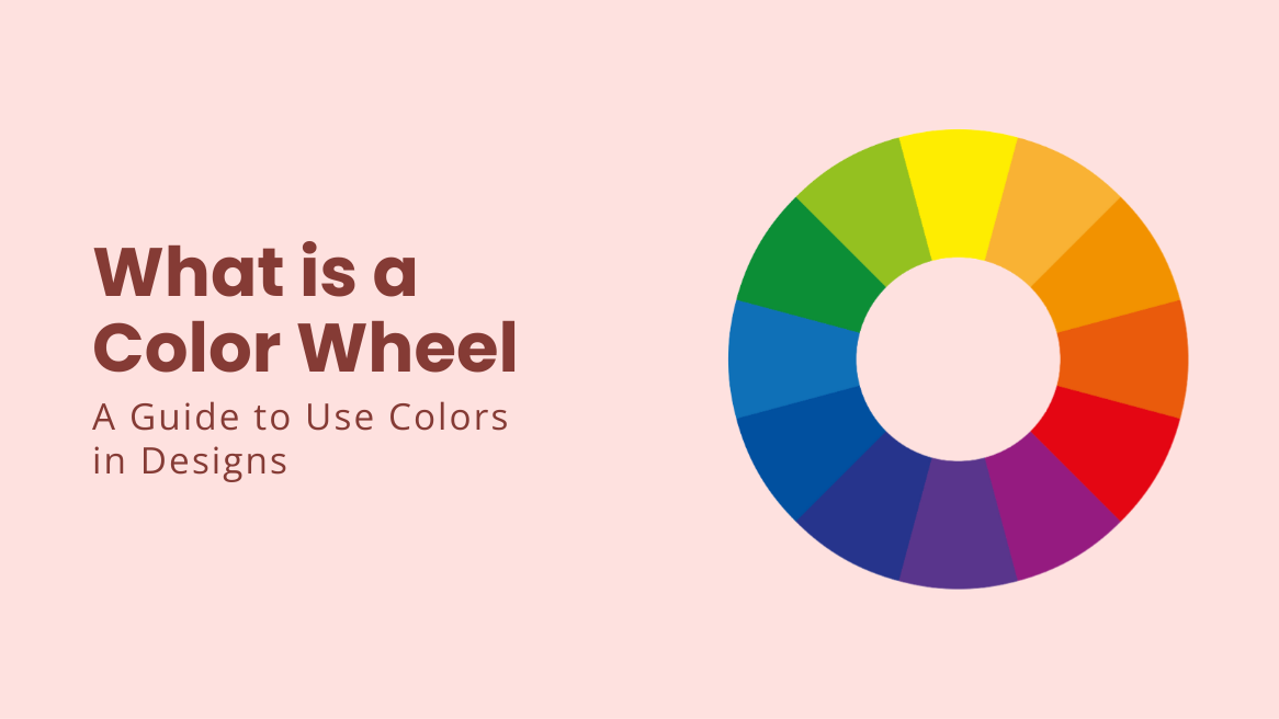
What is a Color Wheel: A Guide to Use Colors in Designs

“Color is the keyboard, the eyes are the harmonies, the soul is the piano with many strings. The artist is the hand that plays, touching one key or another, to cause vibrations in the soul.” – Wassily Kandinsky
The artist indeed brings magic with the colors. I am not an artist, but I know why some color combinations work while others don’t. Earlier, I used to go through a series of hits and trials while selecting colors for my designs until I stumbled across the secret of color theory.
Before I tell you everything about colors in design, let’s thank the person who explained the science behind color schemes by introducing the color wheel. That’s none other than Isaac Newton (yes, the gravity guy). But first, let’s find out what color wheel is and why you should care about it.
You will be surprised to know that colors influence 85% of shoppers’ purchase decisions and have the potential to increase brand awareness by 80%. Needless to say, colors significantly impact our decision-making in everyday situations. Therefore, you should unravel the science behind the color theory.
What is a Color Wheel
A color wheel with 12 colors is a systematic arrangement of colors that helps understand color variants, their mixing, and harmony.
Color schemes are color combinations aligned with the help of a color wheel to produce eye-pleasing effects in the design. These are as follows:
- Monochromatic Color Scheme: Diverse shades and tints of the same color.
- Analogous Color Scheme: Three colors on the color wheel are placed side by side.
- Complementary Color Scheme: Colors are on the opposite side of the color wheel.
- Split-Complementary Color Scheme: Color opposite to the two adjacent colors of the complementary color.
- Triadic Color Scheme: Three evenly spaced colors on the color wheel.
- Tetradic Color Scheme: Two complementary pairs on the color wheel, opposite each other.
- Square Color Scheme: Four colors are equidistant from each other on the color wheel.
Read further to learn more about color models, color variants, warm colors, and cool colors.
Before you say show me the color wheel, you must also understand how to apply it. In this blog, you will explore the color wheel and color schemes with meaning, the types of colors, their variants, and how color schemes on the color wheel work. Furthermore, you will get pro tips on using color theory to create the best color palette with templates showcasing colour wheel design ideas.
Table of Contents
What is a Color Wheel
A simple color wheel contains 12 colors arranged to represent the visual relationship between these colors. As per the colour wheel definition, this systematic yet straightforward arrangement allows you to understand color variants, their mixing, and harmony. It has primary, secondary, and tertiary colors. Here is a colour wheel image for your understanding.
What is the Purpose of a Color Wheel
So, how does a colour wheel work? In simple words, the color wheel will guide you the next time you ask yourself, “What looks great with green?”
It will help you to arrange colors aesthetically in your designs without going through a series of hits and trials. But why color for wheels? It could be any other shape isn’t it? Gradually, you will get all the answers within this blog.
Moreover, the colors of the wheel look different in digital and print media. Therefore, you should know about the two types of color wheels: RGB (red, green, and blue) and RYB (red, yellow, and blue) used for print and screens, respectively. However, auto color wheel models dictate the presentation of colors in different media to a large extent.
So, let’s explore the types of colors and the mixing models based on the base color wheel all colors to get a better idea.
Types of Colors on the Color Wheel
It’s almost impossible to explain a color wheel without the knowledge of various types of colors. So, let me enlighten you with the different kinds of colors in the color wheel. So, what colors are in the color wheel? I will tell you more with various images of color wheel patterns for better understanding.
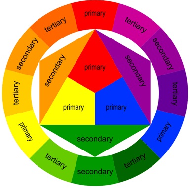
Overall, there are three colors on the color wheel- Primary, Secondary, and Tertiary colors. You can call these as the color wheel maker. Look at the labelled color wheel to understand them.
What are Primary Colors in Art
Primary colors are the parent colors, which means you cannot create these colour wheel colours by mixing different colors. Using primary colors in any design will make it stand out with the potential to create eye-catching visuals. You can use one or a combination of these to bring the desired effect.
How Many Primary Colors Are There
In the color wheel theory, there are three primary colors. Also known as parent colors, the primary colors are:
- Red
- Yellow
- Blue
What are Secondary Colors in Art
Mixing two primary colors gives a secondary color. For a better understanding, check out the image at the top. The secondary colors help to make your visuals pop or enhance the image as accents.
How Many Secondary Colors Are There
The three primary colors allow various color combinations. Overall, there are three secondary colors. These combinations can be:
- Red + Yellow = Orange
- Blue + Red = Purple
- Yellow + Blue = Green.
What are Tertiary Colors in Art
Mixing one primary color with another secondary color gives a tertiary color. Making tertiary colors can be tricky because all colors don’t produce distinct colors after mixing. Here, the color wheel will guide you to identify what exactly you should incorporate.
While mixing primary and secondary colors, always remember to mix secondary colors next to their primary colors. In simple words, refrain from mixing primary and secondary colors at the opposite end of the wheel. If you do so, combinations like red + green and blue + orange will result in a brownish hue.
How Many Tertiary Colors Are There
We have many options to choose from while making tertiary colors. There are colour wheel six colours for tertiary colors, and here are examples of different groups of colors.
- Red + Purple = Magenta
- Red + Organe = Vermillion
- Blue + Purple = Violet
- Blue + Green = Teal
- Yellow + Orange = Amber
- Yellow + Green = Chartreuse
Now, you are ready to understand the concept of the color models. The business of colors works around the artwork.
So, how many colors are in the color wheel? Color wheel with all colors comprise of primary, secondary, and tertiary colors, and you have your twelve colors.
What is a Color Model
To help you understand how does color wheel work, you need to understand the color model. A color model is a system used to represent and describe colors numerically. In simple words, the color model helps to define colors and how they would appear on the screen or the paper.
Additive and subtractive colors constitute the two color models. Let’s learn about the two color models, also known as the RGB color model and the CMYK color model for the color of color wheel.
What is the RGB Color Model
We see colors only when they reflect in light. Objects don’t have their color. In fact, we see all the colors only because of the light waves. The additive or RGB color model is similar to one of the types of color wheel that works by mixing different wavelengths of light in the dark.
What are RGB Colors
The RGB colors for the additive color model are red, green, and blue. Additionally, each color has a value (you can understand value as the strength of the colors) between 0 and 255. So, if you want a purely green color, red and blue will have a 0 value, while green will have 255.
Likewise, you will get the white light when you add equal amounts of all three colors.
What is the RGB Color Model used for
The additive color theory is helpful for TVs, projectors, and digital screens. Since mobile phones have become the mainstream advertisement source, embracing the RGB color model is essential. So, when you portray your logo in bright colors, the RGB model ensures the viewer can perceive the exact shade and intensity.
What is the CMYK Color Model
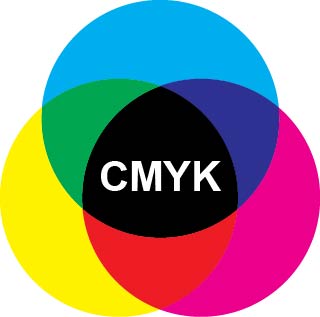
We all applied CMYK or subtractive color theory in kindergarten when we were used to mixing colors on a white sheet. We are subtracting the white light on the sheet by mixing different colors.
How Many CMYK Colors Are There
The CMYK color model uses four colors – cyan, magenta, yellow, and black. We subtract the white wavelength from being visible by adding different light wavelengths. Like RGB, CMYK colors also have values from 0 to 100.
Mixing all the colors with 100 values for each one will bring an actual black color, whereas a 0 for each will result in pure white.
What is CMYK used for
Modern printing systems use the CMYK model to produce desired colors for printing. Your printer cartridges have CMYK listed on them. When you use print media, embracing the subtractive color theory will give you the desired colors on the paper.
Various Color Variants
“Pink is not just a color. It’s an attitude, too.”– Miley Cyrus.
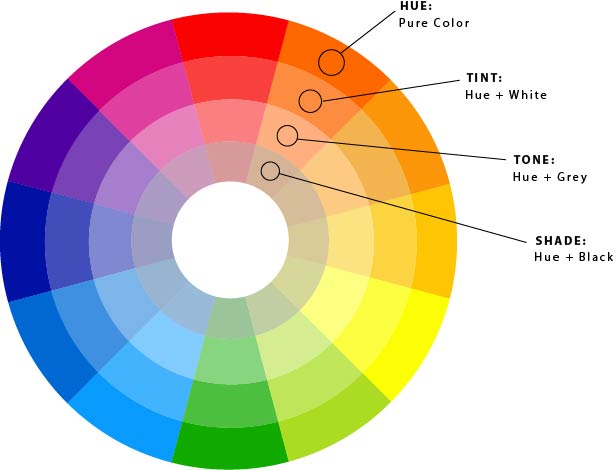
Did you notice no pink in the color wheel or the two color models? If you remember the 64 colors of your crayon box, many of them need to be added to the color wheel. Many color variants include hue, shade, tint, or tone. Let’s explore each of these with the help of the all color wheel outline image.
What is Hue in Color
Hue refers to pure color, which means all types of colors – primary, secondary, or tertiary colors. You mix different hues to get the desired color. Mixing hues with black, white, and grey produce other color variants like shade, tint, or tone for the color combination wheel.
The other color variants affect the product of any mixture to a large extent. Based on variants, the mixture deviates from the pure color mixture.
What is Shade in Color
Shade refers to the mix of hue and black. Generally, we call a shade when it’s darker, and that’s how shade works. Depending on how much black you add, there can be multiple shades of the same hue; for example, Red + Black= Burgundy.
What is Tint in Color
Tint is the opposite of the shade. When you add white to any hue, it gives a tint. Returning to the question of pink, it is one of the tints of red; that is, Red + White = Pink.
What is Tone in Color
For tone or saturation, you can add grey to any hue. It helps manipulate the intensity of any color. Most people refer to saturation when referring to the colors in the digital images. Saturated colors like hot pink, vibrant red, or lime green appear too bright; thus, adding grey helps to tone down the image, enhancing the visual appeal.
Depending on the greyness you add, you can shift a color towards a lighter or darker tone. For example, Blue + Grey= dull blue/ steel grey (depending on the amount of hues mixed)
I have solved the colorful mystery of 64 crayons. The wheel allows you to manipulate the colors of the color wheel, such as brightness, intensity, darkness, and softness. It’s your time to play around with a tint of blue and a hue of yellow and see what you can create. Let’s explore colors in-depth color wheel.
Types of Color Schemes
“Why do two colors, put one next to the other, sing? Can one really explain this?” – Pablo Picasso
Yes, we can! You have picked your colors, and it’s time to plan which of these go together. Indeed, the types of colour wheel and color model will help you to represent the desired colors, but to bring eye-pleasing combinations, you need to know what color schemes are. To help you choose and experiment with harmonious palettes, try using a color schemes generator.
When you use the color coordination wheel the right way, you are actually using the colour scheme wheel. The color scheme wheel is aligned with the help of colour wheel combinations to produce eye-pleasing effects in the design.
In simple words, these are the colors of the color wheel that work great together. Let’s explore color schemes in the color wheel with a few templates showcasing the color wheel design ideas:
1. Monochromatic Color Scheme
Monochromatic does not mean black and white; it includes diverse shades and tints of the same hue. If you need clarification on color combinations, monochromatic colors offer safe options as primary color scheme.
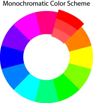
Rather than contrast, monochromatic designs bring a clean, harmonious, and cohesive visual appeal. Look at one of the color wheel designs from gorgeous X/Twitter post templates from DocHipo, exuding elegance in varying tones of purple.

Get This Template and More
Also, notice this gorgeous monochrome poster that matches the product color with the overall layout.

Get This Template and More
2. Analogous Color Scheme
In an analogous color scheme, we use three colors placed side by side on the colour wheel in the design. This color wheel color combinations is one of the best ways to use a dominant color followed by two other supporting colors.
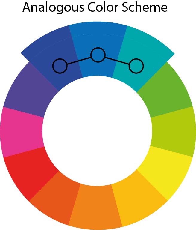
Let’s look at some designs for color wheel. To illustrate it better, observe this Instagram post template where hues of yellow dominate while orange and green support the layout- as a combo of 3 color wheel.

Get This Template and More
Here is another example of analogous colors in the LinkedIn post template. The template exhibits a professional vibe using various hues of blue on the colour wheel.

Get This Template and More
3. Complementary Color Scheme
When you ask, ‘Which type of colors are opposite on the color wheel’ or ‘What are the complementary colors?’, just remember that opposites attract. The complementary colors are on the opposite side of the color wheel. These colors make the perfect contrast, forming beautiful imagery. Therefore, you get many contrasting color combinations like red-green, green-magenta, orange-blue, etc., which are part of the complementary color wheel.
Check out one of DocHipo’s Flyer templates that creates an eye-catching contrast in the orange and blue colors of the color wheel.

Get This Template and More
Also, DocHipo’s Business Card templates portray a variety of color schemes. Here is one of the examples of a complementary color theory wheel.

Get This Template and More
4. Split-Complementary Color Scheme
You can create contrast in your designs using three different hues. Split-complementary colors help create soft contrast, unlike bold contrast in complementary color combo wheel.
To choose the split-complementary colors, pick a shade on the color wheel along with the two adjacent colors of the complementary color. For example, if you choose red, you must select the colors adjacent to green on the color wheel.
Observe how this sports blog graphic template effectively uses split complementary colors like violet, orange, and green.

Get This Template and More
Here is another example of the split complementary color scheme in DocHipo’s presentation template.

Get This Template and More
5. Triadic Color Scheme
In a triadic color wheel scheme, we use three evenly spaced colors on the color wheel. You can use this color scheme to create high contrast with vibrant shades. Using triadic color of the wheel, one can equally distribute the weightage of the design among all three colors to maintain harmony.
For instance, DocHipo’s Facebook post templates ingeniously leverage triadic color wheel simple to illustrate their designs.

Get This Template and More

Get This Template and More
6. Tetradic Color Scheme
Tetradic or double complementary color schemes can seem overwhelming at first glance. This color scheme uses two complementary pairs in the design or forming the color wheel square, which can be challenging to balance. With so many colors, I tackle this problem by selecting a dominant color and using others as accents. It helps maintain the harmony of the design without imposing any colors.
Check out this Christmas Facebook Post showcasing a balanced tetradic graphic design color wheel.

Get This Template and More
7. Square Color Scheme
While using a square color scheme, pick four colors equidistant from each other on the colour wheel, forming a square or a diamond shape. Unlike the tetradic scheme, these colors help in creating a softer contrast. We will again use a dominant color followed by other colors as accents in the design.
Moreover, you can experiment with different shades and tones while using these colour wheel maker.
For instance, this Cyber Monday Instagram post cleverly balances all the colors of a square color scheme.

Get This Template and More
With this, we come to the end of colour coordination wheel scheme types along with their application.
What are Cool and Warm Colors
“I found I could say things with color and shapes that I couldn’t say any other way.”- George O’Keeffe.
Is there a better way to express than colors? I don’t think so. Colors evoke emotions and sensations in the viewer. You have explained your color wheel, but colors have much more to say than simply combining.
Our eyes perceive several nuances in a design; color is undoubtedly crucial. That’s why we are trying to find our way around colors. People perceive colors in a hundred different ways across the globe. Yet the distinction between warm and cool colors comes naturally to us.
To illustrate, look at these two Facebook ad templates from DocHipo. Notice how shades of red and blue bring different effects on our minds.

Get This Template and More

Get This Template and More
While the former template evokes warmth and spiciness, the latter captures the chilly winters. You can feel that colors exhibit different temperatures.
Moreover, you can divide the colour wheel into warm and cool colors. As illustrated, you can call half of it the cool colour wheel, whereas the other half is the warm colour wheel.
What are Warm Colors
Warm colors include red, orange, yellow, etc., hues, along with their combinations. As the name suggests, they help you associate with sunlight and heat. Not just temperature but colors also evoke different responses from the viewers. For example, if you want to advertise your restaurant, red, yellow, and orange are the most delectable colors.
Similarly, you can use brown, gold, peach, and pink tinges to exude warmth in designs. Warm colors are great for stimulating activity. Therefore, these colors are also associated with spaces like gyms and restaurants.
That’s what this design from DocHipo’s Poster templates is doing.

Get This Template and More
What are Cool Colors
Exploring the latter half of the colour wheel will bring you to the cool colors color wheel. Colors like blue, purple, green, etc, and their combinations make cool colors. These colors remind you of water, snow, or sky, exuding a calm and soothing vibe. Cool colors also help bring a cool and refreshing vibe to any space. Therefore, cool hues are helpful in relaxing spaces like bedrooms and spas.
Check out this refreshing design from DocHipo’s range of beauty brochure templates.

Get This Template and More
How to Use a Color Wheel in Graphic Design
The color wheel is explained, and let’s figure out how to apply it in design. Don’t know where to start with your design? Here are a few tips to help you get started with the color wheel application for your purpose.
1. Observe Color Schemes in Other Designs in Your Niche
Identify your niche and explore designs around you. You can observe digital methods as well. The trick is simple: watch designs that hook you at first glance. Note all the features and use of colors in these designs. Also, observe why a particular design stands out among its contemporaries.
2. Understand the Mood and Context of Your Design
Once you know about your niche, it’s time to decide about the context of your design. Some basic questions you should ask yourself are:
- What is your target audience?
- What do you want to convey?
- What will the mood of your design be?
Consider these questions before choosing colors for your design.
3. Start with a Base Color from the Color Wheel
Now, choose a base color that suits your design. Remember the cool and warm colors and how they operate? Use this knowledge while selecting the base color. Consider certain essential aspects like brand language, contrast, and design gradient in graphic design. Depending on the purpose, choose a base color and apply color schemes like monochrome, complementary, triad, and so on. While trying colors, I suggest you allow your instincts to select the best combination.
4. Apply Different Color Schemes Guided by the 60-30-10 Rule
Applying different colors to your design will require a series of experiments. Try out various color schemes in your designs. To distribute the weight effectively, try to keep 60% of the primary colors (typically the background), 30% of the secondary colors, and 10% of the accent colors, respectively. It helps beginners keep the balance of all the colors. Later on, you can experiment with more colors while designing.
For example, notice how colors are in different proportions in these email header templates.

Get This Template and More

Get This Template and More
5. Pay Attention to Color Psychology
Color psychology is essential to evoke the desired effect in your audience. Different colors evoke different emotions; for example, red is for energy, love, and passion, and green promotes the message of vegetarianism, environment-friendliness, and freshness. You must remember that colors express different messages in different contexts.
Observe how colors express meanings and evoke responses in these book cover templates to help us associate with the context.

Get This Template and More

Get This Template and More
In addition, your knowledge of the color wheel theory adds a technical advantage while designing any piece for your brand.
Learn How to Choose Colors for Your Brand and make your brand stand out.
6. Use Tints and Shades to Add Depth and Dimension to the Design
Once you have selected your colors, it’s time to add details. Experiment with shades, tints, and tones to give various elements depth, dimension, and visual interest. Use lighter hues for objects far away and darker for things near them. Tints and shades also help maintain visual harmony and cohesiveness.
Notice how the gradient background shade enhances the overall appeal of this event’s LinkedIn post template.

Get This Template and More
Learn to add stunning backgrounds to your designs with this video.
7. Create Color Hierarchy
Creating a color hierarchy means organizing and prioritizing colors within a design to draw a viewer’s attention, emphasize certain elements, and establish visual order. It involves several aspects, such as choosing the base color, introducing repetition, and effectively dividing the colors’ weight.
For instance, this design from DocHipo’s Tumblr graphics templates draws our attention to the color repetition and the text. Notice how the different hues of yellow occupy the background and text overlay to create a hierarchy.

Get This Template and More
How to Design in DocHipo Using Color Wheel Theory
Want to know the secret behind eye-catching designs? Designing a document from scratch can be overwhelming and time-consuming. Now, it’s easy with DocHipo! Get your hands on ready-to-use DocHipo templates for premium designs for all purposes.
DocHipo makes your design journey smoother and faster. Our professionals have done all the heavy lifting of designing with gorgeous color combinations and pleasing graphics. Moreover, you can unleash your creativity with the intuitive drag-and-drop DocHipo editor.
Sign up with DocHipo and create your design in three simple steps:
1. Choose Your Template
As soon as you sign up, you will land on the homepage of DocHipo. Here, search for your document template in the search bar.
You will get a diverse range of template designs to choose from. Select a template that aligns with your purpose to get started.
2. Customize Your Template
After selecting the template, you will arrive in the DocHipo editor. With the help of versatile design widgets, customize the text, image, graphics, and more in the template.
Further, experiment with color schemes and variations to enhance your design’s background. DocHipo’s eye drop tool helps you synchronize the design elements on the template. You can choose the eye drop and select any color on the screen. Now, you can color all the design elements with the exact shade.
DocHipo also lets you add your color palette with the brand kit feature to make on-brand documents.
If you are clueless about color combinations, try preset Color Themes from DocHipo and choose what appeals to you the most.
Learn to use the Brand Kit in the DocHipo editor with this video.
3. Download Your Design
After making all the changes, click on the three dots in the upper-right corner of the editor. Now, select the suitable file type and quality and click download to save the design.
Also, watch this video for crucial tips for graphic design.
Rolling the Color Wheel Your Way
That was a lot to remember about colors, wasn’t it? Now, you have all the information about ‘what is a colour wheel’ and what colors are on the color wheel, with crucial tips about the color wheel theory in your back pocket to apply to your designs.
Remember, the more you play with color combinations, shades, tones, and tints, the better you will become at bringing visually pleasing designs for your viewers.
Practicing with colors will also help you to learn about balancing the colors in any layout. Sign up with DocHipo and start practicing color schemes and interesting customizable features. Despite so many color schemes, rely on your senses to decide. I will leave you with these inspiring words.
“Life is a painting, and you are the artist. You have all the colors in the spectrum on your palette – the same ones available to Michaelangelo and DaVinci.”– Paul. J. Meyer
FAQs
What is a color wheel in art?
A color wheel is a systematic arrangement of colors on the spectrum that helps understand color relationships and harmonize colors in art.
How many colors are on the color wheel?
A color wheel consists of 12 colors, which are-
- Three primary colors: Red, yellow, and blue
- Three secondary colors: Orange, green, and purple
- Six tertiary colors: Magenta, violet, vermillion, amber, teal, and chartreuse
Which color model is used in printed designs?
CMYK (Cyan, magenta, yellow, and black), or subtractive color model, is used in print designs to achieve true colors.
On the color wheel, where are complementary colors?
Complementary colors are color opposite wheel on the color wheel. Together, these color schemes bring visually bold contrast.
What are considered cool colors?
Colors that evoke relaxed and calm feelings as we associate them with sky, ocean, or greenery. Typically, colors like blue, cyan, green, magenta, and purple are considered as cool colors.


