
How To Create Charts With DocHipo: Guide to Interactive Visuals

Need to create reports but feel overwhelmed by staring at rows and blocks of numbers? What you need is full attention on how to create charts that turn data into visual stories.
How to create charts
- Choose a Chart Maker: Pick a user-friendly interactive chart maker for a quick and easy solution.
- Select the Chart Type: Pick a chart type that goes well with your goal or data set.
- Insert Data in Your Chart: Now, add values from your spreadsheet into the chart maker to reflect in your new chart.
- Customize Your Chart Design: Adjust colors, fonts, features of axes, labels, legends, grid, and caption styles, etc.
- Download it: Finally, you can download your customized chart in various formats.
- Update Your Chart: You can edit the values and other features of your chart in the future.
Interactive charts are your reliable weapons for data-driven visual storytelling that lays out raw data in a visual rhythm. It helps you organize information into a visually engaging pattern, making the data and its relevance easy to understand.
Table of Contents
What are Interactive Charts
Charts can be both static and interactive. Usually, what you used to see a decade ago was static pictures of charts and graphs that don’t move, zoom in and out, or update in real time. Yes, static charts would feel more like images with valuable data points, but they would lose relevance over time.
Whereas interactive charts are clickable and dynamically editable with real-time data, keeping the data presentation relevant and enjoyable to explore. Instead of just looking at numbers, you can hover, click, and edit the information with customizable chart types, axes, grid, labels, legends, and styles features.
Why Use Interactive Charts in Your Marketing Documents
- A compact display of data, with strategic visual representation, makes the data more comprehensible than five long paragraphs with clunky language that make the same point.
- Numbers always make the information more credible. However, the style of visual presentation makes all the difference. When you can check each detail with a click or a simple hover and update the whole data sheet instantly, data visualization becomes effortless, and your presentation looks super polished. So, case studies, proposals, pitch decks, and even social posts feel more trustworthy when they back the story with real numbers.
- Interactive charts in a well-presented format can easily grasp the attention of the viewers and even spike up their attention span to the story you want to tell with your well-researched data.
So, why do people use charts? If you want to turn complex data into instant clarity, you’ll love using an online charts maker to create interactive charts. These charts help you spot trends faster, compare numbers easily, and make confident decisions without digging through endless text or stressful spreadsheets.
Now, let’s talk about: where do we use charts? Here are some clues. From campaign performance, audience demographics, product comparisons, and KPIs, you can easily present your information to your audience in a way that makes them go, “Wow.”
Smart Ways To Use Different Chart Types in Your Marketing Documents
Now that you know what an interactive chart is and how it’s different from static ones, it’s time to look for some ideas or inspirations to use them for business. Before that, you should also know what charts to use when. DocHipo provides chart types such as single- and stacked-horizontal charts, vertical bar and stacked vertical charts, area, line, pie, and donut charts.
So, let me briefly explain the different types of charts and their uses:
- Vertical bar charts: Best for quarterly revenue tracking, sales comparison, marketing campaigns, etc.
- Stacked vertical bar charts: Best for product sales, monthly revenue compositions, sales by region, social media traction, monthly ad spend/ad revenue, customer segmentation, etc.
- Horizontal bar charts: Employee rating, KPI reports, before vs after reports, feature analysis reports, etc.
- Stacked horizontal bar charts: Trend analysis, channel ROI, sales pipeline, etc.
- Line charts: Stock and share market trends, market growth, yearly revenue reports, financial forecasting reports, etc.
- Area charts: Best for website traffic, market expansion, customer growth reports, etc.
- Pie charts: modern dashboard-like charts, market share, expense breakdown, budget allocation overview, risk analysis reports, etc.
- Donut charts: Brand revenue breakdown, KPI progress, campaign results, customer satisfaction score, brand sentiment score, etc.
Now, let’s dive into some ideas and see how you can use these interactive charts in the real world.
1. Show Market Growth and Trends with Multi-Series Line Graphs
Multi-series line graphs let you track how a market evolves over time. You can use them to reveal growth patterns, seasonality, and competitive shifts with multiple line charts that turn your marketing presentations and scattered data into a clear, forward-looking story. See the following image with line graphs as part of a marketing presentation.

Moreover, line graphs are ideal for sharing market trends, stock news, and other data, making them among the most widely used interactive growth charts in financial contexts.
2. Stacked Vertical Bar Charts for Comparing Product Sales
Stacked vertical bar charts are perfect for comparing product sales because they show two stories at once: the total sales volume and each product’s contribution to that total.

You can easily identify top contributors and explain sales performance clearly to stakeholders without overwhelming them with multiple charts.
3. Simple Horizontal Bar Charts for Case Study Reports
Simple horizontal bar charts are perfect for showing before-and-after impact in case studies or presentations because they tell a clear transformation story at a glance.

Moreover, it’s useful for long labels without clutter, which is common in case studies. It evenly takes up space on both sides, making the area look fuller yet minimalistic.
4. Interactive Pie Chart for a Visually Enticing Pitch Deck
You can use interactive pie charts to turn numbers into a story investors can see and feel. They break down complex data into clear, clickable slices! Moreover, the hovering captions in interactive pie charts make key insights in your pitch decks, such as market share or client base, instantly understandable.

5. Classic Vertical Charts to Present Social Media Traction in Pitch Decks
You’ll love how compact, vertical charts make social media traction instantly readable for investors. They clearly show the growth of your social media platforms over time. Interactive bar charts catch so much momentum with clarity.

6. Stacked Horizontal Chart for Fact-Driven Blog Graphics
Stacked horizontal bar charts are perfect for sharing factual data with fewer words and more visual elements in your blog graphics. They combine comparison and composition in a single view. When you need to create interactive bar charts that show how multiple factors with stacked values contribute to a single outcome, nothing beats the plain, simple visualization of stacked horizontal bars.

7. Area Graph for Showcasing Business Expansion with a Panache
By filling the space under the trend line, area graphs visually emphasize scale, momentum, and expansion over time. This makes business growth look tangible, even in engagement-driven Instagram posts. IG posts with charts like the following not only make snackable content but also increase brand authority in the market.

8. Create Stunning Social Media Polls with Donut Chart
On the other hand, donut charts turn social media poll results into scroll-stopping visuals that are easy to read and fun to engage with. They instantly show how opinions are split and make your polls look more polished than plain numbers or bars. It’s perfect for Instagram, LinkedIn, Facebook, WhatsApp, and X for creating clear, credible, and share-worthy engagement at a glance.

These few ideas are only the beginning of using interactive charts regularly for your business. So, it’s time to uncover the most user-friendly online chart creator anyone can use to get polished, sleek data visualizations and break down insightful key points with zero mental hassle.
How To Create Charts in DocHipo Step-by-Step
You’ve seen various types of chart formats and reviewed several use cases in the previous section, where I’ve shown you how to effectively use specific types of charts to convey information clearly and comfortably. Now, let’s delve into how to create charts using DocHipo, an exceptionally user-friendly and efficient online interactive chart creation tool. Here are the steps for how to make an interactive chart:
First, sign up for DocHipo to access the template page and the editor. Now, explore the features and steps to make beautiful charts.
1. Choose a Relevant Template
You can either explore desirable templates or take a blank canvas to enter the editor, where you can access the interactive chart maker. However, starting with a pre-designed DocHipo template gives you a quick headstart. From presentations, infographics, case studies, to social media content, videos, proposals, and other marketing collateral, you’ll get tons of options that will make your work easy.
Watch the video to learn how to find templates in DocHipo.
Once you select a template, you can customize it to your liking. Then, you can directly create interactive charts from the editor and place them accordingly in your personalized design.
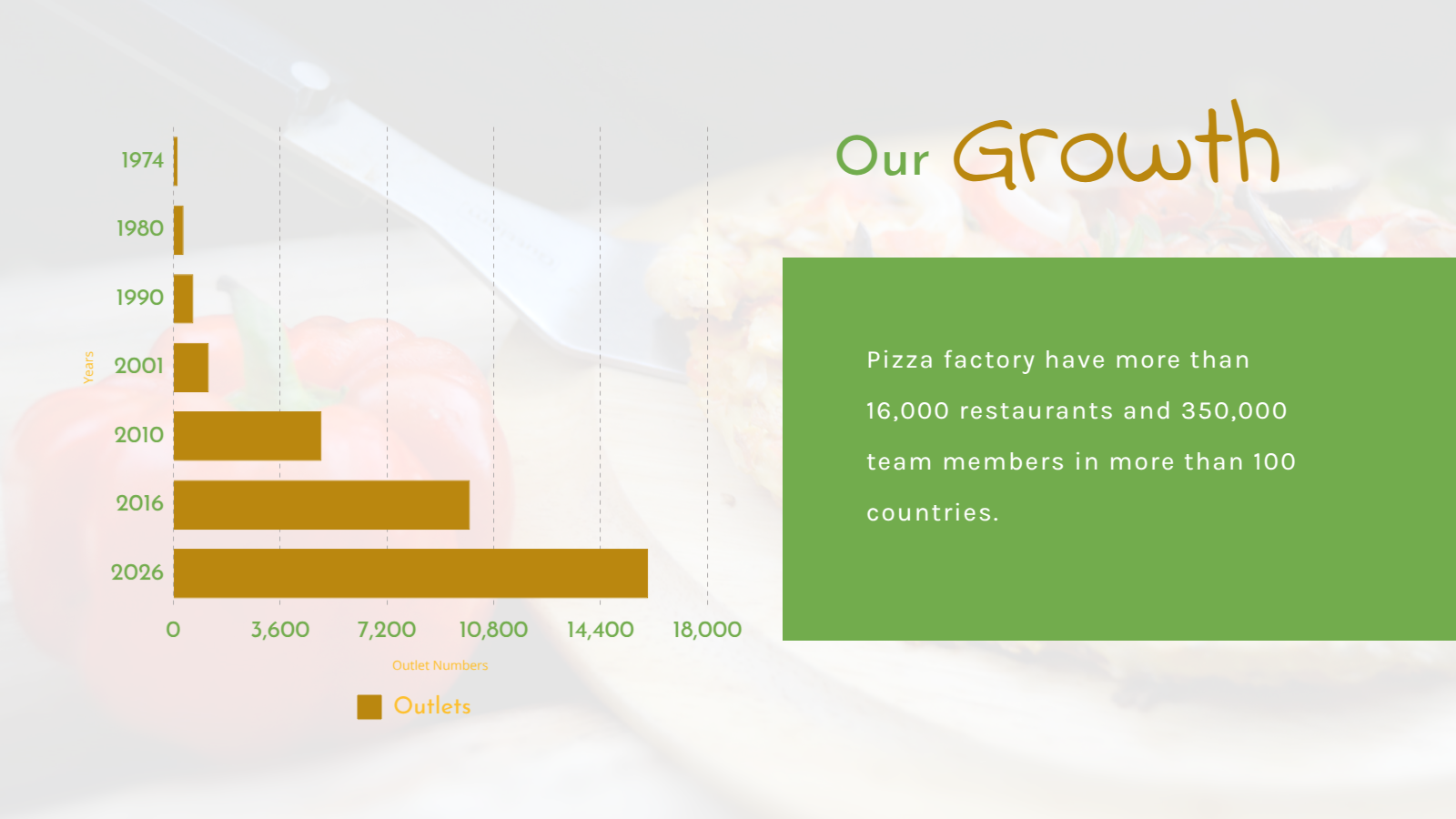
I’ve selected a sales presentation template for a food business to show you how to create a horizontal interactive chart to illustrate a brand’s expansion over the past years.

So, let’s learn how to create beautiful charts with DocHipo in minutes.
2. Pick a Chart Type from the Data Visualization Group
Now, it’s time to explore the interactive charts available in the “Charts” widget within the “Data Visualization” group.

Once you click on the “Charts”, you’ll enter the interactive chart maker with various types of charts, such as classic vertical, stacked vertical, horizontal, stacked horizontal, area, line, pie, and donut charts. You can choose a specific chart type according to your data visualization needs.
I’ve selected the horizontal chart type from the drop-down menu to showcase a business’s market growth over a couple of decades.

3. Enter and Edit the Chart with Your Data
Now, it’s time to edit the chart with real data. There is a table inside the chart maker mentioned as “Data” where you can add inputs that will appear in the chart. You can either copy exact data from any spreadsheet and paste it into the data tab, or manually add them up.

You can also add or remove columns and rows as needed. Also, easily swap the rows and columns to change the dataview. Moreover, you can easily change the column colors by clicking the color dots and choosing from preset, custom, or brand color options.

Now, let’s dive into the deeper customization features of the online chart maker.
4. Customize and Enhance the Chart Visual in the Settings Tab
Just adding real data to make the chart relevant isn’t enough to impress your investors at first glance. You can customize the whole chart display from the chart settings to match the aesthetics of your design.
Find the settings option just beside the “Data” tab. Click on it to find editing options for each component of the chart, such as the axes, grid, labels, legend, and styles. These options will vary depending on the chart type you pick.

From colors to font styles and sizes, you can customize everything in the chart to align with your content.
This is how you can do it in DocHipo:
a. Add Axes Labels
Let’s start with the “Axes” and add titles or labels for each axis to improve understanding.

You can also change colors, font styles, and sizes, and even adjust the display control on the chart axes to show or hide their lines for better visualization.
b. Control Visibility for Grid
Now, you can customize other elements of the chart as well. I’ll move to the “Grid” customization to make further adjustments, such as showing or hiding the grid lines and changing their color.

c. Customize Labels
Then you can move to the Labels section to make similar changes, such as the display of axes and data labels, typefaces, and font sizes, to achieve perfect visual harmony.

d. Make Visual Adjustments for Legends
Moreover, customize the chart legends similarly.

e. Apply Light or Dark Hovering Captions for Smart Interactivity
DocHipo chart maker lets you make your chart interactive with the caption-hovering option. You can turn it on or keep it off for flexibility. Also, you get hovering-style options in both light and dark themes.

5. Insert the Chart, Make Final Update, and Rearrange It in the Design
Once everything looks perfect, set to update the chart, and insert it into the design. You can easily resize and reposition the chart for cohesiveness.

Now, you can apply animation as well for visual enhancement, but this step is optional. You can add interactive charts with animated effects to your square videos for social media, ads, or presentations, and elevate the visual experience with a touch of refreshing animations.
6. Download Your Design
Finally, set to download your design by clicking on the “Download” button in the top-right corner.

You can download the design at high resolution in various formats, including PDF, PNG, JPEG, MP4, GIF, and more. I’ve saved the presentation with the interactive chart as a PNG file.


At last, you can double-click on the chart or use the ‘Update Chart’ option on the contextual editing bar for future edits. So you can add, remove, and manipulate the entire data set whenever you want with new values in your designs.
Get ready to create interactive charts with DocHipo online chart maker with the short video below.
Best Practices for Creating Clear, High-Impact Charts
After the quick guide on how to create charts with DocHipo, it’s time for some pro tips to get your visually impactful, interactive charts perfect from the very first time!
- Stick to one idea per chart: If a chart needs too much explaining, it’s doing too much. Focus on one clear takeaway without playing with too many factors and goals.
- Keep labels clean and minimal: Too many labels clutter the view. Let the visuals speak and support them with short, clear text.
- Use contrast to guide attention: Highlight key data points with contrast colors so the most critical insights stand out instantly.
- Match the chart to the story: Line charts for trends, bar charts for comparisons, pie charts for proportions; there is a specific chart for every story. So, choose wisely.
- Stay consistent with colors: A uniform color palette across documents builds clarity and brand recognition.
- Test across screen sizes: What looks great on desktop should still be readable on tablets and phones. Always test and use the correct chart size for data visualization across different platforms.
- Add smart interactivity: Use hover effects and captions to reveal details without overwhelming the view.
- Keep branding intact: With DocHipo’s customization features and brand kits, align fonts, colors, and styles seamlessly with your brand.
Wrapping Up…
This blog is not only about how to create charts with the most intuitive interactive chart maker, but also about the ins and outs of interactive charts, their importance, and use cases. From different types of charts to practical uses, this blog can be your beginner’s rulebook.
So, if you want to make charts online that work with real-time data and look dynamic to enhance your visual information, sign up for DocHipo for a hassle-free journey!
FAQS
How to make interactive bar chart?
You can make interactive bar charts using a chart creator. DocHipo lets you create a variety of interactive bar charts and more with its simple yet impactful online dynamic chart maker.
How to make online line graph?
With DocHipo chart maker, you can show your market share or expected revenue, or whatever you like, with a simple click, data manipulation, and much-needed customizations.
Which chart is used for business?
Businesses use different charts based on the goal: bar and column charts for comparisons, line and area charts for trends over time, and pie or donut charts for composition. The best chart is the one that makes insights easy to spot and act on.
How can I use charts as an effective way?
Focus on one clear message per chart, choose the right chart type for your data, and keep labels simple.
What type of chart would be used to represent market share?
You can use pie and donut charts to show market share because they clearly represent parts of a whole. They work best when comparing a few key players at a single point in time.
What is one benefit of interactive data visualization?
Data visualization with dynamic interactivity boosts engagement by letting you explore data on your own. It leads to better understanding, faster insights, and more confident decision-making.
What is the difference between static and interactive data visualization?
Static visualizations show fixed data with no interaction, while interactive visualizations let you click, hover, filter, or drill down.

