
13 Design Principles and Best Practices to Apply Them Skillfully

Have you noticed some graphic designs have extraordinary appeal while others seem off? You know when a design is not working but fail to figure out why. We usually think designing a piece, like a Facebook post, is about following your heart. While this is half of the story, the other half involves the techniques known as design principles. In other words, design principles are the basic rules that give a magical touch to your creative endeavors.
13 Design Principles
- Emphasis: Highlighting certain design elements so that they stand out.
- Alignment: Checking various elements’ hierarchy, proximity, and spacing.
- Balance: Arranging various elements to distribute visual weight evenly.
- Contrast: Using different colors, shapes, sizes, and elements to distinguish one component from others.
- Repetition: Creating unity and cohesiveness by repeating shapes, colors, fonts, etc
- Proportion: Refers to the placement and space that various design elements occupy in a design.
- Movement: Helps maintain continuity in design pieces.
- White Space: It is the blank area, and it’s manipulation to symbolize an object.
- Hierarchy: Brings the viewer’s focus to a few elements more than others.
- Variety: Elements like colors, shapes, images, fonts, and typography make a design more vibrant.
- Unity: The combination of all the elements should complement each other.
- Rhythm: Repetition and movement help you to achieve rhythm.
- Proximity: Refers to the nearness of the elements to each other.
In design, elements are the ingredients, and principles are the recipe that guarantees a masterpiece. We cannot explain everything in a paragraph, so we have included everything in this article. We will walk you through 13 graphic design principles and elements along with the examples of design principles. You will also learn their impact on the viewer with the help of the template designs illustrating every principle.
Table of Contents
What are Design Principles in Art
We are not artists, but no art piece exists without design principles. If you ask to define design principles, it’s not that simple. The 13 basic principles of design include emphasis, alignment, balance, contrast, repetition, proportion, movement, white space, hierarchy, variety, unity, rhythm, and proximity.
The artist doesn’t need to use every principle in their design, but they aim to achieve harmony and convey the intent behind the creation by using these principles in an artwork. The principles of graphic design that are used in photo editing are similar to paintings.
Why are Design Principles Important
You start with a blank canvas and a head full of ideas to curate a simple design. Now, this can get chaotic and confusing. Now that you know what are the design principles, you can use them to design anything. Nonetheless, they also help to give the maximum visual impact. Further, design principles evoke a strong interest in the viewer. Even the most abstract designs require some of these principles to provide a sense of rhythm and direction. To sum up, the principle of design makes your job convenient when you sit to design. Before you start, you should be familiar with design elements.
Elements of Design
After knowing the definition design principles, let’s find out about elements of design. Elements are the tools you use to create your design. These are the basic units of an artwork. Your tools are explained to you:
- Line- This is an essential element connecting two points. In design, a line can be straight, wavy, dotted, thin, or thick; either way, it gives a sense of neatness and direction.
Notice how this fashion square post template uses the lines to highlight the fashion brand.

Get This Template and More
Check out the exclusive collection of DocHipo’s fashion square post templates.
- Space- Space refers to the gap between two design elements, but you can also manipulate the white space around the objects to show a particular object.
- Shape- Shapes can be anything with enclosed space in the design; it can be geometrical or abstract.
Notice the sharp geometric shapes in this business YouTube banner template that are appropriate for the professional edge.

Get This Template and More
Learn more about the huge collection of shapes in the library from DocHipo.
- Color- Colors evoke emotions in the viewers. Broadly, colors have three properties- hue, saturation, and value. Hue refers to the name of the color, saturation is the intensity, and value refers to the darkness and lightness of the color. When you choose colors for your brand, consider these aspects.
To illustrate, this cute Christmas Facebook post template creates pleasing appeal with different colors.

Get This Template and More
Explore Christmas Facebook post templates with DocHipo.
- Texture- Texture is the feel of a surface. It can be smooth, rough, or granular; the sight of the surface translates into the feel of the texture in the design.
This cleverly designed fashion YouTube banner template shows the denim texture to make the layout speak for itself.
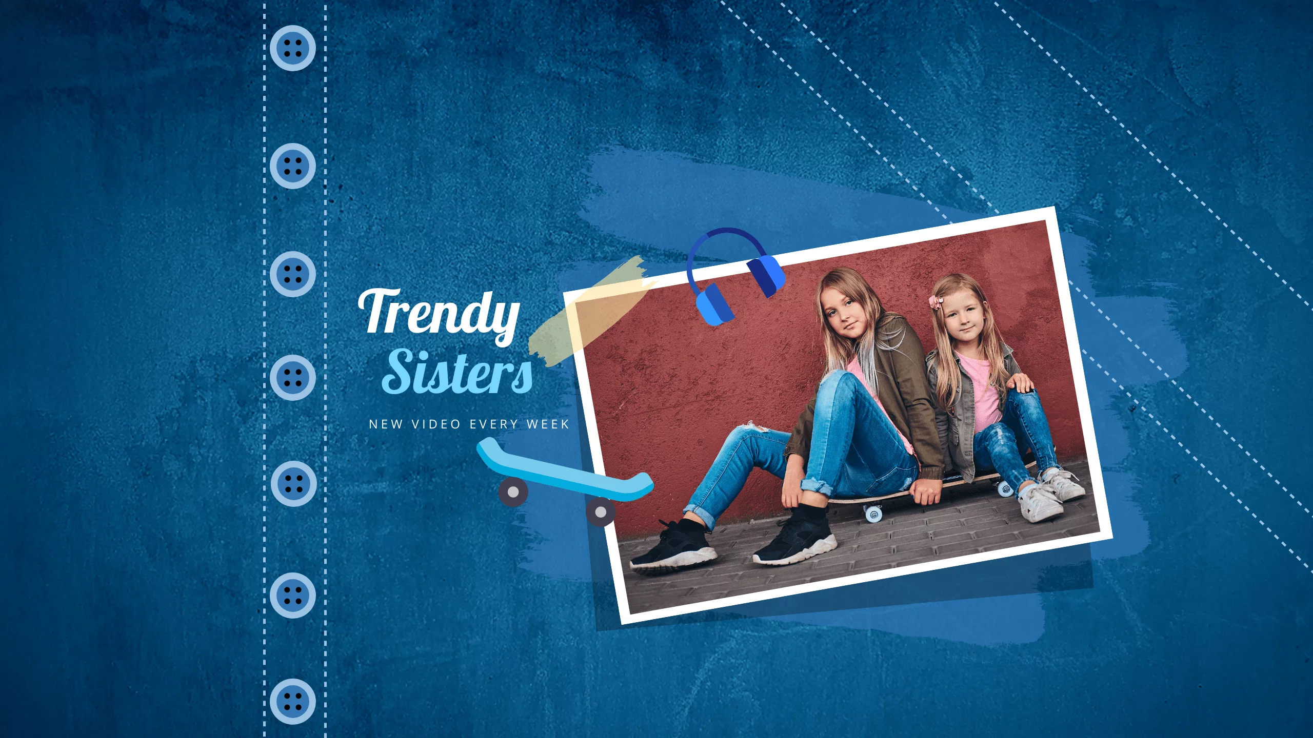
Get This Template and More
- Direction- Direction refers to the movement in the design. With the help of various elements, you draw your viewer’s attention in a direction.
How Many Principles of Design Are There
Now you know ‘what are the design principles.’ We have discussed the principles of design extensively. Now it’s time to answer another question- How many design principles are there?
Overall, there is a list of design principles for refining your designs. Moreover, we have used DocHipo templates to help you visualize the design principles examples.
1. Emphasis
Emphasis means highlighting certain design elements so that they stand out. When readers look at the design, they automatically see the highlighted feature.
You can emphasize the design by changing the fonts, text size, and text color or adding effects like shadow or border. Look at this Christmas poster template as one of the principles of design emphasis examples, highlighting ‘gifts’ and ‘love’ with the help of font size and text color.

Get This Template and More
This restaurant flyer template is an excellent example of emphasis. First, it draws our attention to the bold text ‘Pizza’ with shadow effect. Secondly, the entire focus of the flyer is on this yummy cheeseburst pizza.

Get This Template and More
Another emphasis principles of design example is this New Year X/Twitter post template. The template innovatively uses the shapes and icons related to cookies balancing principle and design.

Get This Template and More
2. Alignment
Alignment helps with organizing various components of the design. Once the elements are aligned, it shows visual consistency.
You can quickly achieve alignment by checking various elements’ hierarchy, proximity, and spacing. To illustrate better, this is one of the designs from blog graphic templates that include lines, angular shapes, and text in alignment to appeal to the viewer.

Get This Template and More
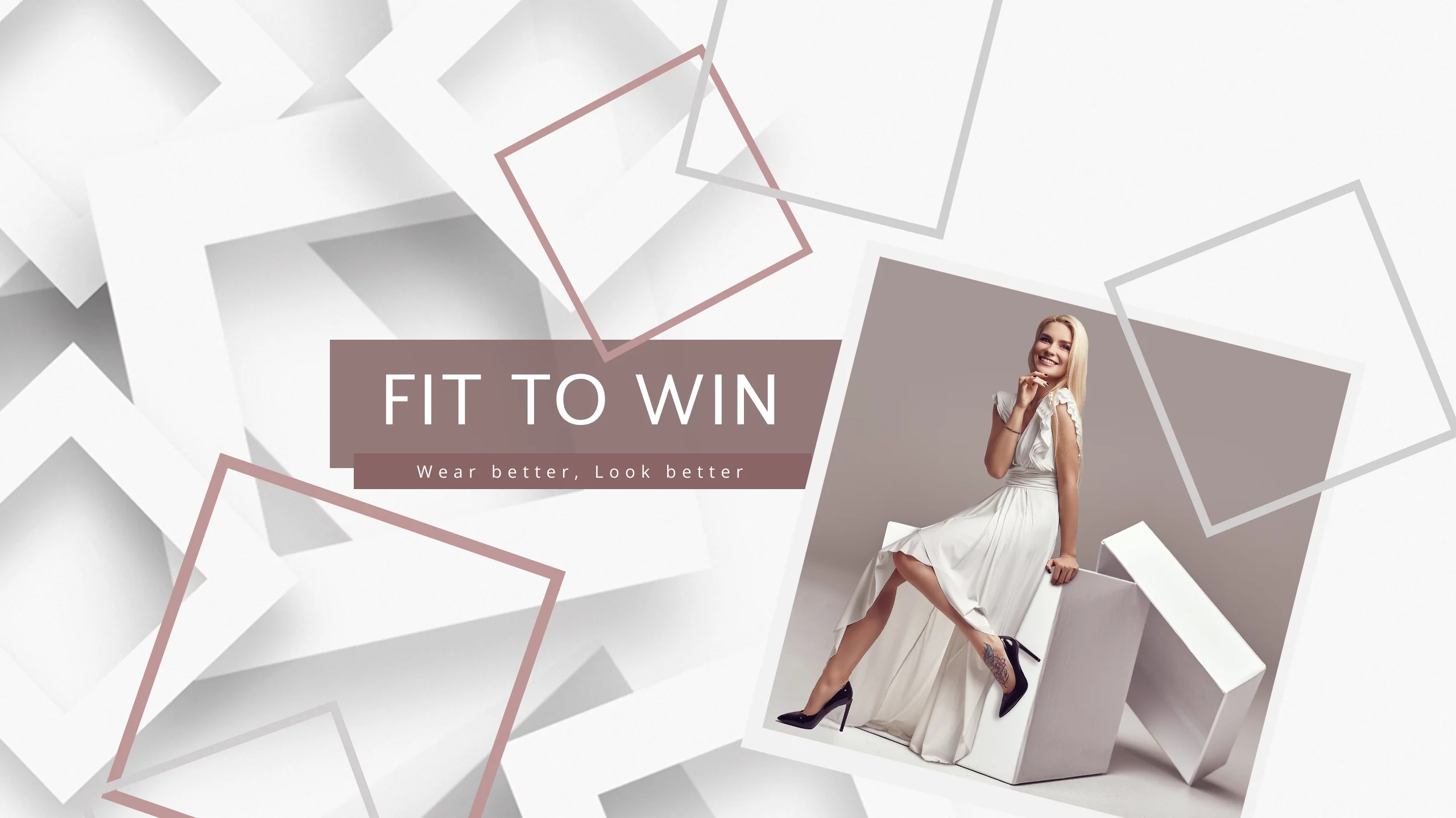
3. Balance
Achieving balance does not mean aiming for similarity but arranging various elements on the canvas to distribute visual weight. For a symmetrical design, you can place identical aspects on either side; for asymmetrical balance, you can place similar, minor elements on one side. Sounds complicated, right?
Look at this presentation template design; a more extensive textured background is placed against the image with similar elements and color tones, creating the perfect balance.

Get This Template and More
4. Contrast
We have discussed three design principles, let’s continue with others. Contrast means using different colors, shapes, sizes, and elements to distinguish one component from others. It helps you to catch your viewer by surprise. There are various ways to achieve contrast, like color, hue, font, graphics, etc. In the design, the effect of the contrast depends on the other design elements. You can create beautiful contrasts if you know the art of choosing color combinations using the color wheel.
For example, this tempting breakfast invitation template grabs your attention with an eye-catching orange hue against a subtle backdrop, creating a beautiful contrast.

Get This Template and More
Take a look at the exclusive breakfast invitation templates from DocHipo.
You can play around with various shades of the same color to bring the contrast. One of the fashion X/Twitter post templates from DocHipo justifies this type of contrast. Also, notice the playful fonts in ‘Purple Passion’ to complement the design aesthetics.

Get This Template and More
Be creative with your contrast while using the shapes in the design. This YouTube banner has various types of 2D and 3D, yet some stand out against the monochromatic background.
Get This Template and More
Moreover, you can make your images stand out against a dark background like this food business card template, creating a sizzling contrast.

Get This Template and More
5. Repetition
To make your designs more cohesive, you can repeat elements such as shape, color, fonts, etc.. Repetition is instrumental in achieving other principles. Now the question arises: “What design principle is based on repetition?”. Two of them are unity and rhythm. Keep scrolling to know how it works.
Also, check out this DocHipo infographic template with repetitive color combinations in the entire design. The repetition of selected colors and shapes gives a synchronized appeal to the template.

Get This Template and More
Check out these DocHipo infographic templates for inspiration.
7. Proportion
In simple words, proportion means that nothing should feel out of place. It refers to the placement and space that various design elements occupy in a design.
For instance, this car sale business card template smoothly manipulates the size of the various elements. The striking background showcases the luxurious car but does not overpower the image of the salesperson in the front.

Get This Template and More
In one of the real estate Instagram ad templates from DocHipo, the design carries equal weight for the image and the features, distributing the overall proportion.

Get This Template and More
7. Movement
Even though a design is static, the viewer can feel its flow. Movement makes your design more dynamic and eye-catching. It helps maintain continuity in lengthy design pieces such as menus, brochures, infographics, etc.
Now, you can use many elements to bring movement, like lines, shapes, colors, edges, etc. To illustrate, here is a real estate brochure template from DocHipo with a beautiful curvy line to bind and take the design in a direction.

Get This Template and More
Notice the use of zig-zag lines running across this infographic template. It adds movement and continuity to the design.

Get This Template and More
8. White Space
White space or negative space does not necessarily use white color. Simply put, it is the blank area, and it’s manipulation to symbolize an object. Primarily used in minimalistic designs, white space brings the appeal with solid shapes, colors, and patterns.
This real estate business card effectively uses white space in the design.

Get This Template and More
You can also check dozens of real estate business cards with DocHipo.
9. Hierarchy
In design, when we say hierarchy, it’s visual hierarchy. So, applying hierarchy will bring the viewer’s focus to a few elements more than others. Hierarchy is achieved by differentiating through size, shapes, and colors while maintaining harmony throughout the design.
For instance, look at these pleasing food Facebook ad templates that can be used to draw attention to wherever you want. In the first one, the attention goes to the 50% discount and then to the waffle image, followed by other text elements. Notice the change in the size and type of the font throughout the text.

Get This Template and More
The Framing design principal is similar to hierarchy, except, it involves margins and highlighting of the main element. Check out this Facebook ad focuses on ‘2 large pizzas’ while the pizza image stands out with color contrast.

Get This Template and More
10. Variety
Variety adds extra flavor to spice up your design. You can bring variety through many elements, like colors, shapes, images, fonts, and typography.
Notice the visual variety this vibrant blog graphic template achieves with pictures and text.

Get This Template and More
Add colors and shapes like these poster templates to make your design more vibrant.

Get This Template and More
This simple yet vibrant poster design captures the festive mood of Christmas with various cute elements.

Get This Template and More
11. Unity
To achieve unity, follow various other principals of design. There is no hard and fast rule, but to connect all the visual elements. That means your text, graphics, and color combination should complement each other.
Look at this soothing book cover template from DocHipo. You can get a sense of unity with hues of blue and wavy graphics to give the beach vibes.

Get This Template and More
Check out the exotic collection book cover templates of DocHipo.
12. Rhythm
When you listen to good music, its rhythm tempts you to listen to it repeatedly. Repetition and movement help you to achieve rhythm. Repetition can become monotonous; that’s what we need to avoid. To illustrate, this infographic template justifies the rhythm with similar pathway imagery running all over the design.

Get This Template and More
13. Proximity
Proximity refers to the nearness of the elements to each other. Similar elements, when placed nearby, are seen as a whole. Proximity helps in unifying design elements while the other part stands out. For example, this New Year poster template plays with proximity, which radiates the feeling of celebration.

Get This Template and More
Want to make eye-catching content? Check out the latest graphic design trends to stay updated with content that will engage your audience.
Further Reading
Best Practices for Implementing Design Principles Effectively
You know all about design principles and elements of graphic design. However, applying these principles can feel overwhelming. Take a glance at these graphic design tips to make designing easy.
Understand the Design Principles
Take a closer look at all the design principle examples and understand the effect each evokes for the viewer. Further, understand how each principle is applied in a design to communicate effectively.
Maintain Consistency in the Design
Harmony is the key to the appealing design. You should be consistent with font, typography, color, alignment, and graphics. Bring only a few components together, as it makes the design confusing.
Understand the Purpose of the Design
Your purpose and target audience vary everywhere, whether a social media post or a sale poster. Based on your purpose, you can establish a clear hierarchy with headlines and critical information or drag attention toward an element using contrast and movement.
Utilize the Whitespace
Let your design breathe and avoid overcrowding. White space helps highlight the essential elements of your design while giving a more organized appeal.
User-Centered Design
Applying design principles aligned with user-centered design ensures that your creations are intuitive, user-friendly, and cater to the needs of your audience. Moreover, they should make designs that are compatible with different platforms, whether you’re trying to engage in app development, or create simple brochures.
Experiment with Design Principles
You don’t have to always follow the principles as hard and fast rules. Flaunt your creativity and create an out-of-the-box design to draw your viewer’s attention.
Stay Updated with Trends
Keep an eye on the latest trends and innovations in design. Also, be open to adapting to new styles while incorporating these principles.
Understand Limitations and Constraints
When working professionally, you have various limitations, like specific color palettes, brand guidelines, and technological restrictions. Apply principles effectively after understanding these constraints.
Seek Inspiration
Creativity stems from inspiration. Draw inspiration from different art forms and disciplines to fuel your creativity and approach design with a fresh perspective.
Design Principles Application Made Easy with DocHipo
Despite observing all the principles of design examples, you can feel overwhelmed with many graphic design best practices to create a stand-out design. Don’t worry; DocHipo will share your load. The graphic design software is free and easily accessible, with thousands of stunning templates. Our professional designers have done the heavy lifting of choosing the most appropriate, fonts, hierarchy, movement, etc. You can use these as your starting point where principles like balance, contrast, and integration are already present.
With templates following the design principles, you can easily edit these templates using the drag-and-drop editor. In the DocHipo editor, you get ample creative freedom to tweak the text and graphics. For instance, you can use tools like the eye-dropper to pick colors from images to complement the design elements.
It’s not just about creating beautiful documents. DocHipo allows you to export and share your creations easily, inviting feedback and collaboration from others. That way, you can polish and refine your designs based on what others think.
In a nutshell, DocHipo provides an exciting digital playground where your creativity knows no bounds. Want to know how?
Design Documents in Three Simple Steps with DocHipo
DocHipo’s simplified design philosophy helps you to create anything in three steps. Sign up with DocHipo and begin your design journey with these steps:
1. Choose Your Template
Once you have signed up, you will come across the homepage, where you can search for templates that suit your purpose.

You will land across various template categories. Choose a category and get dozens of eye-catching templates to choose from.

2. Edit Your Template
Use the design widgets on the left side of the DocHipo editor to edit text, background, icons, shapes, illustrations, and stock images. To simplify customizing, list three principles of design to bring the changes. Customize text effects and color combinations according to the graphic elements.

Learn to add widget effects in DocHipo with this tutorial.
Also, learn to edit the text in DocHipo with this video.
Check out The Ultimate Guide to Using the DocHipo Editor to Design Your Documents
3. Download Your Design
After making all the customization, click on the three dots in the upper right corner to download.

Select the quality and file type of the document. Your document is ready to download.

Go Ahead with Your Design
That was all about the design principles. You have explored design elements and principles examples and gained enough knowledge to apply them in the future. Further, with the best practices and handy tools like DocHipo, we are sure you are ready to create a fantastic design. Whether it’s your personal Instagram post or business presentation, follow these principles and create a design like a pro. Sign up with DocHipo to create a design now!
FAQs
What are graphic design principles?
Graphic design principles are the guidelines that help with the arrangement and manipulation of the design elements to create visually harmonious and practical designs, encompassing concepts like balance, contrast, alignment, repetition, and proximity. These principles ensure designs are visually appealing and communicate messages clearly to the audience.
What are the 7 principles of design?
You can list the principles of design as balance, contrast, emphasis, rhythm, proportion, unity, and hierarchy.
What are the 12 principles of design?
The 12 design principles are Emphasis, Rhythm, Proportion, Balance, Repetition, Unity, Hierarchy, Alignment, Movement, White Space, contrast, and Variety.
Which basic design principle is primarily made up of lines?
Alignment, rhythm, repetition and emphasis is primarily made up of lines.

