Typography in Logo Design: A Culmination of a Universal Brand Language for Global Customers

I remember reading a very interesting article about language. The article discussed the Sapir-Whorfian Hypothesis, which states that the language we speak (and write) constructs our thought process. That means thoughts started existing after language was discovered.
I could not stop rattling my brain with questions that kept me awake the entire night!
To think of it, languages were the product of symbolic drawings that our primitive ancestors scrapped on the cave walls. It got simplified and turned out to brew different languages from different regions. Through those drawings, primitive humans would instantly perceive the message and the thoughts surrounding it.
In a similar context, typography is no different.
Typography in Logo
- Knowledge of Your Business Niche: Understand your product or services, mission, vision, values, etc.
- Target-Audience: Understanding your audience will help you decide the font and color structure.
- Deciding on Typographic Logo Colors: Colors generate different emotions, which add to the non-verbal language radiated by the typography logo.
- Universal Appeal: Choose letters that all can read and are well acquainted globally.
Typography, an art form, has also become a distinct language, having a powerful aspect of communicating messages. Especially in Logos, it is the global language of the consumers, as it enhances brand identity by distinctly defining the logo.
In this blog post, we’ll discuss the interrelationship between language and typography, tap into some amazing typographic logo examples from brands, crucial things to consider for typography in logos. Read till the end for a super-fun step-by-step guide for creating typography in logo design.
Table of Contents
What is the Role of Typography in Logo Design
The role of typography in logo design is utmost important as this powerful visual element communicates the crucial elements of a brand’s identity and its message. The typefaces you choose, be it playful, modern, elegant and so on, creates an instant impression of what your brand represents. Your meaningful art of arranging and designing typefaces defines your brand personality, core values, and tone. It also evokes certain emotions in target audiences. The unique and memorable appearance of typography in logo design makes your brand stand out in the competition.
Language and Typography
A Language is a form of communication that uses words and expressions structurally. It is a process that tries to transmit a message to generate thought.
When we define typography, then we see it as the art of presenting words to form a text and reflect a message. Hence typography is also a very significant aspect of communication that presents language differently.
Now, when you see a beautiful typographic design, it transmits three important factors. First, the words; Second, the way the fonts have been designed and presented; and third, the emotions reflected through the amalgamation of words and design. These three factors combine to reflect a message. I call this the mysterious language of branding.
Referring to the Sapir-Whorfian hypothesis, languages guide our perspectives and how we want to perceive them. With designs, especially typographic design, it plays the same function. The typographic layout fuses emotions with the overall wordy messages.
In the next section, we shall further delve into another aspect of this topic.
English as a Lingua Franca
I am sure you have noticed that almost all the brands (at least most of them) use English words when creating typography for logo. Even brands that do not originally hail from an English-speaking country, has a logo that encompasses English words.
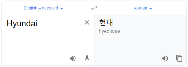
The classic example would be the Hyundai Logo (originated in South Korea):
The logo uses the letter “H”, which is the first letter of the brand name “Hyundai”, and also symbolizes two people shaking hands in agreement. Although the word might be Korean, which means “Modernity”, this brand used an English word to create their logo.
Many other brands did the same, probably because they wanted their business to have a global appeal.
Moreover, English is often known to be the international language of business.
But why so?
The basic reason is that most of the world’s population understands this language. 86 countries recognize English as their official or second language. Hence, English is the most preferred language in businesses that targets a global audience.
Now, if we try to delve further and find the exact answers to why English levies such importance, then we will find out that the root lies in migration and colonization.
Typography Logo Design Examples from Brands
English is a universal language. It is the basic language used by multinational and transnational companies to project their brand identity and messages. Hence, it is obvious to choose English words and Alphabets to create your typography logo. That also includes the tag-lines, which are often present with the logo.
Now, a logo is a symbolic representation of a brand. Hence, every single element in the logo is important. Those elements are varied yet create a rhythm when synced together. It not only creates the visual image of the company but also paints the mental impressions. It guides your customer’s thought process when they think or discuss your business products/services.
But, along with all the elements that a logo makes up, the typography in the logo or accompanying the logo is important. Mainly because it boosts the overall brand message.
I will show you 3 examples of my favorite typographic logos that are recognized by the global audience.
Cadbury
This typography is simple and uses a script-typeface. But strikingly, the logo seems fluid and resembles the smoothness of a signature. Yes, it originated from a signature. But that’s not all. Cadbury has a long, intriguing journey of its own.
John Cadbury started his business in England in 1824, with a humanistic vision to substitute the ills of alcoholism, with the goodness of chocolate. It first started as a beverage, but soon it transformed into the eating chocolate bar. With time, the actual owner aged and his descendants took care of the business that flourished overseas as well. In Australia, it had a drastic transformation and became what we get today.
Through this constant transformative process, their brand appearance also kept on changing, finally resting to the purple color (1920). Soon in 1921, the script-based typographic logo came into being, inspired by the signature of William Cadbury, the owner of this prestigious brand.
This logo represents a legacy which communicates to us what we can expect when we unwrap the purple packet.
McDonald’s
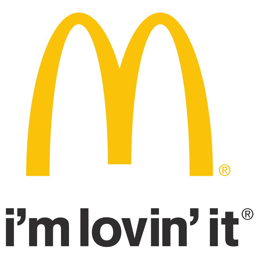
This is another global fast-food chain that never fails to test our temptations. On every road trip, when you clearly see the big golden letter ‘M’, from a distance, you absolutely know what to expect from it. Your mind soon gets mired by the vision of French fries and amazing burgers that will satisfy your journey.
Well, I usually relate the golden arched, ‘M’ logo to the long French fries that cannot hold its weight. To be honest, the logo is a wonder in itself and has a reputation to be more engrossing than the food products.
If we trace the journey of McDonald’s, then we will find an inspirational story of two brothers, Richard Mcdonalds and Maurice Mcdonalds. These two brothers, who continued their father’s restaurant business, thought of revamping their outlet into something more interesting. It was then that McDonald’s came into being with a renewed architectural structure. The golden arched “M”, was the part of that structure, which later became the logo.

Another famous brand that keeps the world connected! A simple “f” in the logo speaks a thousand words. It literally takes each one of us to a memory lane, as Facebook has become an intimate aspect of our lives. It is almost like an album that keeps on recording our happiest moments, our mistakes, and most of all it emphasizes the importance of friendship.
The typographic logo is a simple bold modern Sans-serif, giving us a grounded feeling. The blue color is also very significant here as it signifies strength and trust. Mark Zuckerberg, along with his university friends Eduardo Saverin, Dustin Moskovitz, and Chris Hughes, started Facebook in 2004. The concept of networking and sharing pictures for likes and comments was something that the global audience could not resist from indulging.
4 Essential Points for Creating Typography in Logo Design
You can come from any part of the world, speak any language, but when viewing a typography logo design, you suddenly can understand and interpret what it represents. You don’t need any extra language skills to understand its meaning, because you can read the brand language.
These logos mentioned above are based on English words, but can be understood by anyone around the world. These logos are communicating to their audiences through their form of language, bolstered from the brand image. This is the power of brand language.
To create your own typographic logo, there are few things you must consider.
1. Knowledge of Your Business Niche
It is crucial to understand your business niche to create the right typography. Ask yourself, what are you selling? Why are you selling? What is your company’s mission? How do you see your business and how you want others to see you?
These are important questions that need proper answers. Make proper notes, discuss with your team members, and ask them how they relate to your business?
By having a clear idea, you will be able to ideate the right fonts to craft a perfect typography logo.
2. Target-Audience
This has been a very important factor in every business element. Even for creating typography in logo, this plays an equally significant role.
Understanding your audience will help you decide the font and color structure.
Most of the fonts under Sans-serif have a very universal appeal. But for fonts under the typeface script and decorative, are used under very special circumstances. So, in major cases, fonts under Sans-serif are chosen to get a wider audience. The best example would be the Typography logo of Facebook.
Also, serifs are used selectively, as it is often associated with status and maturity.
3. Deciding on Typographic Logo Colors
Colors are important for embellishing typography logos. Different colors have different meanings.
Check this image out to understand the underlying meanings of each color.
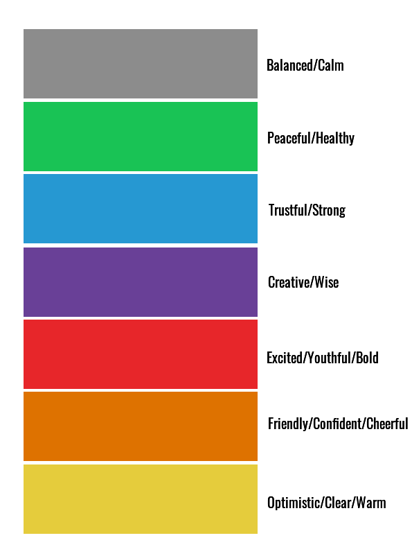
Colors generate different emotions, which add to the non-verbal language radiated by the typography logo.
4. Universal Appeal
What I mean here is that your logo must reach your target audience all around the world. Hence you have to choose letters that all can read and are well acquainted globally.
If you have a special reason, then you can definitely go ahead with letters that signify your regional/national language. But it is advisable to choose a language which the world recognizes.
This is really important if you want to become a global brand catering to your audiences all over the world.
Now if you are pondering about how you can create a typography font for yourself, then quit fretting. You can do this in DocHipo itself.
How to Design Typography in Logos
Trust me! This platform will constantly awe-inspire you to explore more. You just need to sign up and fiddle around the platform. At DocHipo, you can create any document design to meet your business and brand needs.
To create a typography logo, let’s explore the below two typography logo ideas:
1. You can experiment with multiple text editing options.
2. You can select a shape and customize it as per your vision.
Let me briefly show you both options.
First, search for logo in search bar and click on the result.
Choose the blank template to create typographic logos from scratch.
Fill in the Document information.

Typography Logo Design 1
Select the ‘Background’ widget under the ‘Graphics and Media’ option.

You’ll find background categorized into color, gradient, and pattern. Choose from them or directly put the color hex code in the provided space.

Here’s how to create stunning backgrounds in DocHipo.
Now, to add the brand name, select the text widget from the left sidebar.

You can add text in the form of heading, subheading and body text.

Let’s start editing the text by changing the font family.

You can choose a font size from the drop-down menu or type it manually and press enter.

It’s time for experimenting with text colors.

Check out the best color combinations if you struggle with it.
Here’s a quick tutorial for basic text editing operations in DocHipo.
Now, we want to apply the same font and size to the word “THREADZ”. To save time, you can leverage the ‘Copy Style’ to copy the style from “FAB” and apply on “THREADZ.”

Here’s a quick demo.
To spice up the typography in logo, click on the pencil icon and apply some effects.

Select the ‘Outline’ tab and choose ‘Outline’ as the Outline Style.

Edit the outline width and color as you desire.

Take a quick look at the different text editing options.
Click on the color icon in the editing panel and apply transparent color to give the typographic logo a refreshing look.

Refer to the video to leverage transparent color in DocHipo.
Let’s focus on the tagline. Bold “FASHION OUTLET” and change their letter spacing from 0 to 5.

Click on the pencil icon again to choose border effect. I’ve selected ‘Outset’ as the border style.

Tada! It’s download time. Click on the three dots on the top right corner of the editing panel.
I have selected PNG, High-quality.
Here’s how you can download your typographic logo design in DocHipo.
This is the final look:
Similarly, you can create the below logo by choosing a circular shape, applying a border and making the shape color transparent.

Typography Logo Design 2
You can select a shape to for your first letter or can continue with the fonts available. Select the ‘Shapes’ wiget from under the ‘Graphics and Media’ option.

Here I have selected an ‘U’ shape.

After resizing and repositiong it, I have added another tiny ‘U’ shape, and changed the color into white and placed it within the previous shape.

I added the remaining text.

Now, I chose the font called, “Pacifico” as it seemed appropriate with the typography logo.

Next download it! I have used the same image quality.
This is the final look:
Similarly, you can select a square shape and create a typography in logo like the below one.
Further Reading
Conclusion
You know, what is exciting about the typography logo?
It makes us realize the origins of words and how we still see them as a symbol, representing a brand.
Hence, if you want to try font logo design, then you should absolutely go for it. They are simplistic, easy to retain, and most of all, they make your brand relatable to the overall message.
For designing, feel free to explore this wonderful platform of DocHipo. Its is absolutely free and wants your company to growTry all kinds of designs and keep on striving till you have a “wow” moment. So hurry and sign up now!

