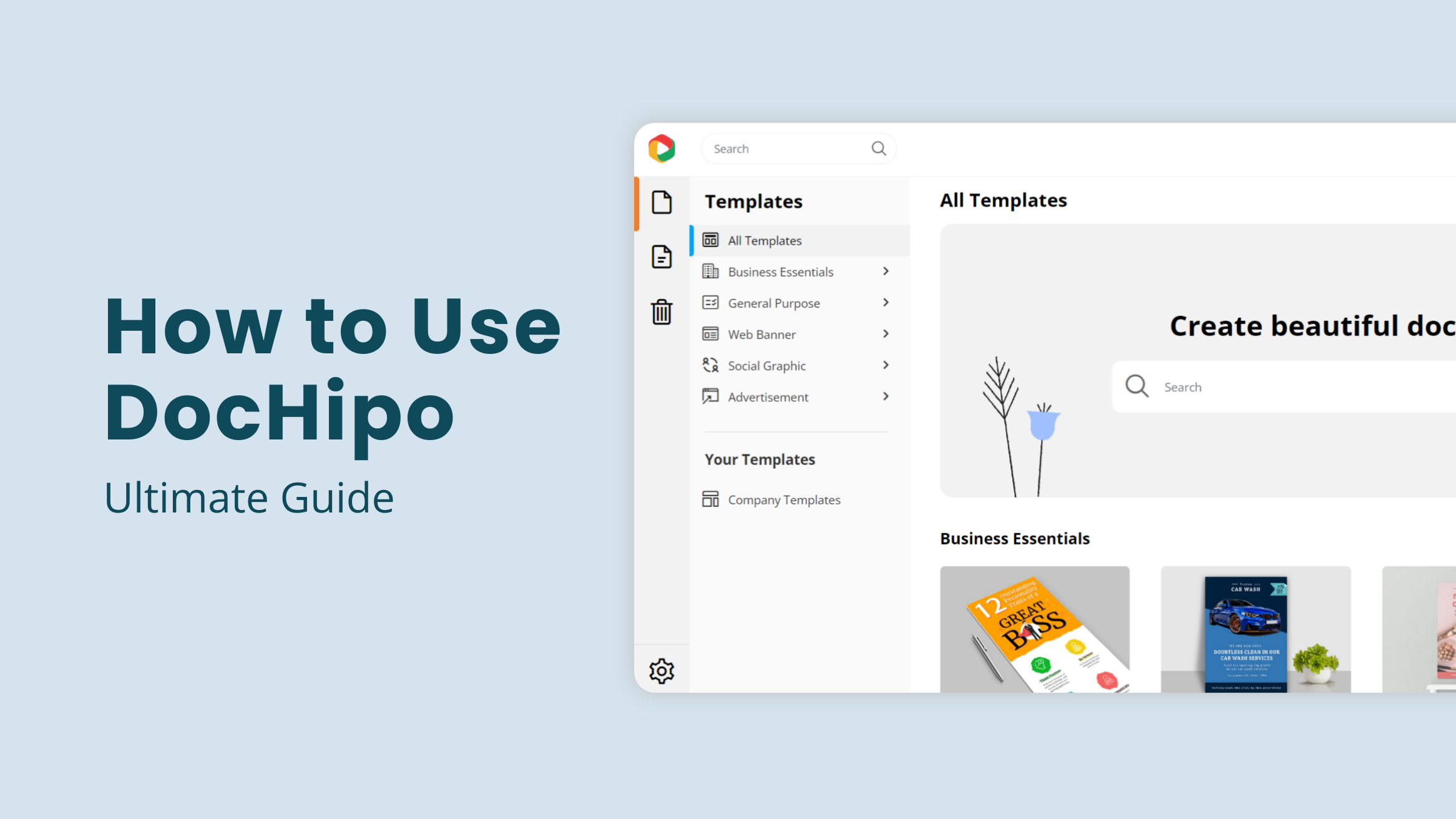
The Ultimate Guide to Using the DocHipo Editor to Design Your Documents

We all love to express…
Whether in words or visuals, we all like to tell our stories…our experiences, and our definition of life.
Now, how do we do that?
We either write a journal or maneuver a color lad paintbrush against the grainy texture of a canvas.
As the world progressed, enhancing all our mental faculties, we witnessed a series of changes that revolutionized the way we perceive the society around us. One of them is definitely how commerce amalgamated with words and visuals, giving rise to Graphic Design.
The global demand for visually marketing their products has increased the designers’ market size, constantly growing by 2.5% each year.
So designing is now an integral part of every business. Whether in the form of advertisement, or product design, visuals have an innate ability to strike the consumeristic cord better.
But designing is not easy.
That’s because apart from your creative imagination, you need tools to help you carve out your ideas. Buying these tools or software can be expensive. Moreover, you need to have a thorough understanding of the software in order to give your best. This makes the whole process time-consuming.
How to Use DocHipo
- Getting started with DocHipo: Sign up with an email ID and a password to access the ‘All Templates’ page. Type your desired document type in the search bar, then click on the result to proceed.
- Start Designing with DocHipo: Choose from the massive library of stunning templates that align with your industry, theme, and design style.
- How to Add and Edit Text: Select and replace the existing text with your words. You can change the size, font, color, alignment, and letter spacing and add shadows and border effects around the text.
- How to Use Pictures: Upload your images through the Pictures widget or access unlimited pictures from stock photo libraries.
- How to Use Graphics: Choose any appealing and relevant vector illustration, icon, sticker, animation, text frame, shape, etc., from the ‘design widgets’ library.
- How to Create Backgrounds for Your Design: Choose colors, gradients, or patterns to create a stunning background.
- Inserting Tables in DocHipo: Click on the Table widget, define the number of Rows and Columns, customize the header and the body text with your choice of color and font
- Page Setup in DocHipo: Resize the document dimensions, edit the page margins, and apply transitions to the multi-page document.
- Versions in DocHipo: See a list of versions of your work saved that you can name, restore, preview, and download.
- Real-time Team Collaboration with DocHipo: Share the document with your team members and determine their access level within the document.
- Downloading Your Document: You can select your file type (JPG/PNG/ Transparent PNG//PDF/ GIF/ MP4) and the Quality (Normal/Medium/High).
To ensure the design process is easy, we will explore DocHipo’s editor.
Table of Contents
Getting started with DocHipo
If you have discovered a creative side to yourself, or need designs that can help you market your products/services better, then DocHipo will seem like a blessing. You’ll be able to create stunning designs without prior graphic design experience.
To venture into this platform, you first need to sign up, following which you will enter DocHipo’s vibrant ‘All Templates’ page. You can type your desired document type in the search bar provided and click on the result to proceed. Otherwise, scroll through the page to explore the various document types or select the one you need from the left sidebar.
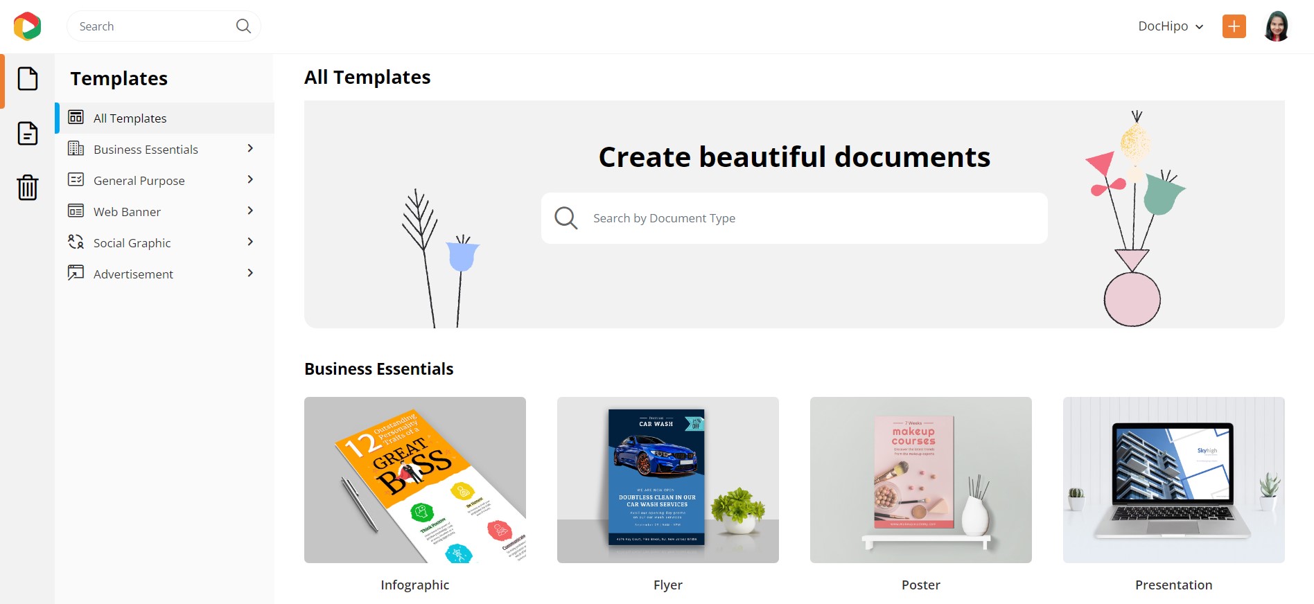
Let’s expand each document category one by one. Below are the Business Essentials documents, such as infographic, flyer, poster, presentation, and brochure.
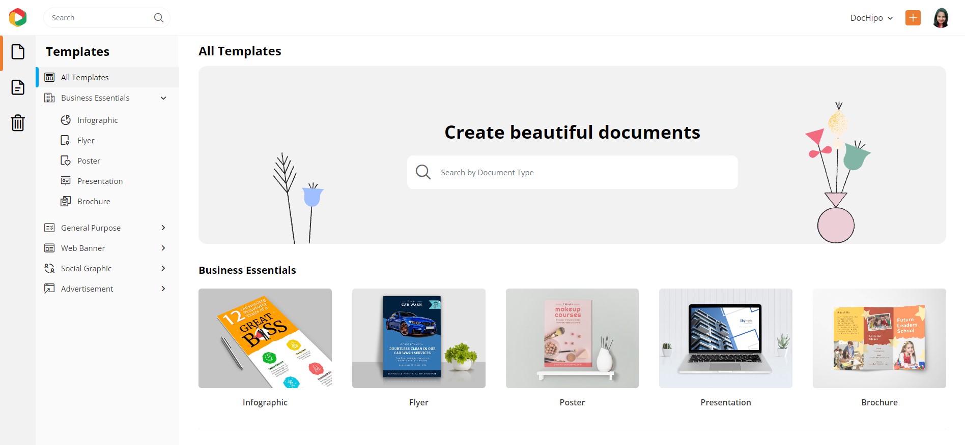
Next, we have a general-purpose document category that includes book covers, business cards, calendars, cards, certificates, invitations, logos, magazine covers, and resumes.
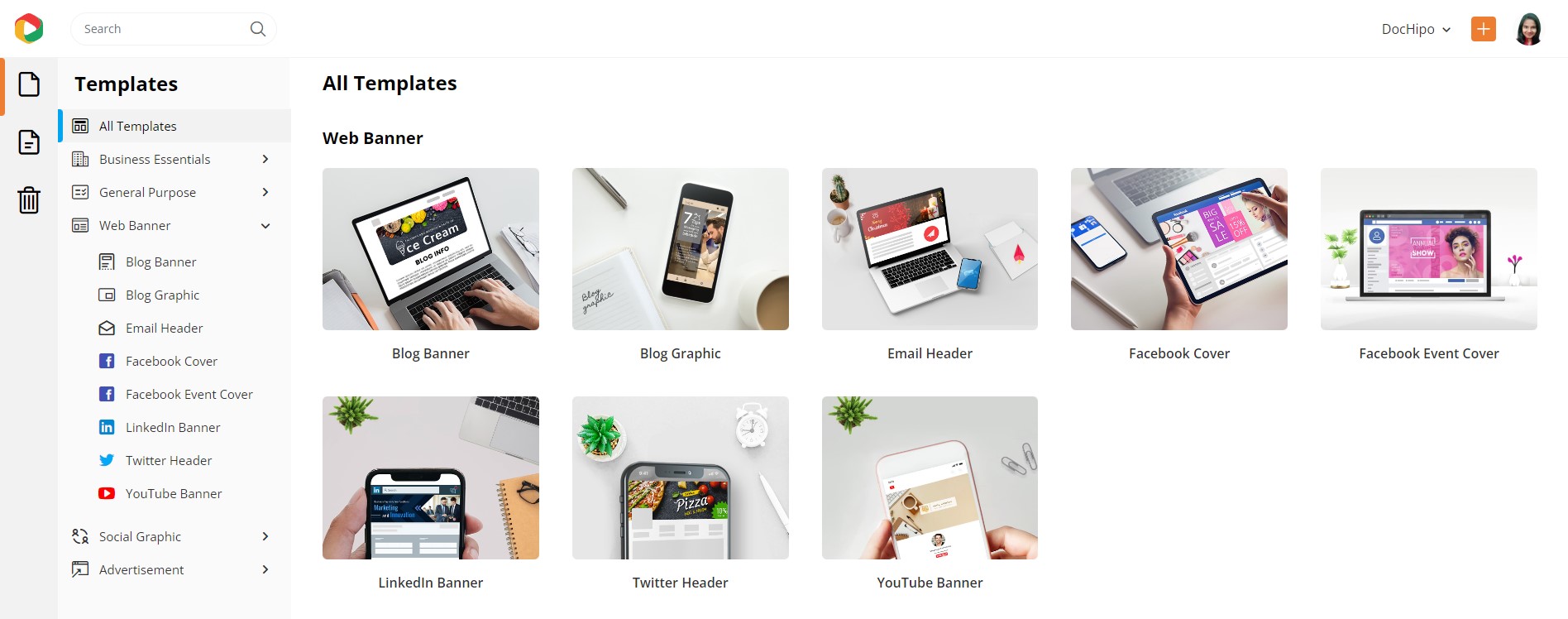
The third category covers various web banners such as blog banner, blog graphic, email header, Facebook cover, Facebook event cover, LinkedIn banner, X/Twitter header, and YouTube banner.
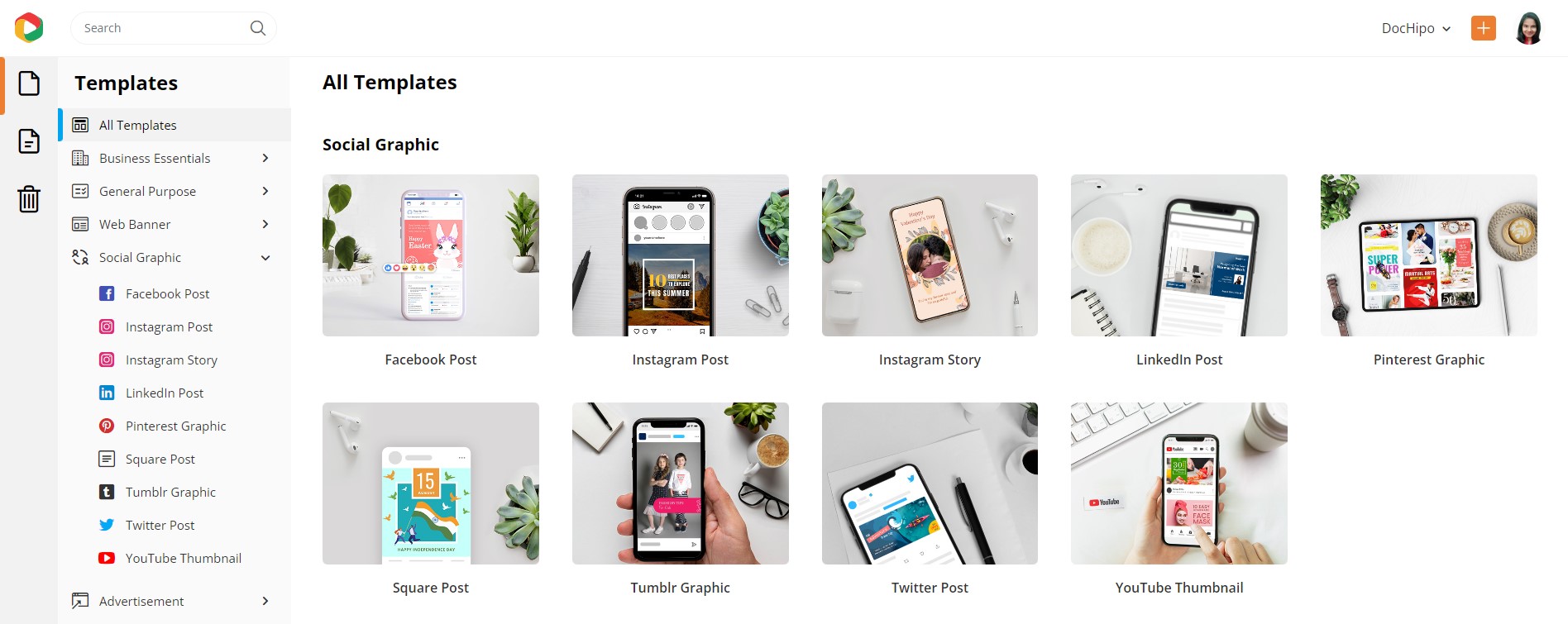
The Social Graphic category of templates covers major social media platforms such as Facebook, Instagram, LinkedIn, X/Twitter, YouTube, Pinterest, and Tumblr.
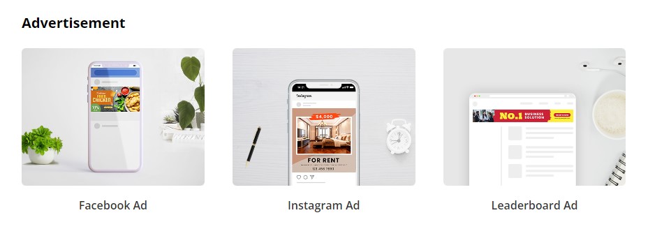
Finally, you’ll get to design graphics for Facebook, Instagram, and Leaderboard Ads.
Watch the video below to find templates in DocHipo.
Start Designing with DocHipo
To enter DocHipo’s editor, you must select a document type. Though you can create any design from scratch, pre-designed templates can supercharge your design process.
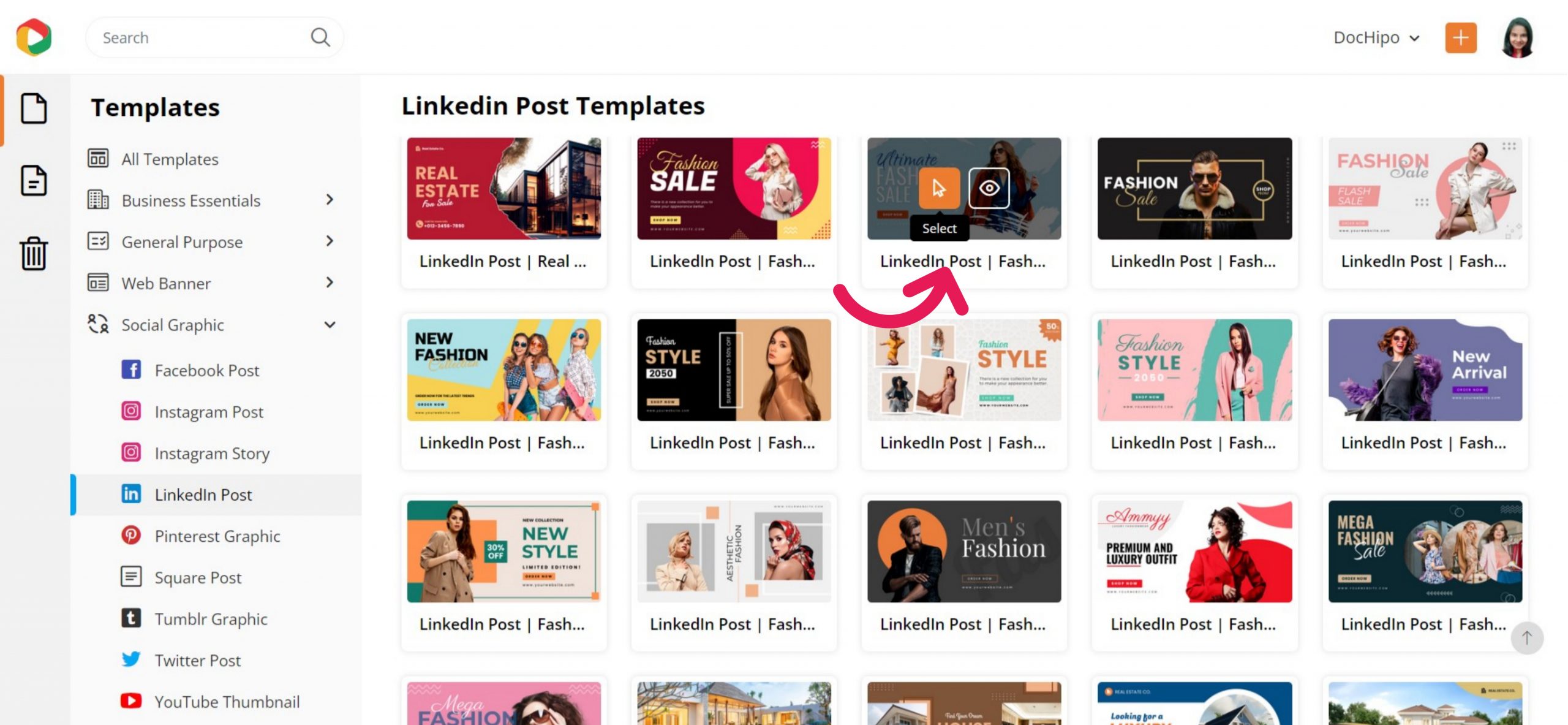
Let’s select the LinkedIn Post Templates first. Once you navigate to the next page, you’ll see the beautiful templates are categorized across industries and occasions.
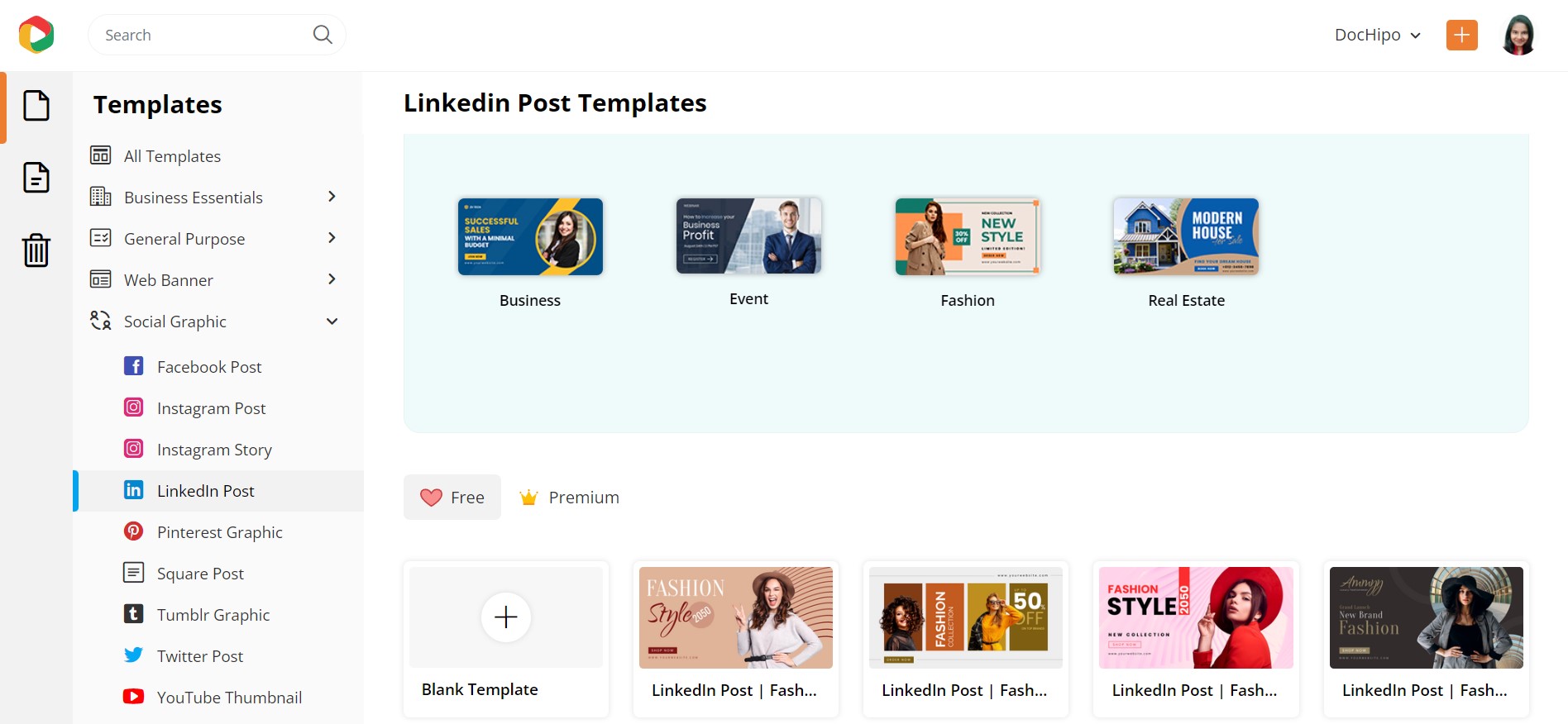
No matter which document type you wish to create, you can hover over the template you love that aligns with your needs to select it or design one from scratch.
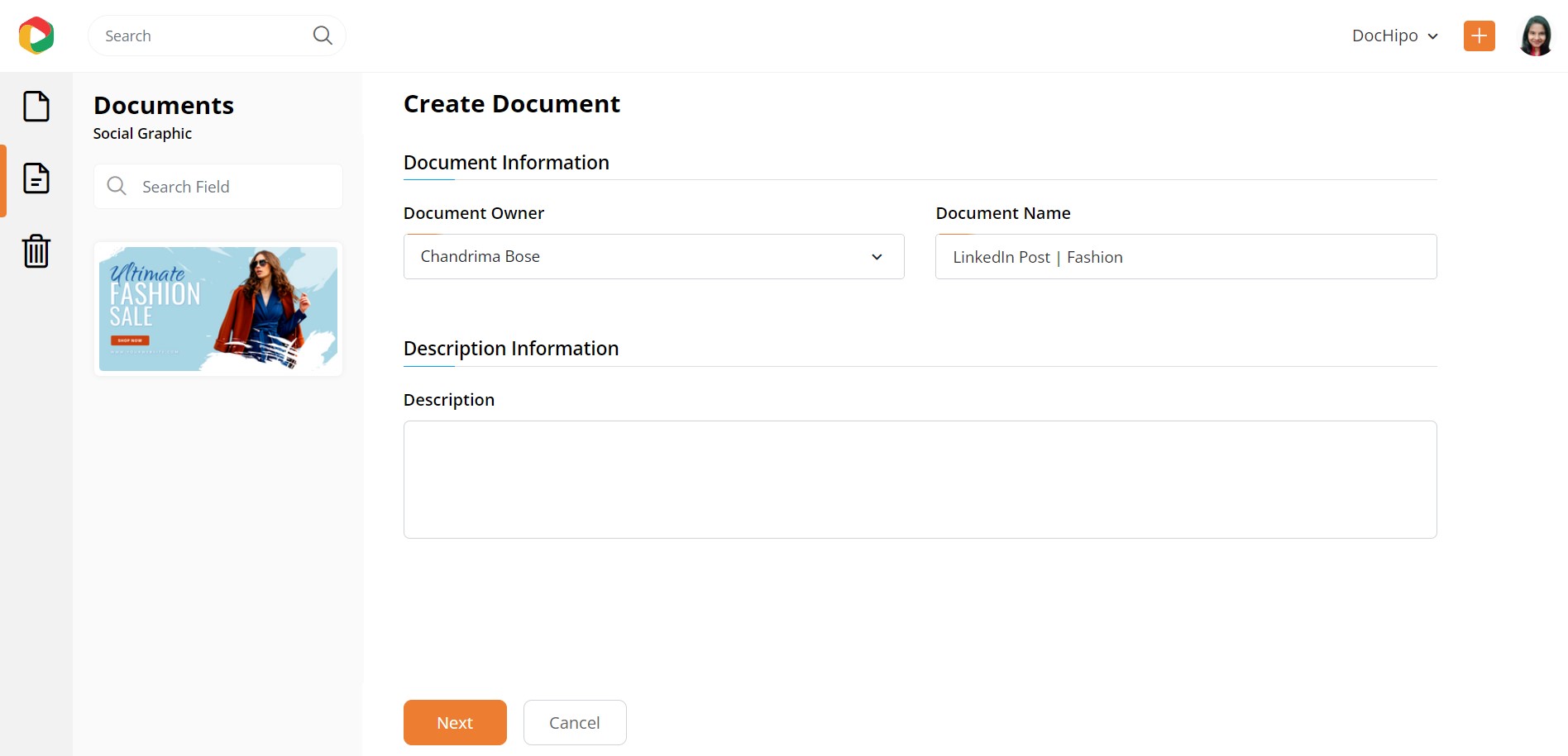
After you select it, you will be asked to provide document information, which will be auto-populated and can be changed if necessary:
Now, you are going to enter the most exciting part of this platform, the editor. You can zoom in or out of the canvas as per your convenience.
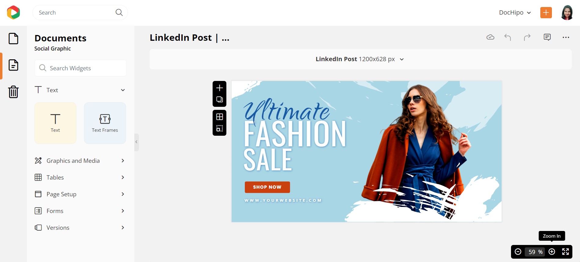
As you can see, this editor is structured to make it easy to navigate and use. The widgets on the left-hand side panel are properly defined, automatically informing you of their purpose. You can also see more editing options on the top panel, which pop up when you select the document on the editor.
So, let me elaborate further on the exciting design elements these widgets let you add.
How to Add and Edit Text
Adding text is a very integral component of designing. After all, the visual you want to use for marketing or other endeavors has a story and a message to highlight.
To edit an existing text, select it and replace it with your words.
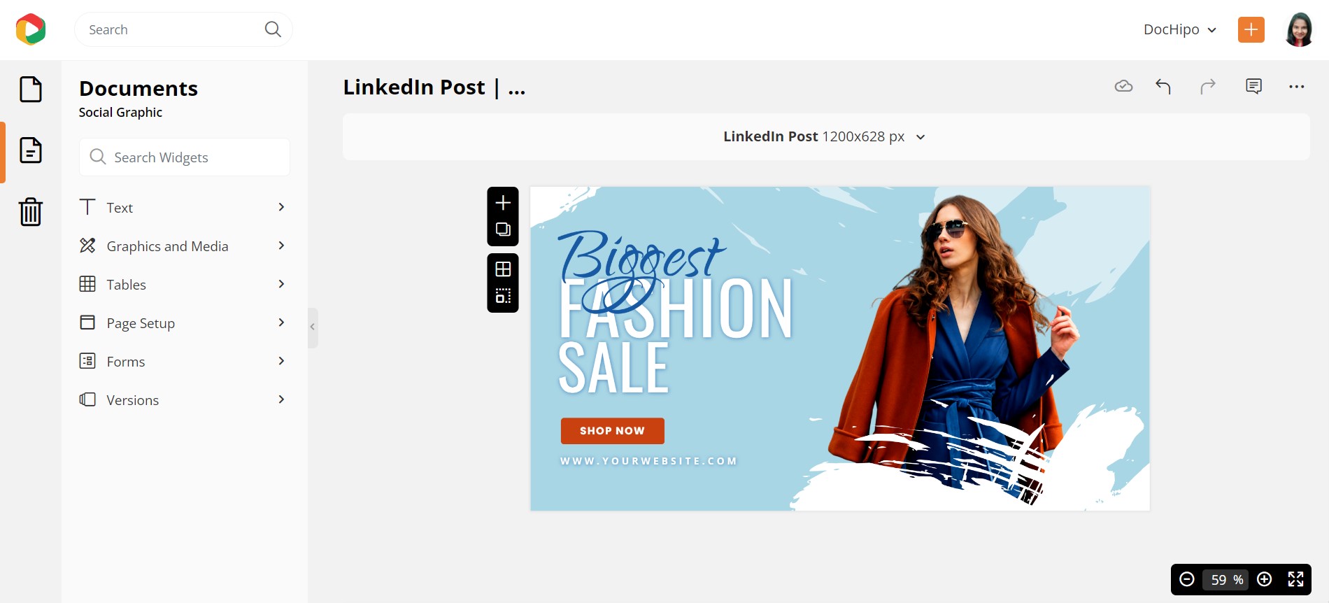
Also, the DocHipo editor has a Text Widget, which enables you to add further text to the document. You can add headings, subheadings, or body text anywhere you want.
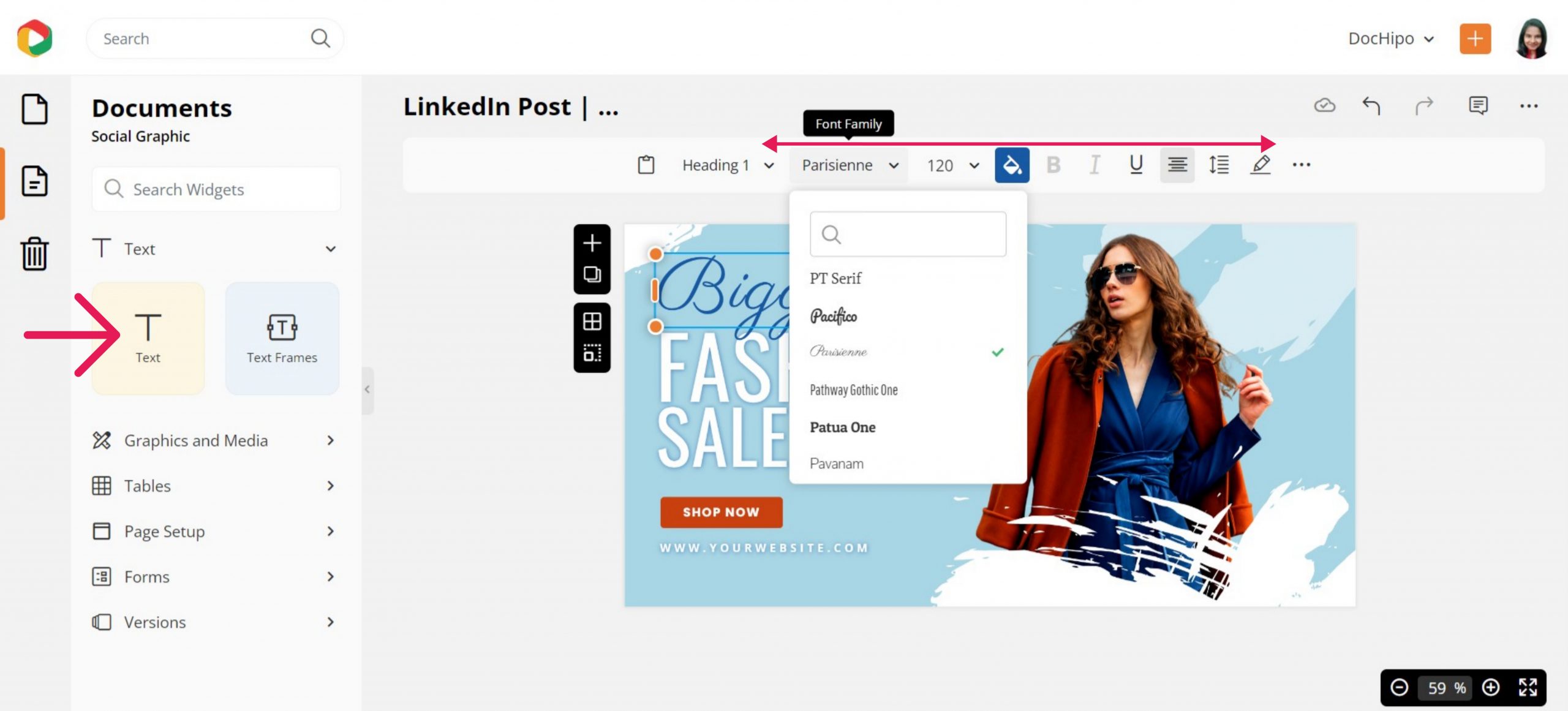
To customize the text further, click the text on the document. You will get to see some options on the top panel. These options allow you to change the size, font, color, alignment, and letter spacing and add shadows and border effects around the text. Let’s have some fun with the shadow and outline effects to uplift the text.
Click on the pencil icon in the top panel to expand the effects options.
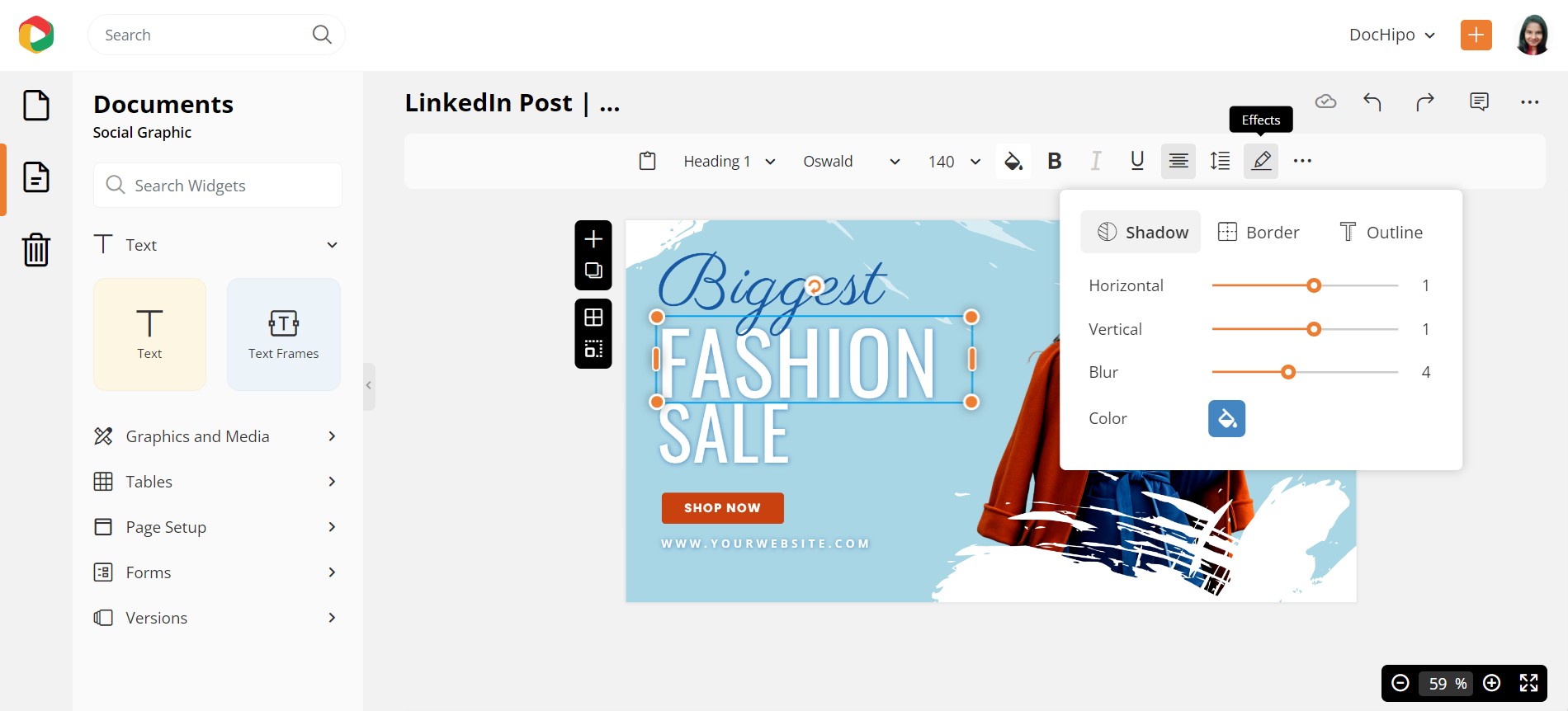
Experiment with the shadow value and stick to the one that looks best.
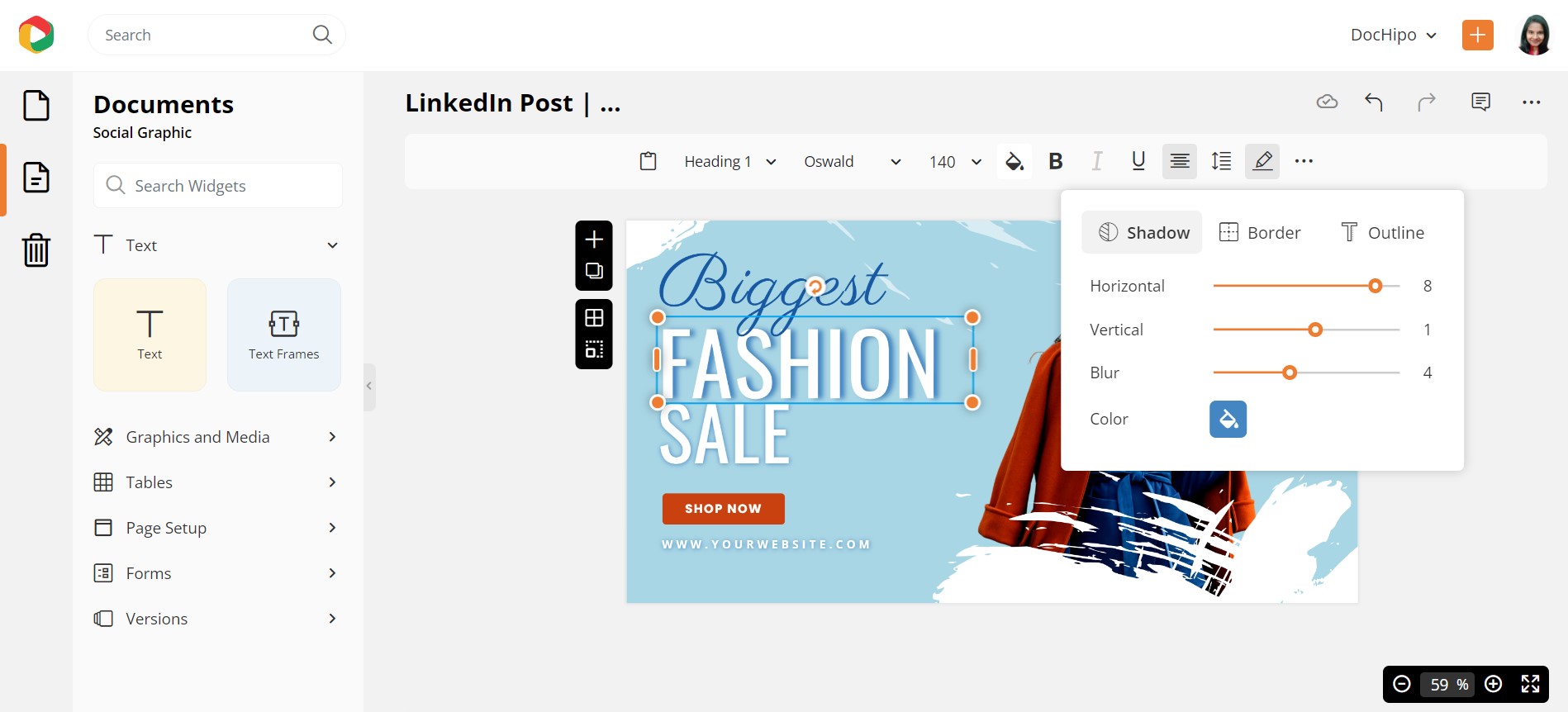
Below is a quick guide on adding text-shadow in DocHipo.
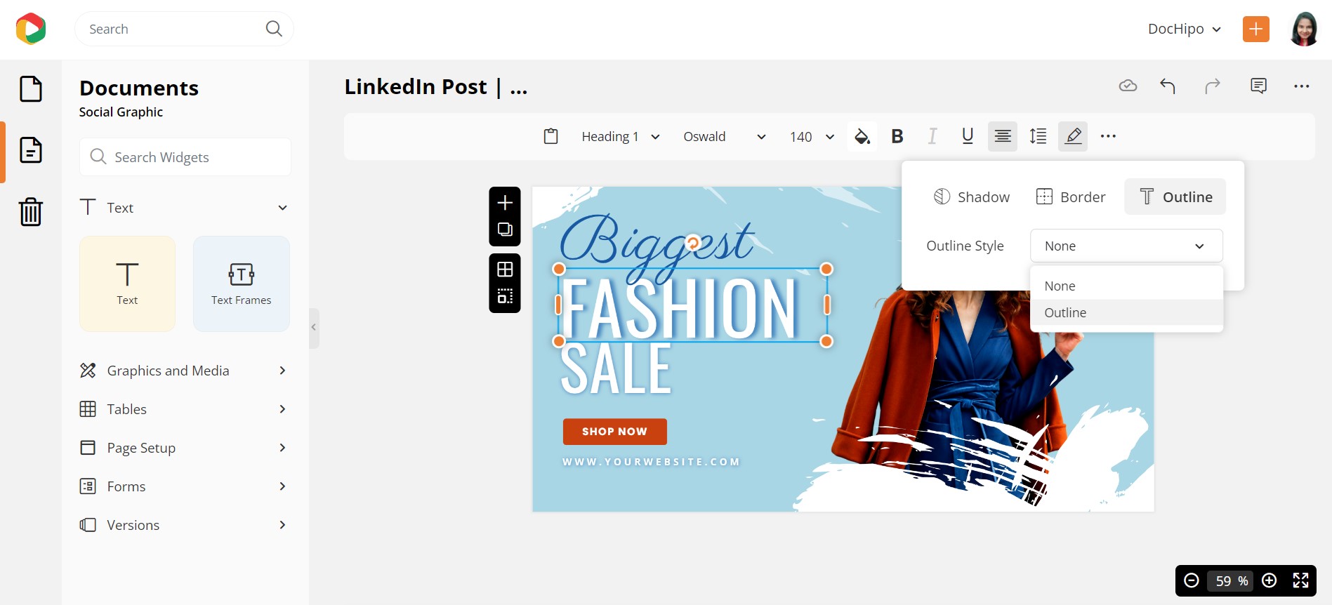
Let’s add an outline to add to its beauty!
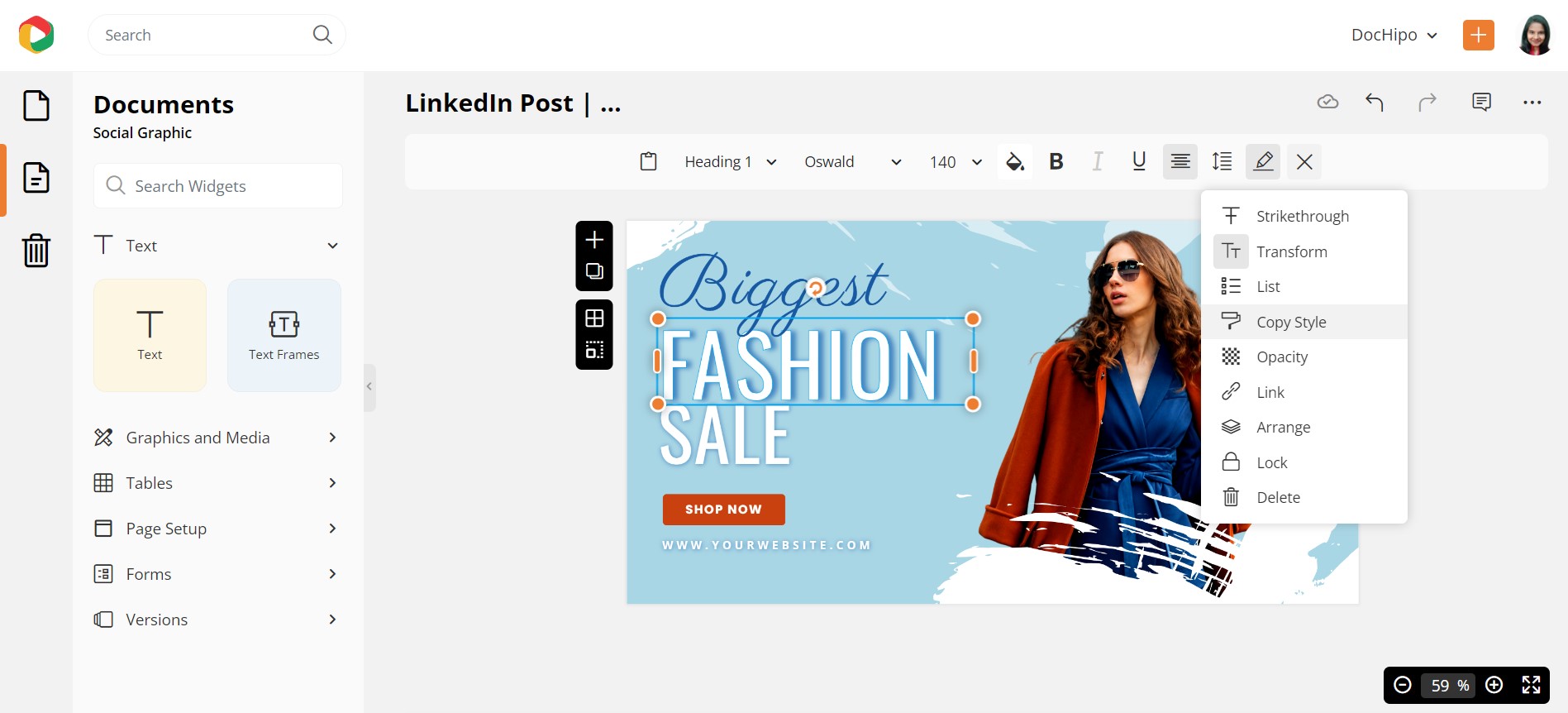
You can copy the style from any widget (text, graphic elements, etc.) and apply it to the widget of your need. Click on the three horizontal dots and select ‘Copy Style.’ Here, we want to copy the style from ‘FASHION’ and apply it to ‘SALE’ to save time.
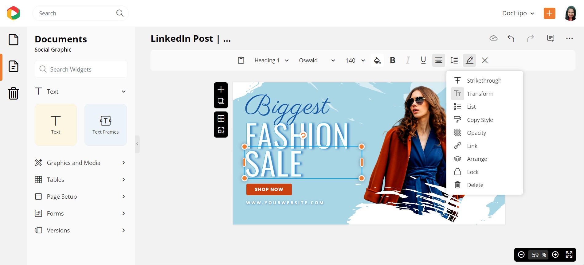
Look at our final design; isn’t it gorgeous?

Here’s a quick tutorial on leveraging copy style to design productively.
You can also adjust the opacity and add bullet points, links, and many other functions, which is great for a document based on information. You also get the option to lock the text elements so that you do not mistakenly move them from the intended position.
Watch our tutorial on adding, editing, or deleting text in DocHipo.
Now let’s move to the next section…
How to Use Pictures and Graphics
This category has different widgets that will allow you to add significant graphic elements to your document. You’ll find pictures, videos, illustrations, stickers, animations, icons, backgrounds, and more under the ‘Graphics and Media’ section.
Pictures
You can add pictures to the document to enhance your message through the Pictures widget. For this purpose, let’s pick up a Travel X/Twitter Post Template.
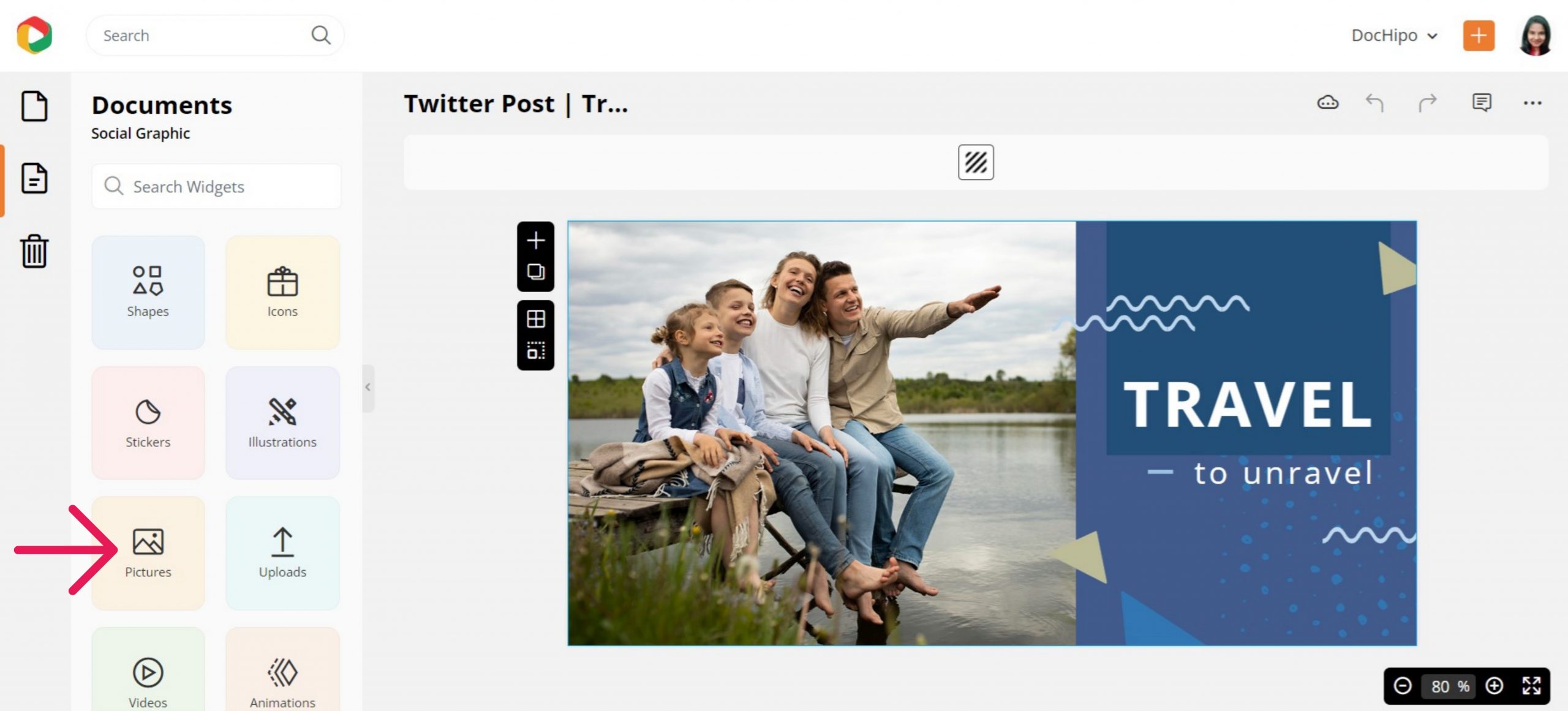
You can access unlimited pictures from stock photo libraries through DocHipo, saving you much time.
Type your theme in the search bar, and choose orientation and color to filter out just what you need. I searched for horizontal family travel pictures.
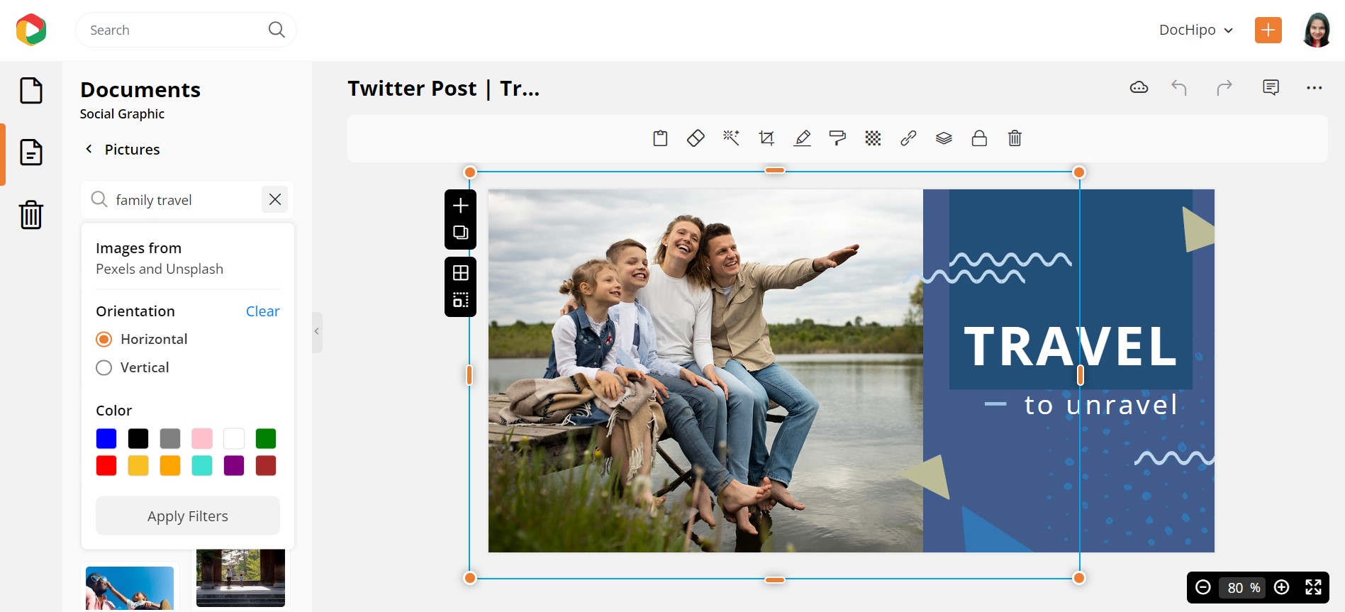
Drag the most suitable picture for your design and drop it on the existing one.
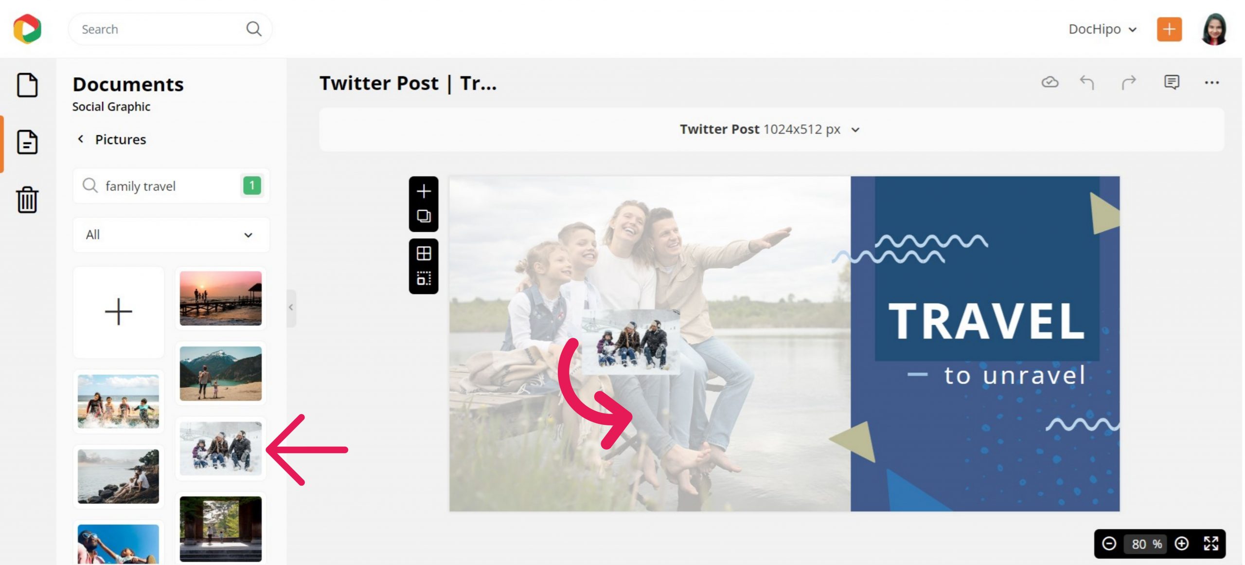
Adjust the picture size and position using the drag-and-drop tool if needed. It’s that simple!
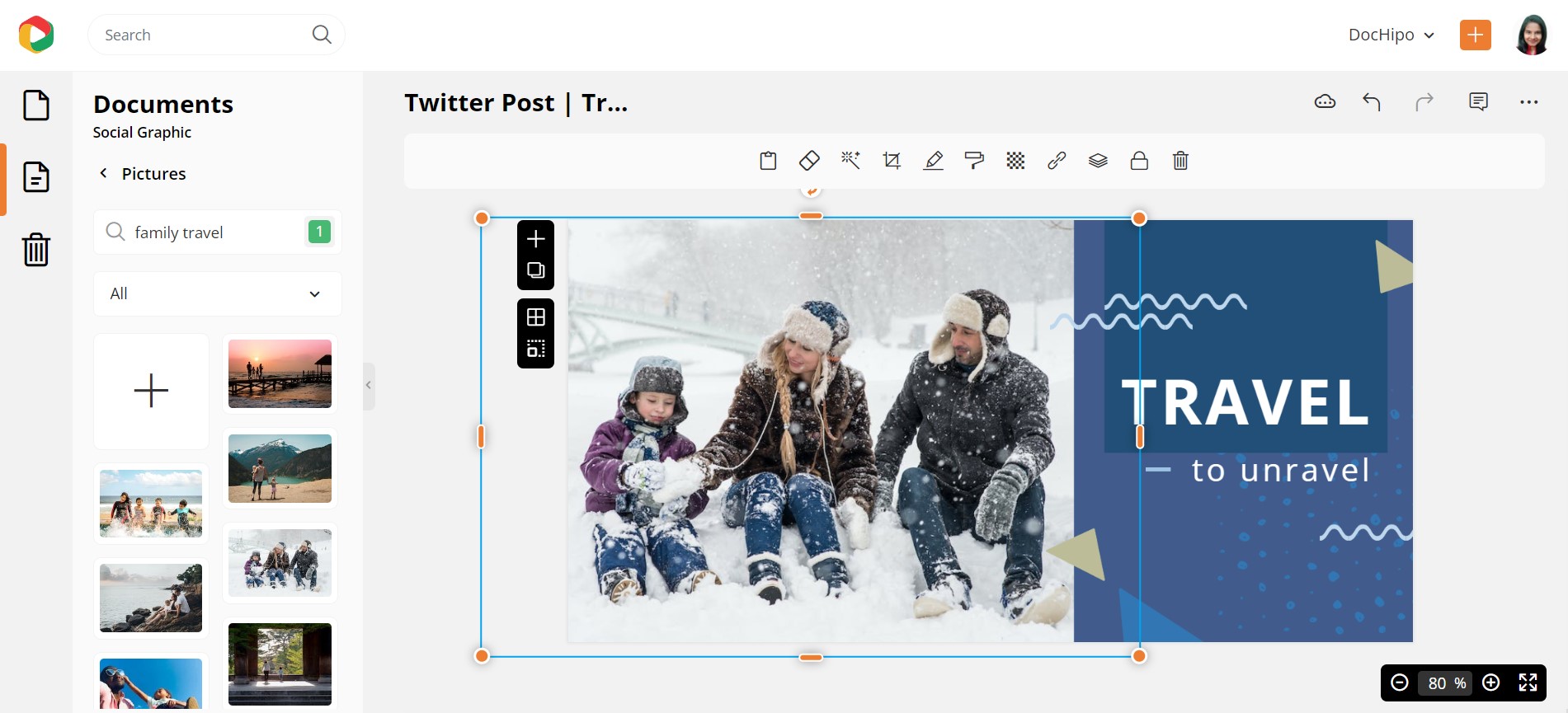
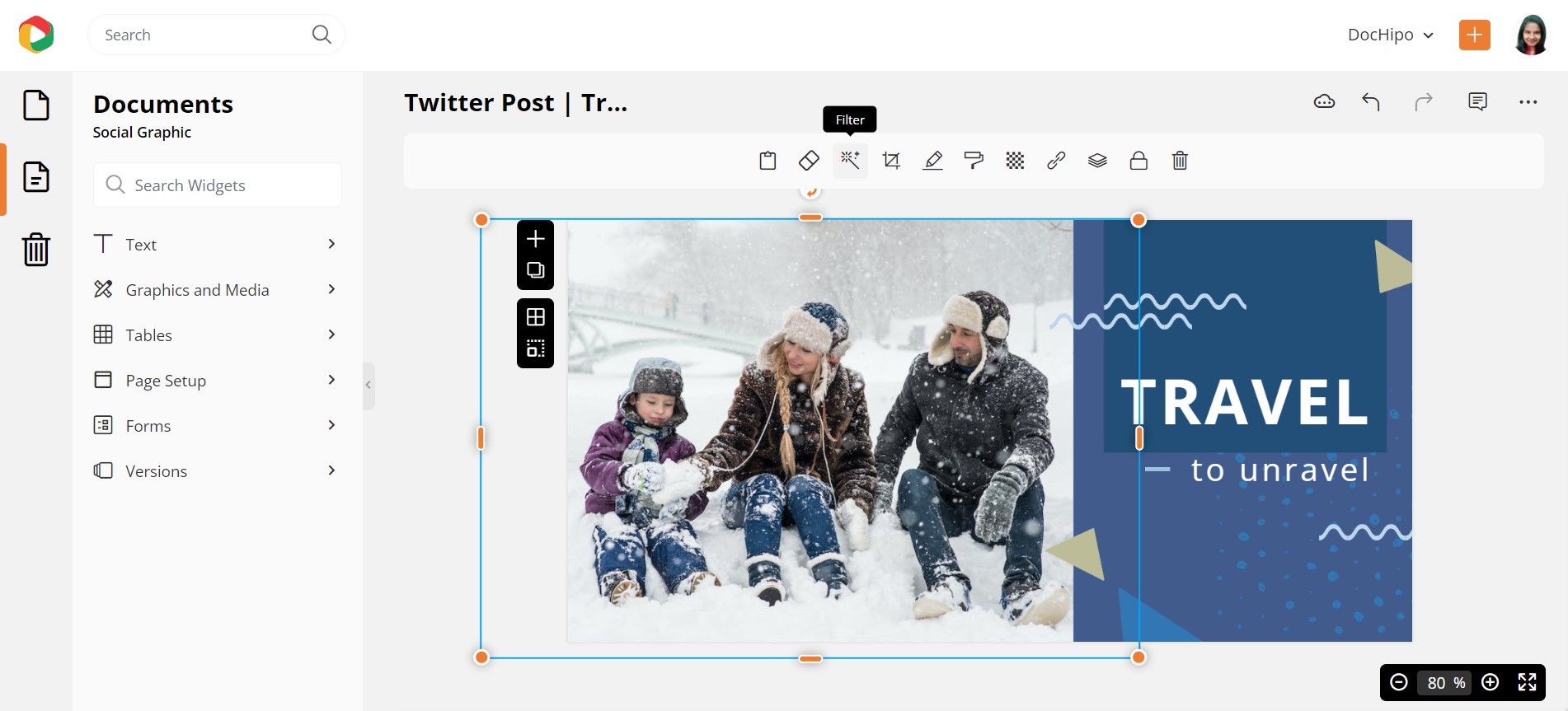
You can experiment with different photo filters to enhance images and add to the emotional factor.
Let’s choose grayscale for now.
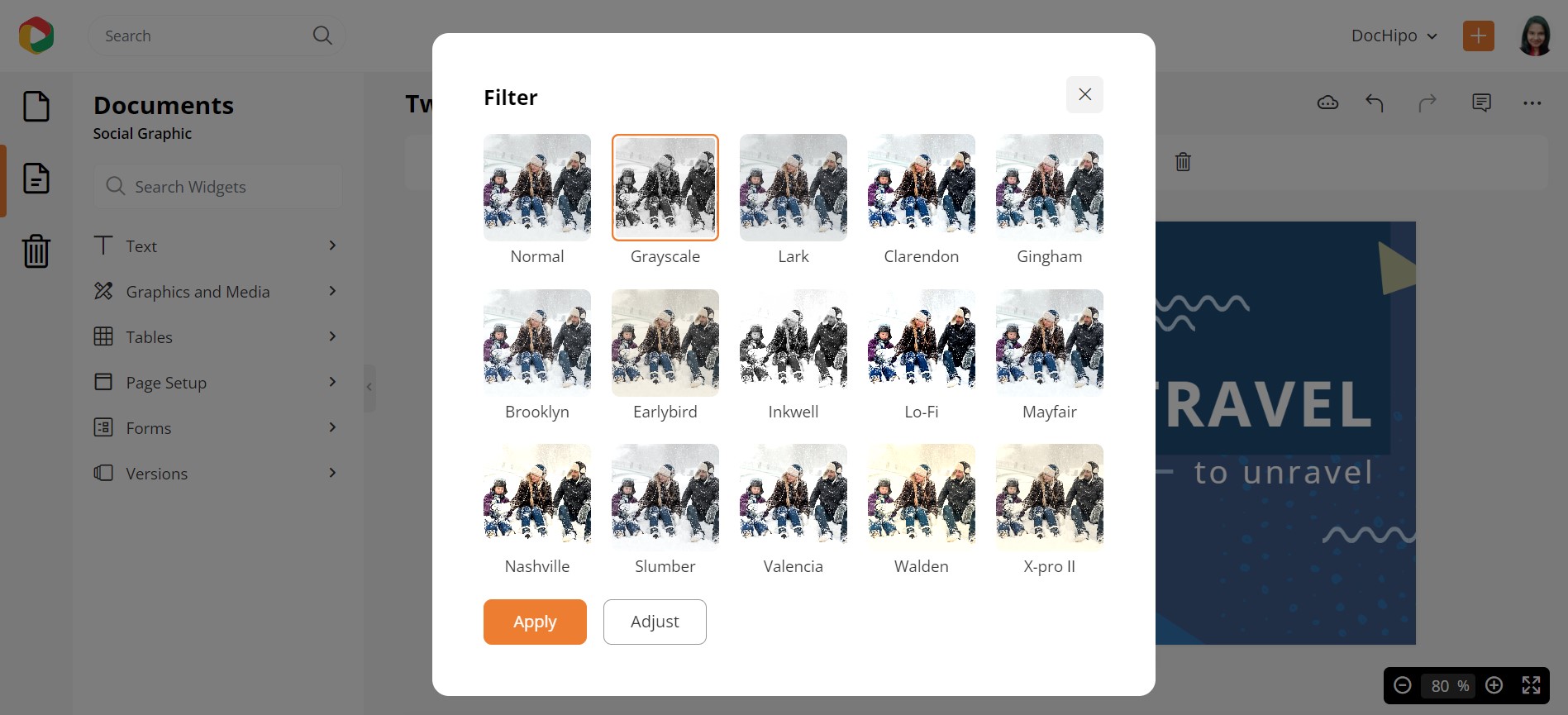
Now it reflects a beautiful nostalgic vibe.

Here’s how to enhance pictures with DocHipo filters.
If you own a product or service business and wish to incorporate your own unique images into the document, head to the Uploads widget to upload multiple images.
Remove the Picture Background within Seconds
While designing marketing collaterals, you may need to remove picture backgrounds to eliminate unnecessary and irrelevant elements and make your image more appealing. And the great news is that you can do it with a single click within the editor itself. This time let’s work with a Sale X/Twitter Header Template from DocHipo.
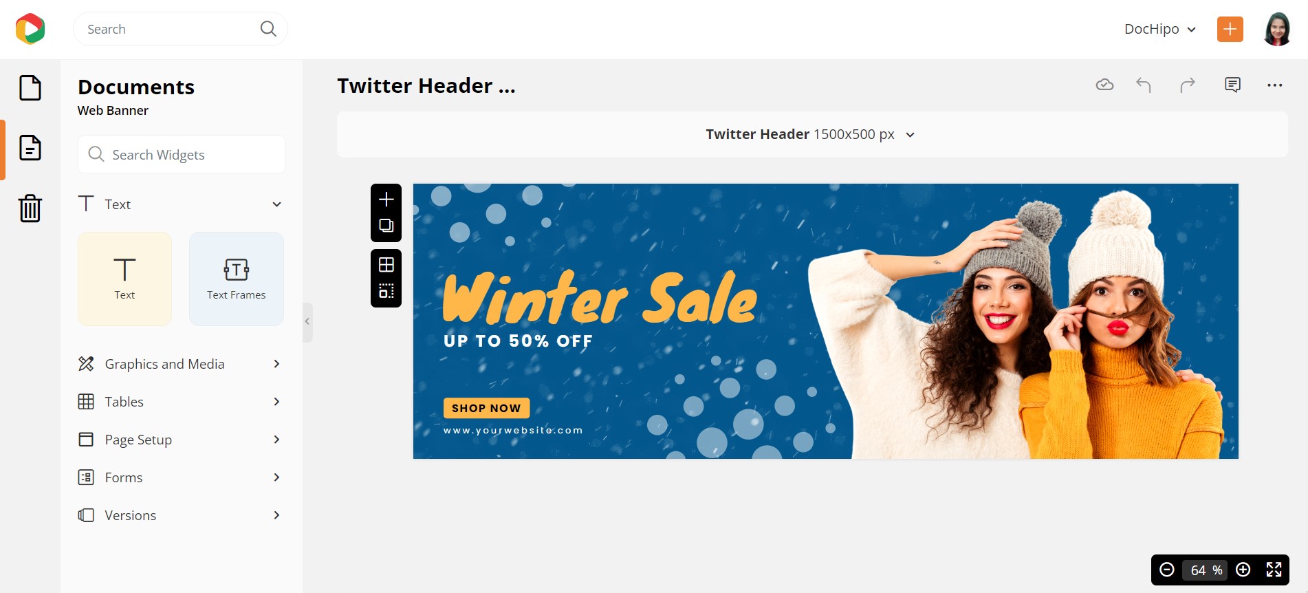
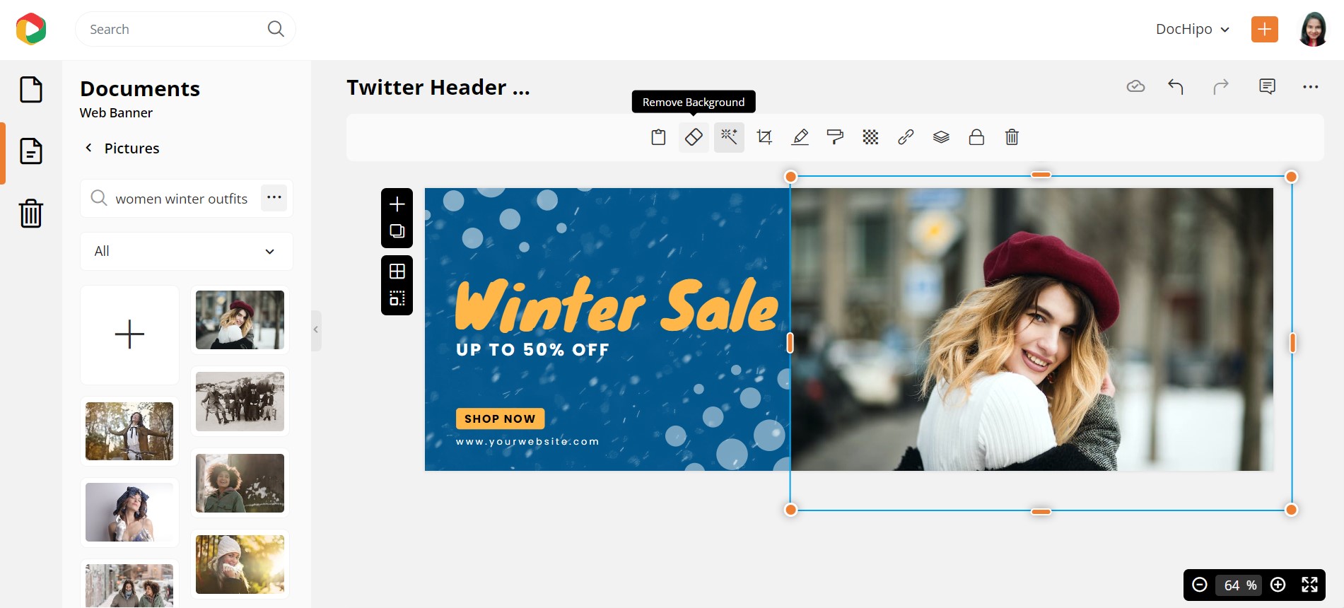
So, we want the same result with a different picture of our choice. Once you replace the existing image, click the ‘Remove Background’ option in the above editing panel.
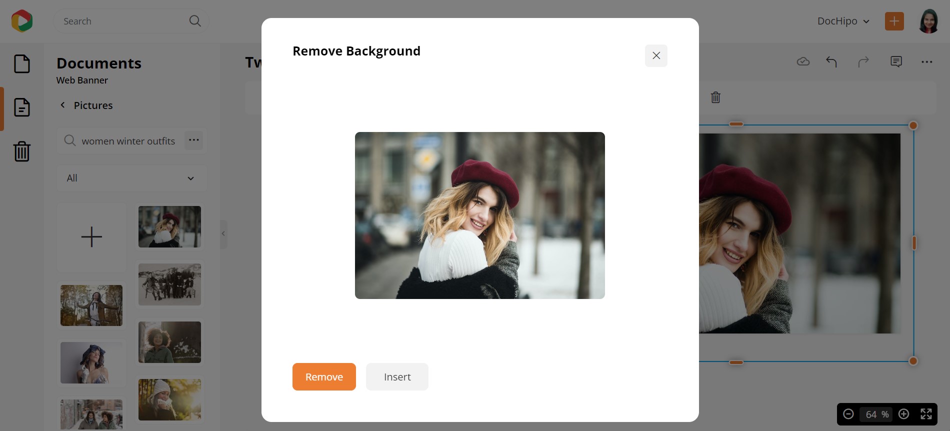
Click on the ‘Remove’ button.
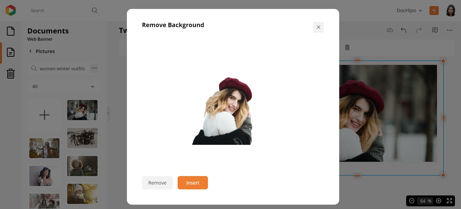
And you’re ready to insert this background-free picture into your design.
Here’s how it looks now.
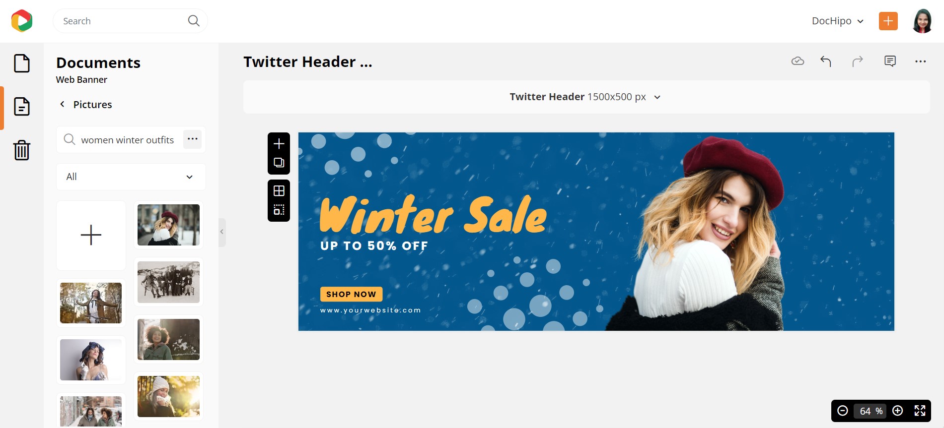
Let’s turn the woman’s face towards the promotional text to make it more meaningful. Select it, head to the top editing panel, and click the ‘Arrange’ icon. Click on ‘Flip Horizontal’ under the ‘Rotate’ tab.
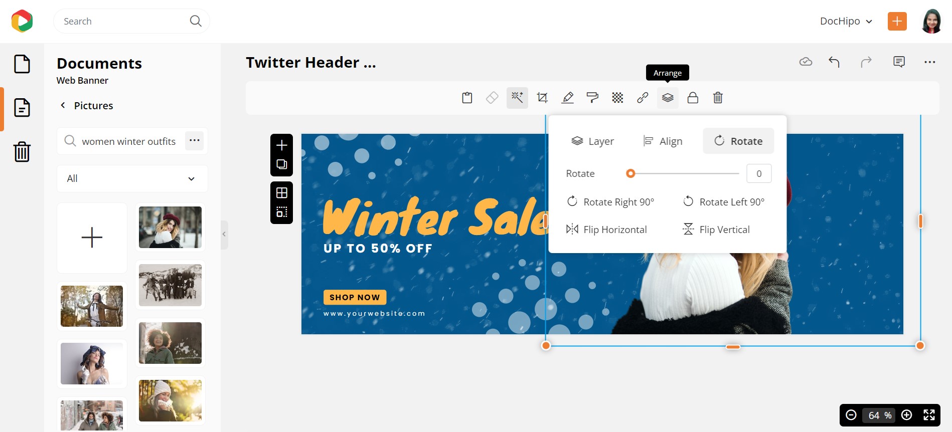
Below is how the Sale X/Twitter Header Design looks after customization.

Below is a detailed guide on arranging widgets in DocHipo.
Here’s a tutorial on removing the picture background in just one click for reference.
Crop Images to Shape
You may need to use a variety of shapes to embrace your image and give your design a refreshing look. Let’s take an example of a Business LinkedIn Banner Template.
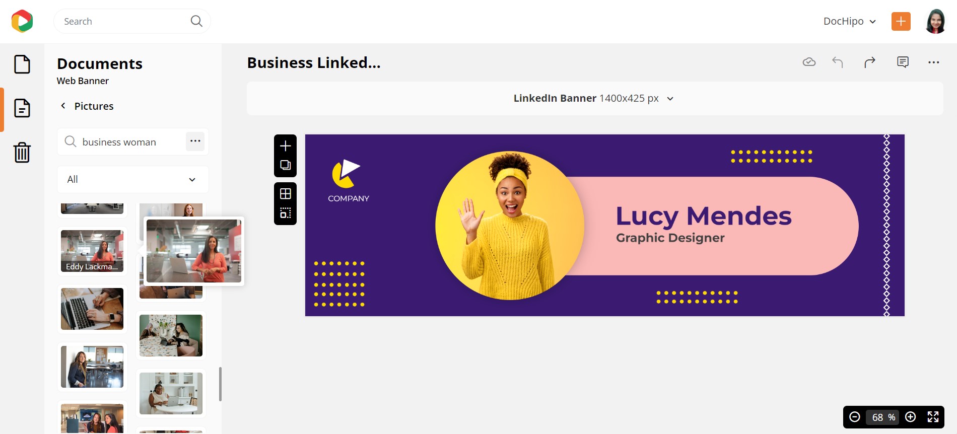
Let’s replace the woman’s picture quickly, and you can see that we need to crop it to eliminate the unnecessary area and let her face become the focus. Select the picture and click on the ‘Crop to Shape’ icon.
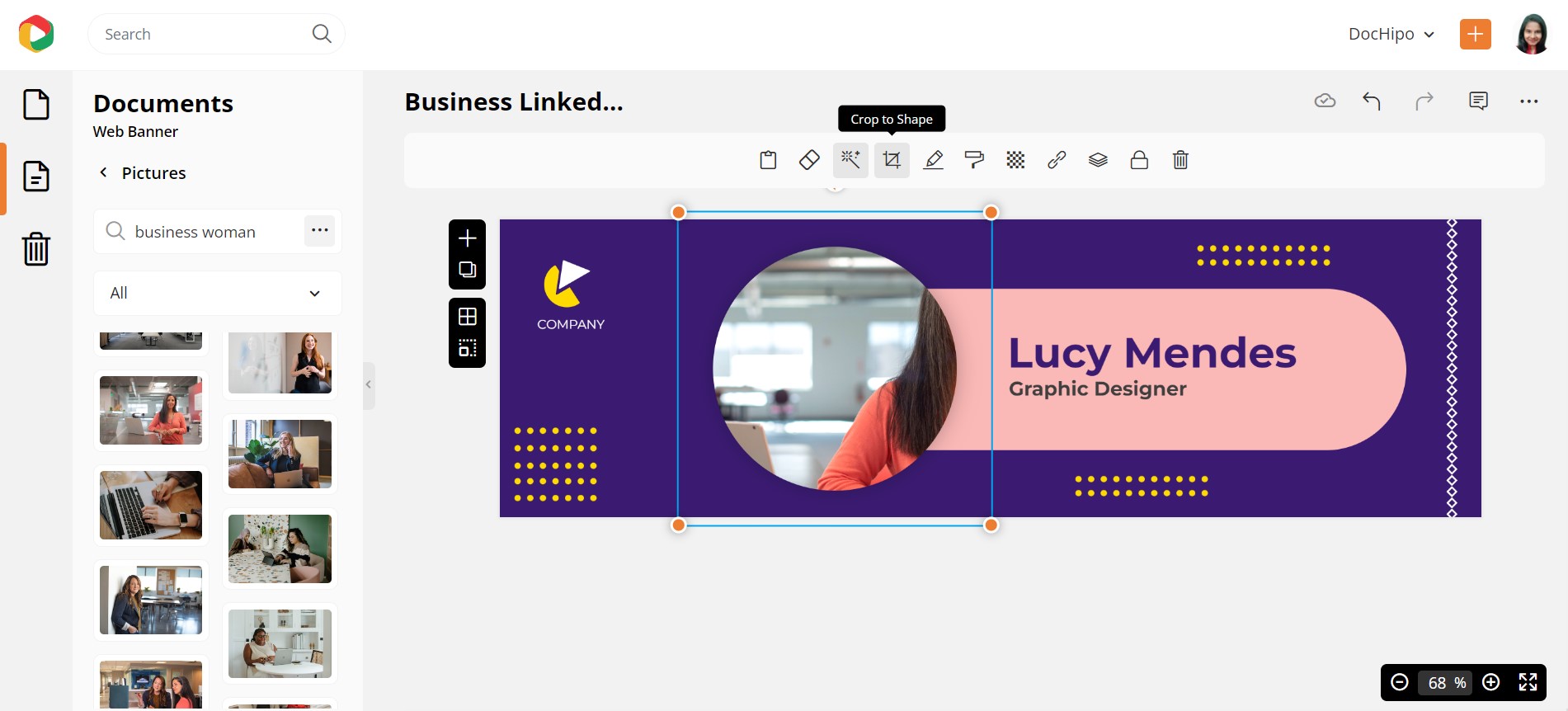
You’ll get a variety of shapes to choose from, depending on your design. Let’s see how it works with the basic shape. You can resize your photo, reposition it with the drag-and-drop tool and click ‘Apply.’
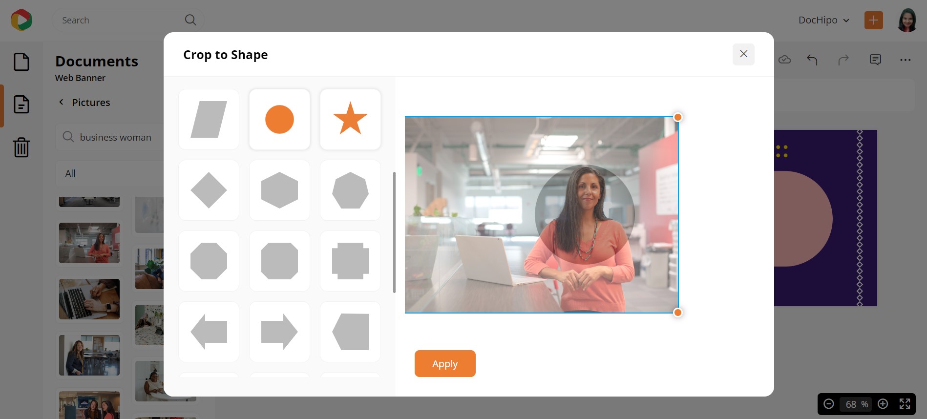
Here’s the final look!

Videos
If you want to add videos from stock photo libraries or YouTube, you can do so through the Videos widget under the ‘Graphics and Media’ section.
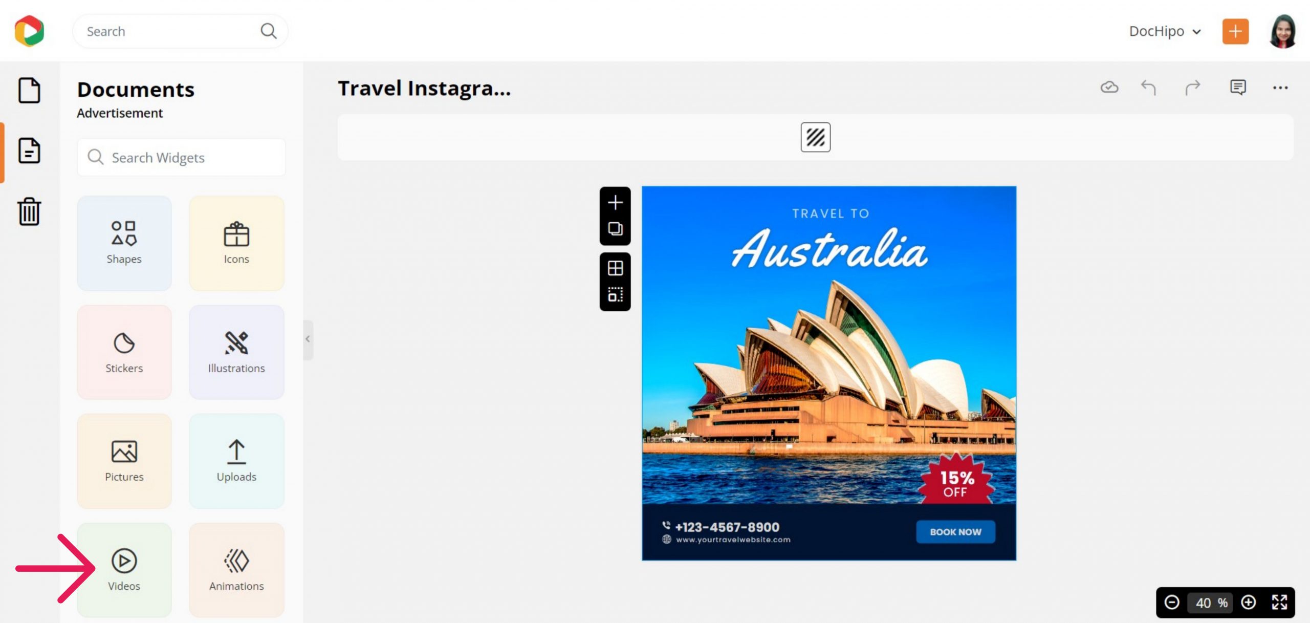
Search for your desired video theme in the box provided.
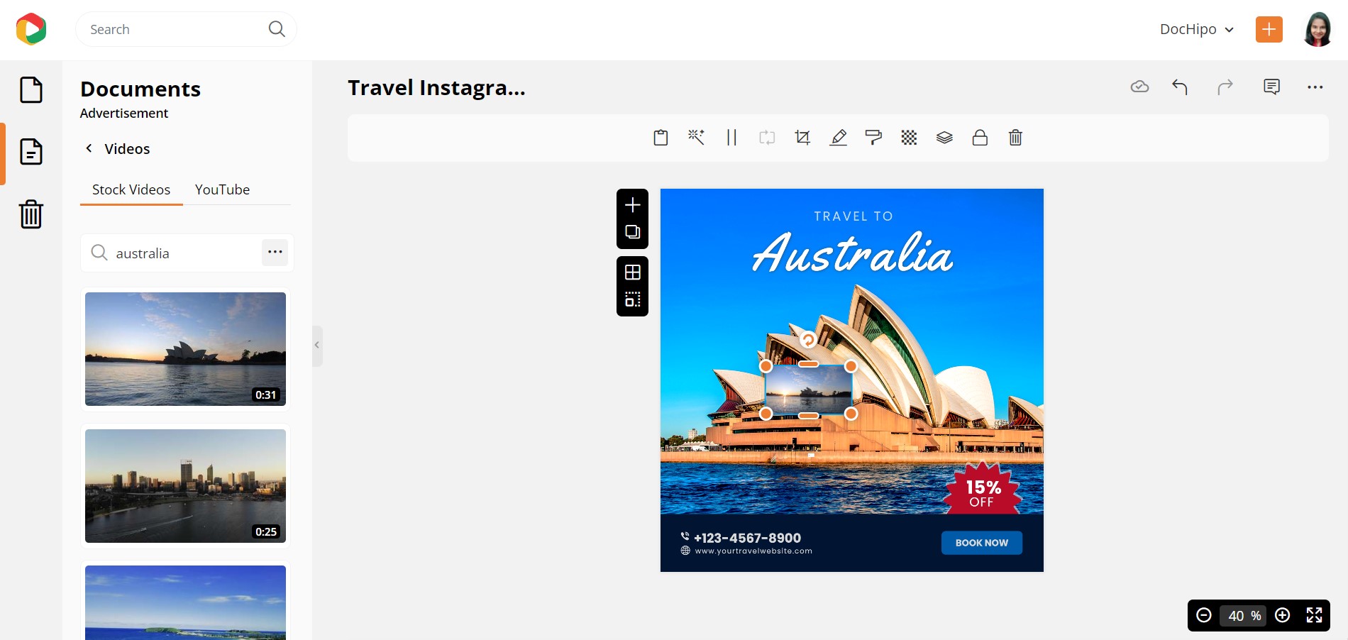
Like pictures, videos have 8-handlers to crop them into any dimension effortlessly. You can layer your text over the image as it was by sending the latter back.
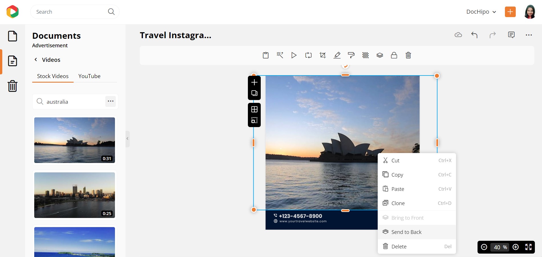
Here’s the final look:
Illustrations
The Illustrations widget lets you get awesome illustrations to make your document attractive. Let’s take a Corporate Flyer Template.
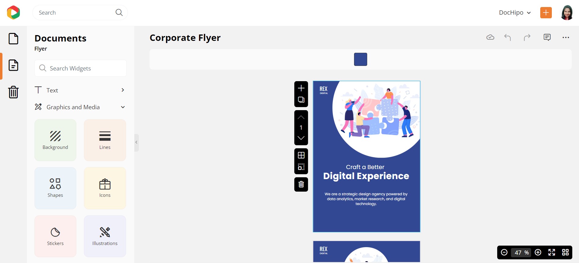
The simplistic yet charming illustrations are sectioned into Solo, which showcases single illustrated characters, and Scene, which presents scenic illustrations. You’ll love exploring both. Let’s select Office Illustrations.
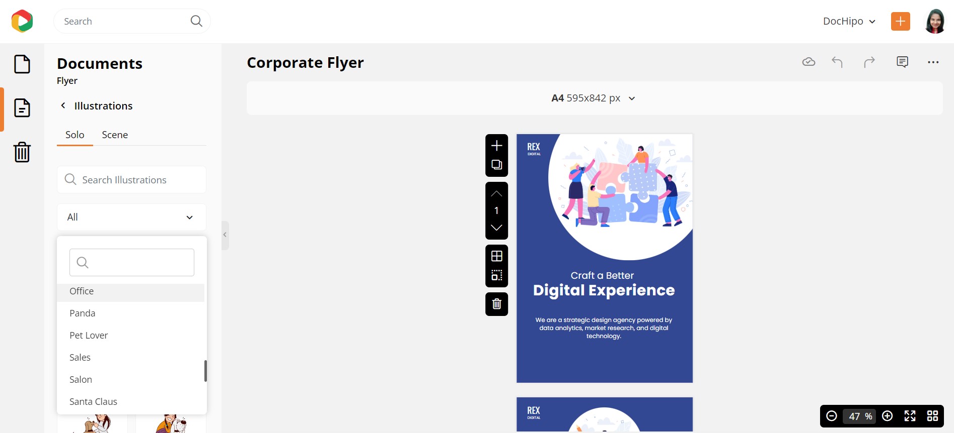
As you can see, the scene illustrations feel more relevant here. You can resize, reposition, customize the color combination, and similar functions even for the illustrations.
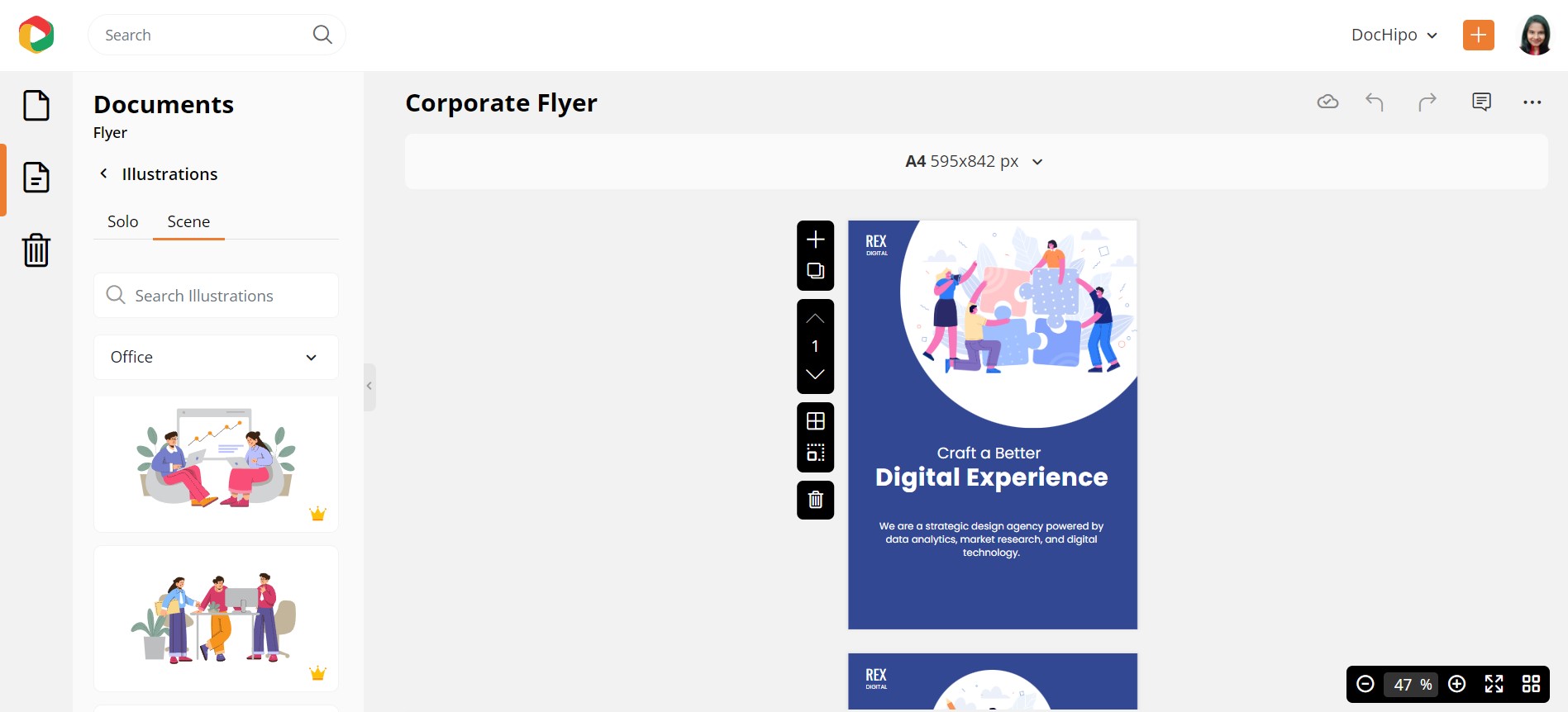
Here’s the final look:

Watch our video to explore the top ten illustration categories in DocHipo.
Animations
You can also add Animations to make your document interactive and memorable. Let’s take an example of a Christmas Facebook Ad Template.
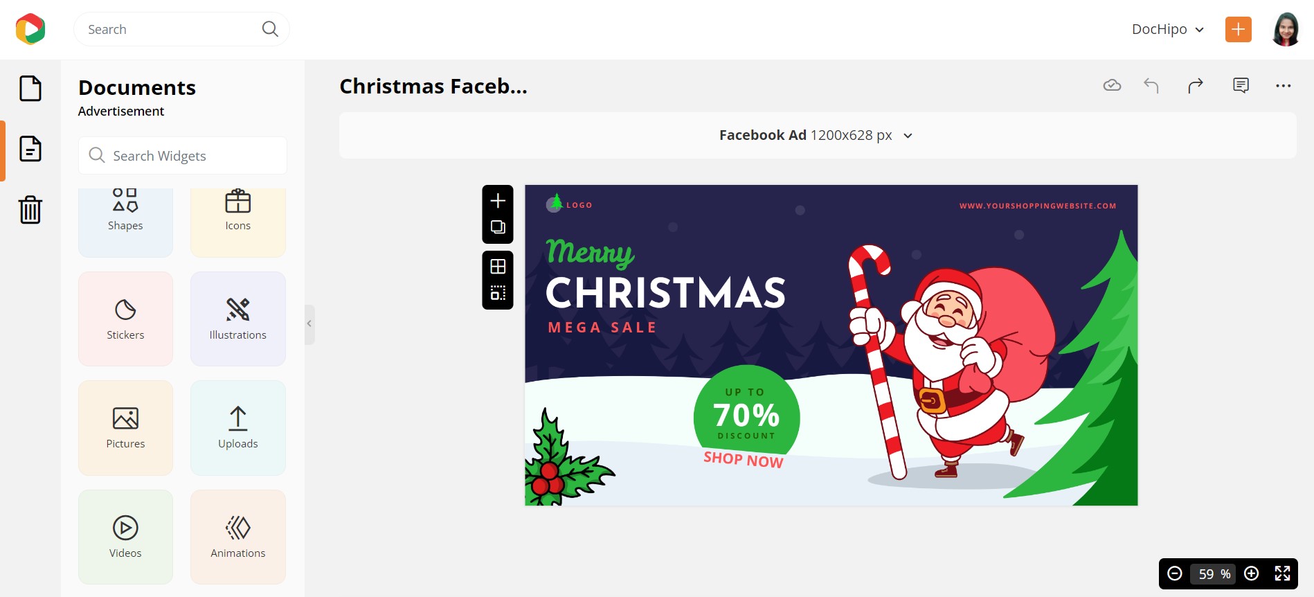
Let’s explore the Santa Clause theme to find a suitable animation.
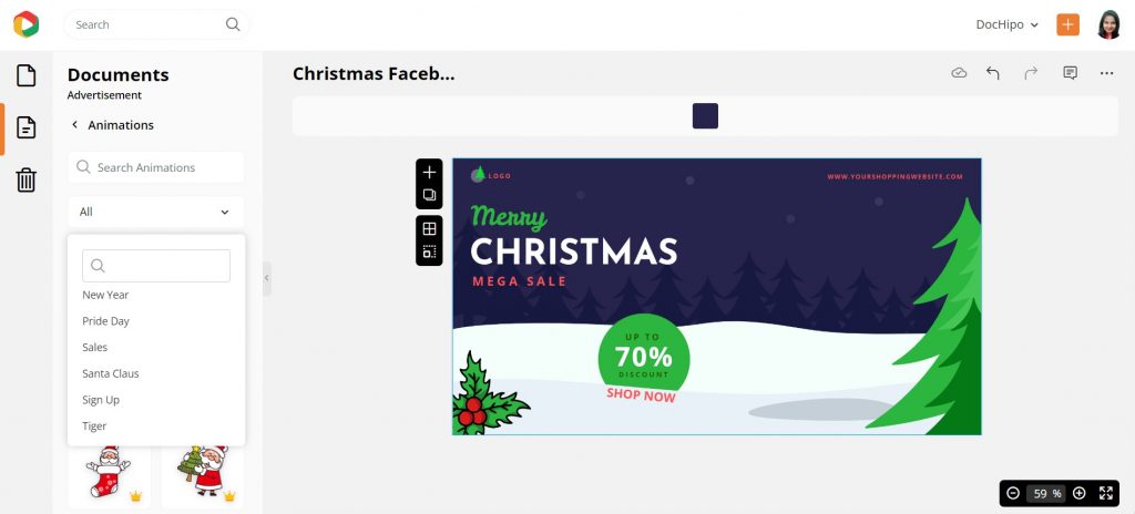
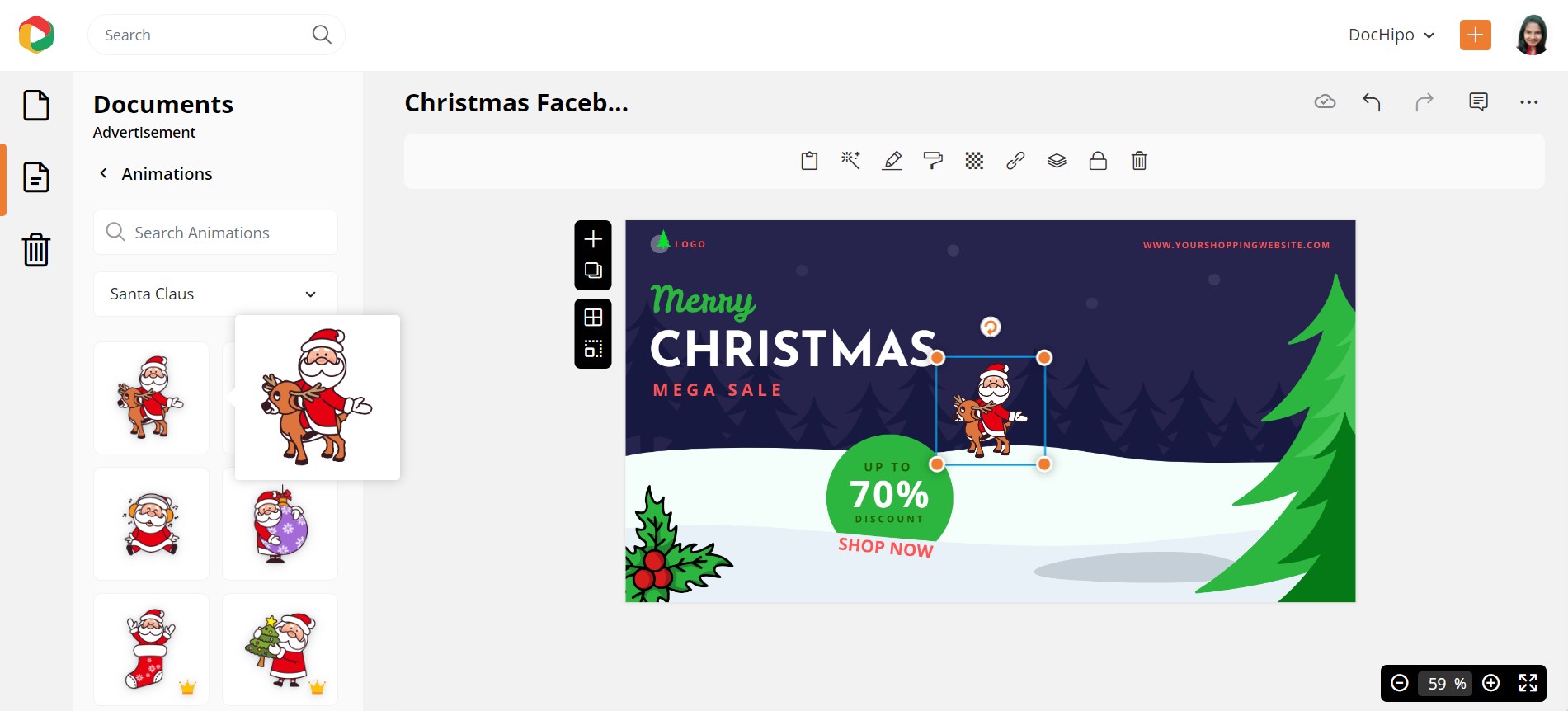
Here is the final look of our animated Christmas Facebook Ad.
Isn’t it adorable?
Check out how to use animations in DocHipo.
Icons
Icons are also a powerful visual element to express a message instantly. Let’s select a Restaurant Flyer Template to incorporate icons. Icons in DocHipo come in both color and mono themes. Select ‘Fast Food’ from the drop-down menu.
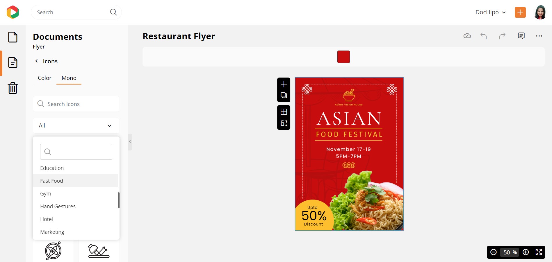
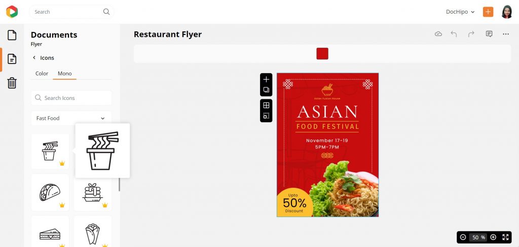
Here’s the final look:

Watch our tutorial on using icons in DocHipo.
Lines
When you want to add lines, you can do so with the Lines widget:
How to Create Backgrounds for Your Design
To add or change the background of the document, you have to select the Background widget. You can choose colors, gradients, or patterns to create a stunning background.
Let’s select a Travel Instagram Story Template to work with background colors.
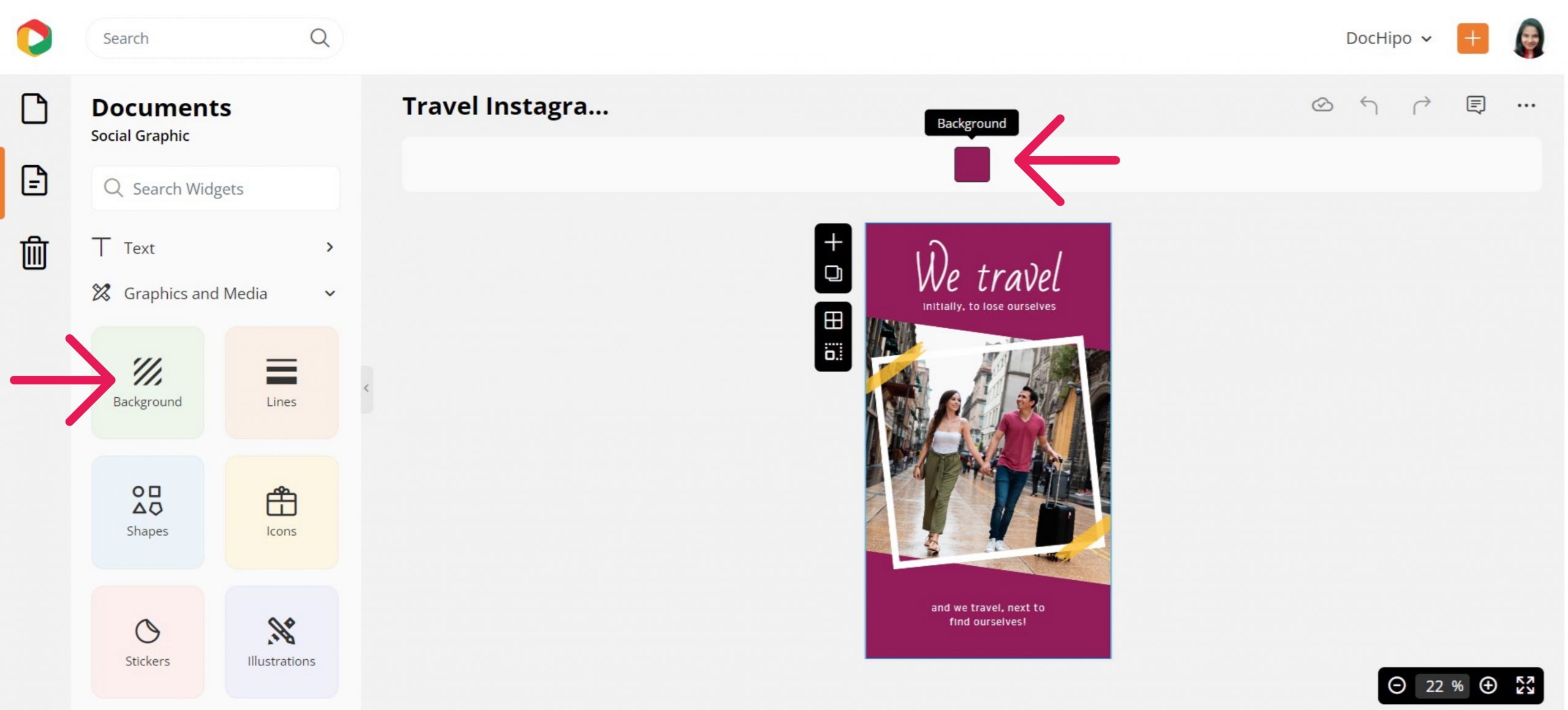
You can choose from the color displayed or put the color hex code in the provided space beside the color icon.
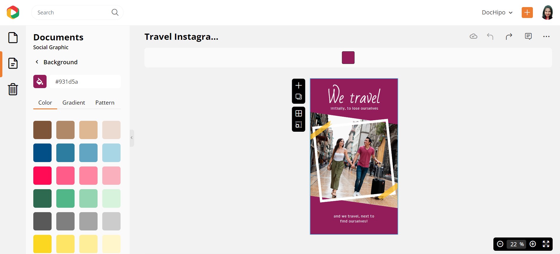
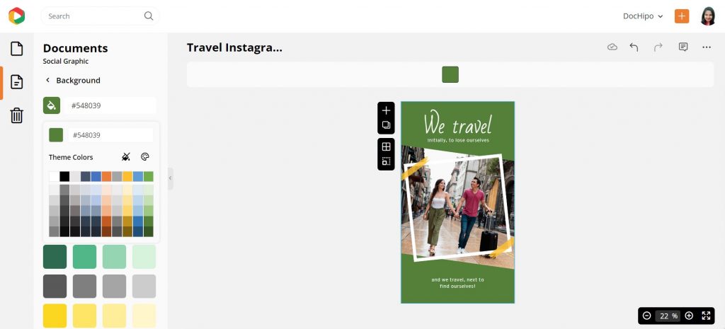
Click on the color icon to explore the theme colors.
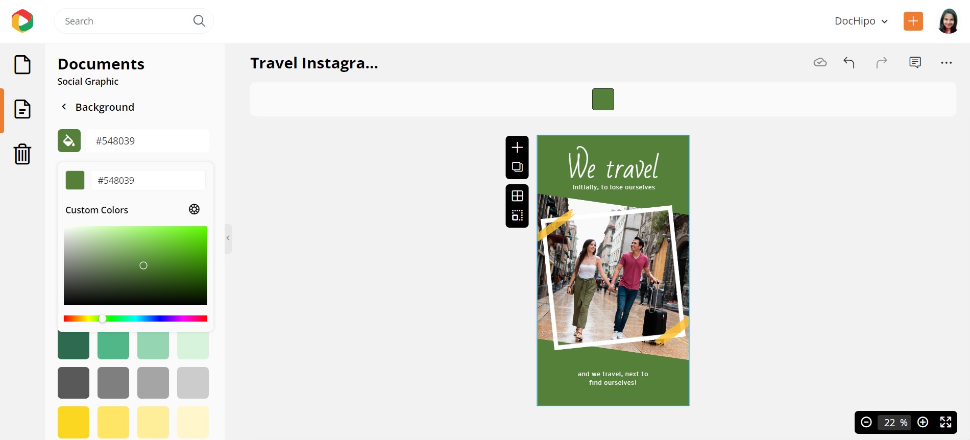
To further experiment with colors, cleck on the color palette icon for custom colors.
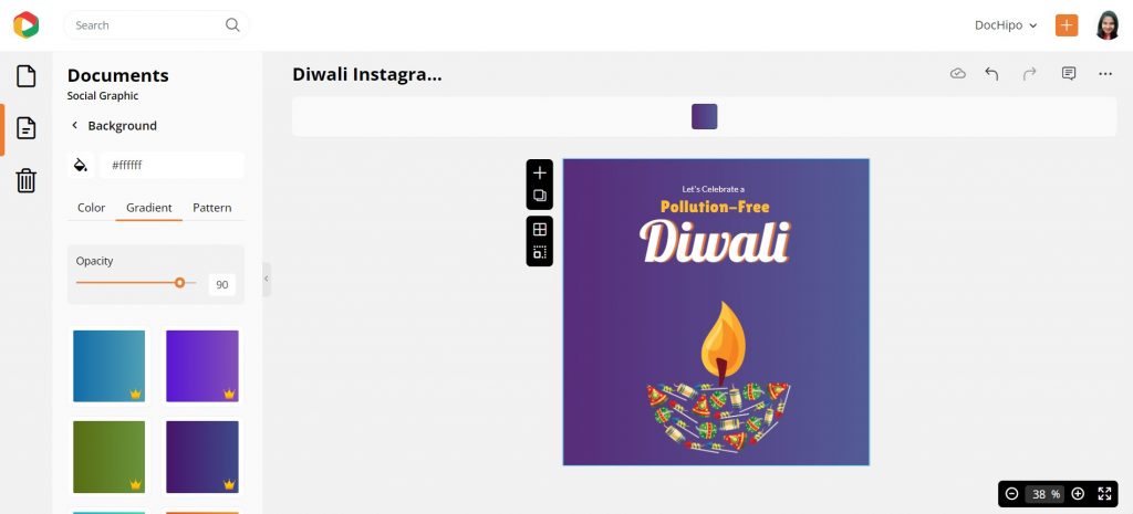
Next, we’ve picked a Diwali Instagram Post Template to show how easily you can design gradient backgrounds.
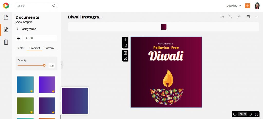
Select the gradient tab and scroll through the beautiful shades until you find your match. You can also change the opacity of the gradient.
Refer to the following video while creating backgrounds for your design.
Inserting Tables in DocHipo
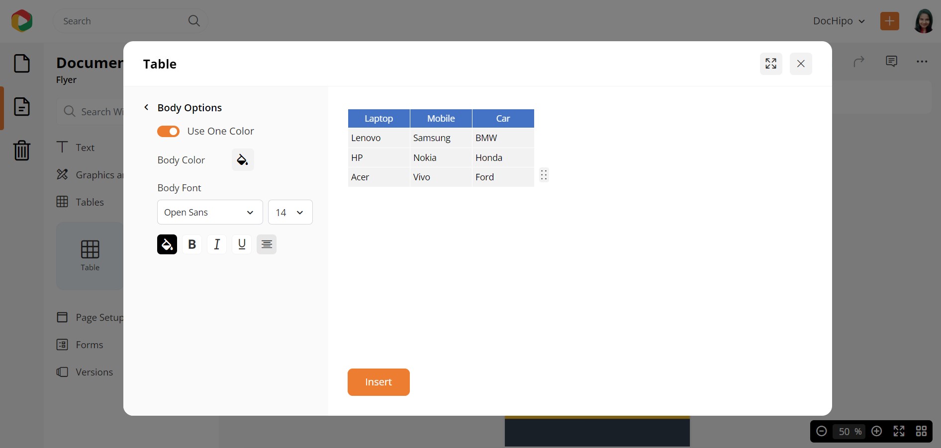
Click on the Table widget to add tables to the document. A box will appear where you can determine the number of Rows and Columns.
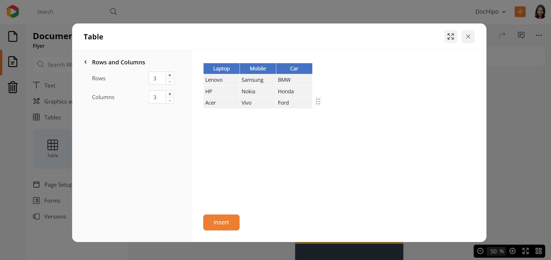
You can also customize the header and the body text with your choice of color and font.
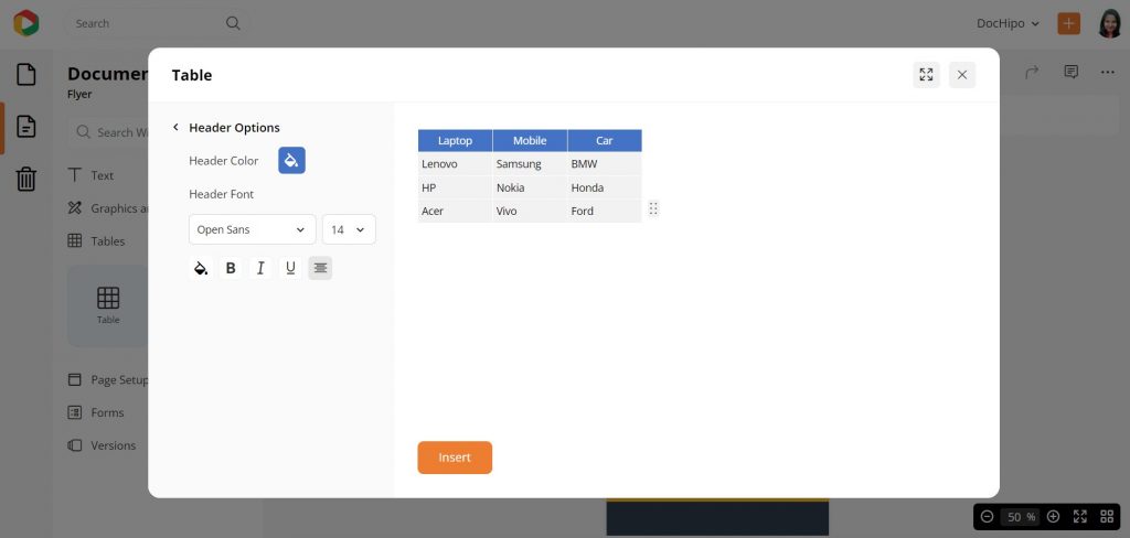
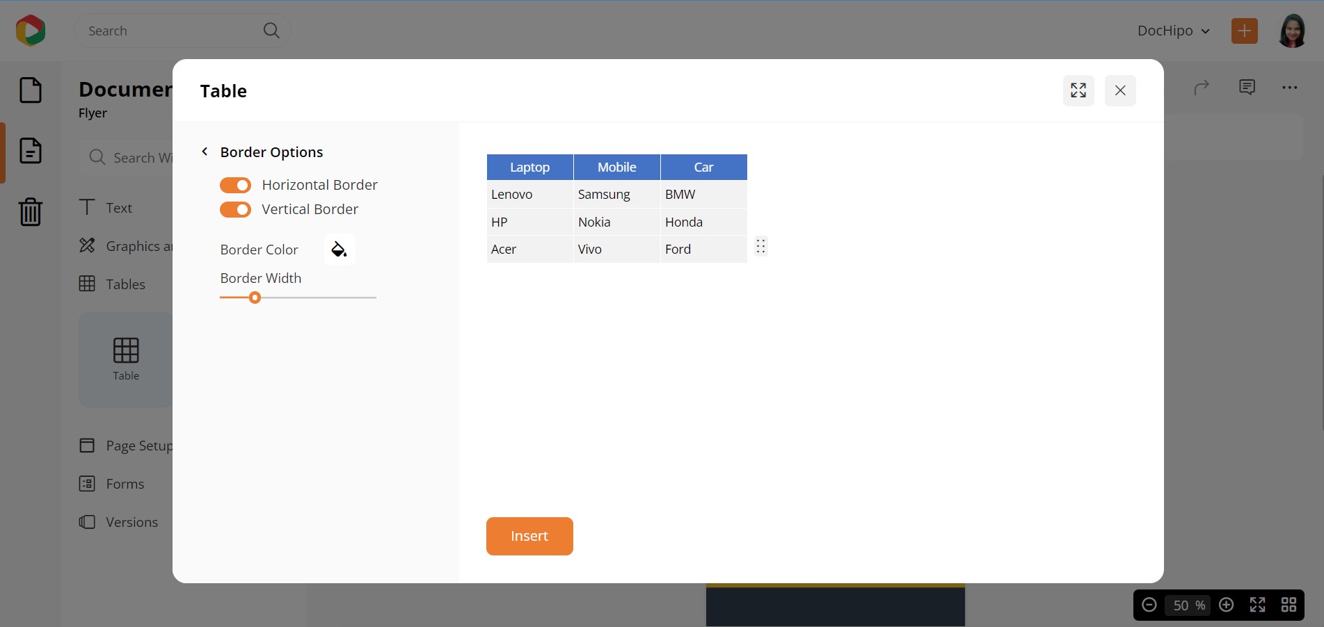
You can even adjust the border Horizontally and Vertically, along with the color and width.
Refer to the below video while inserting tables in DocHipo.
Page Setup in DocHipo
Under the Page Setup category, you can resize the document dimensions and edit the page margins.
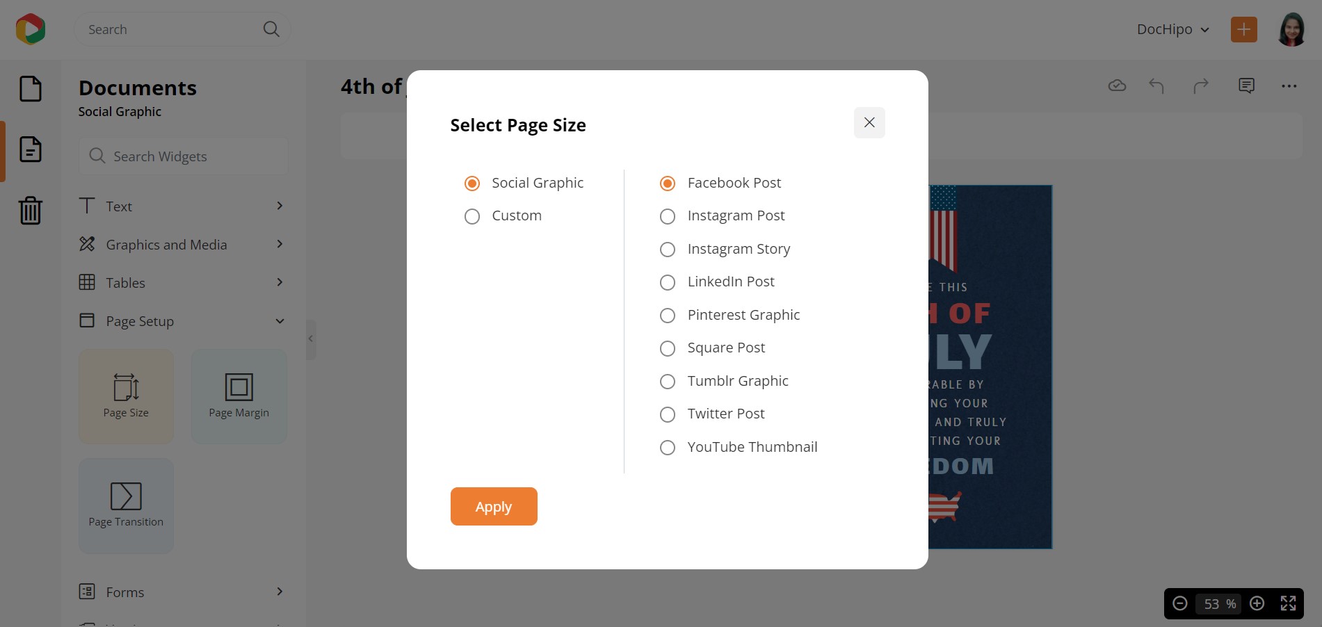
With the Page Size widget, you can reset the dimensions of the document.
After you select this widget, a box will pop up where you can choose a document option from the list to redetermine the page dimension.
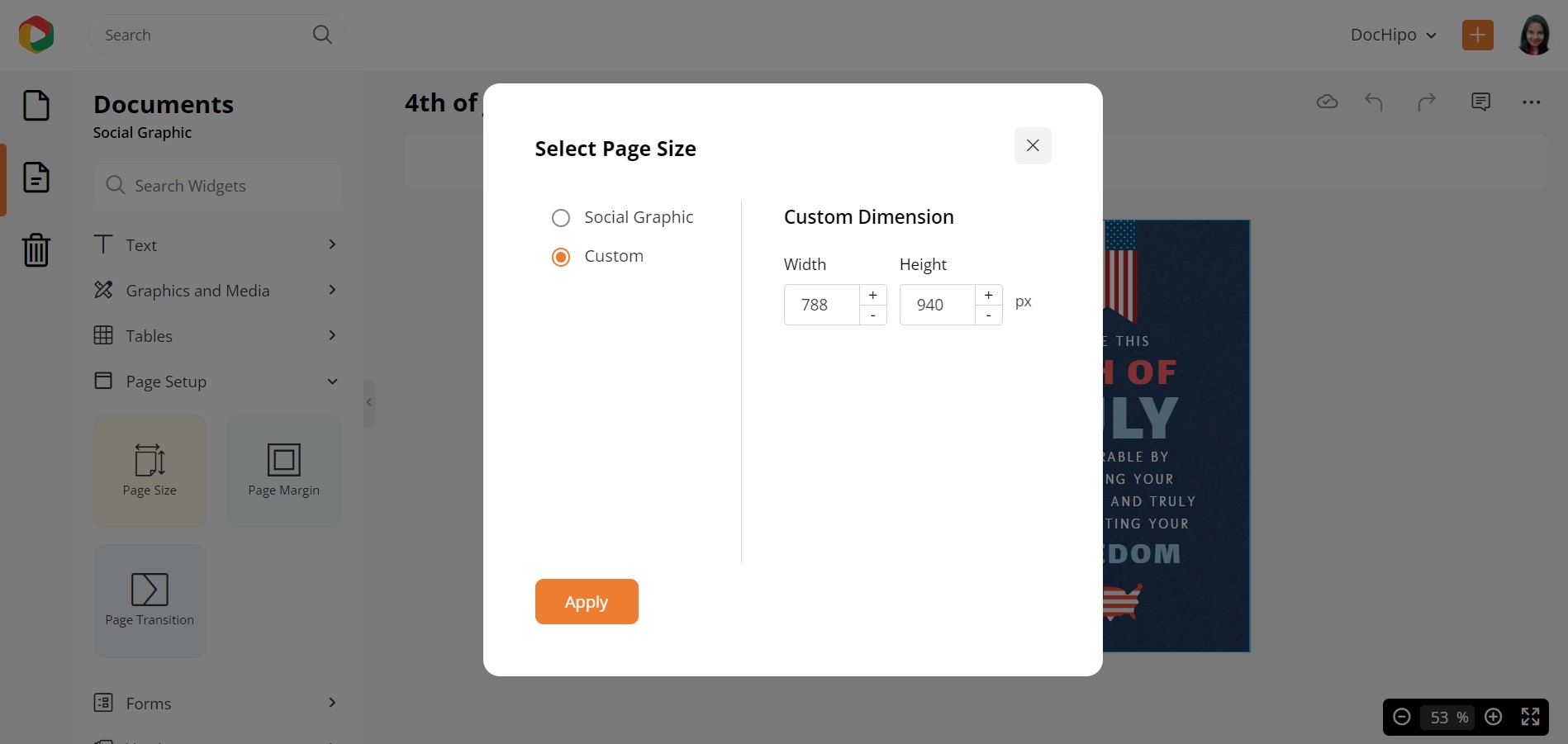
You can also customize the dimensions of your document by choosing your measurements to adjust the width and height.
Coming to the Page Margin widget, you can add margins around your document.
Adding margins around the document gives you three benefits. First, it makes your document look neat and well-adjusted. Second, it ensures that your design is well-contained within the document and does not get disproportionate when printed. Finally, it makes your document look aesthetically pleasing.
With this widget, you can adjust the margin size, color, style, and width.
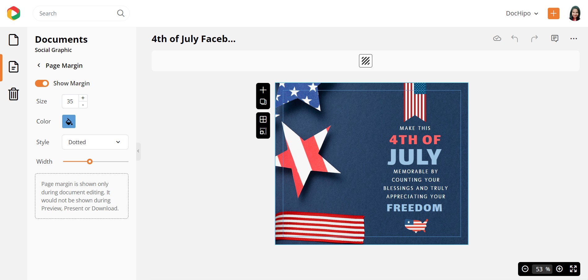
Check out the video below for using page margins in DocHipo.
Page Transition lets you set a transition type and speed for multi-page documents.
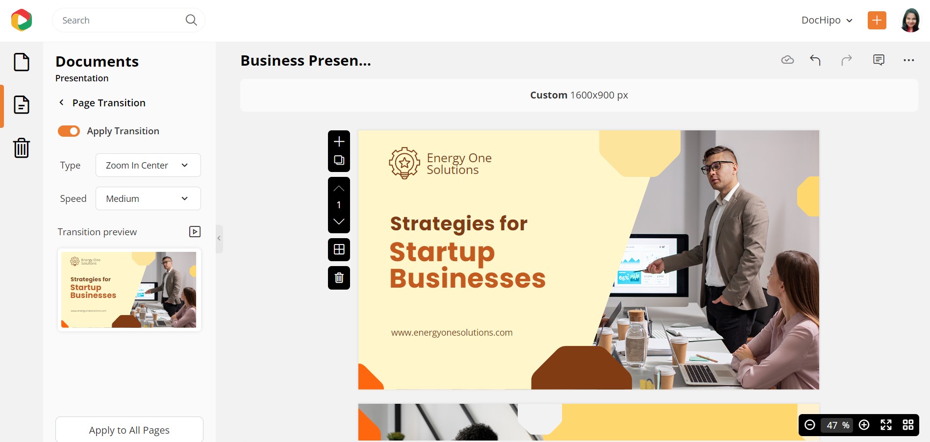
Versions in DocHipo
I am sure you know of this experience where you over-design your document and start regretting it.
Well, now you no longer have to regret experimenting with your designs. You can return to your previous design versions via the Versions Widget in DocHipo’s editor.
When you click this widget, you will see a list of versions of your work saved that you can name, restore, preview, and download.
If you have further queries on versions, here’s a helping hand:
Real-time Team Collaboration with DocHipo
This editor also allows you to collaborate on a design with a team.
Super awesome.
Yes, if you have created a design and want inputs from your team, you can do so on this editor.
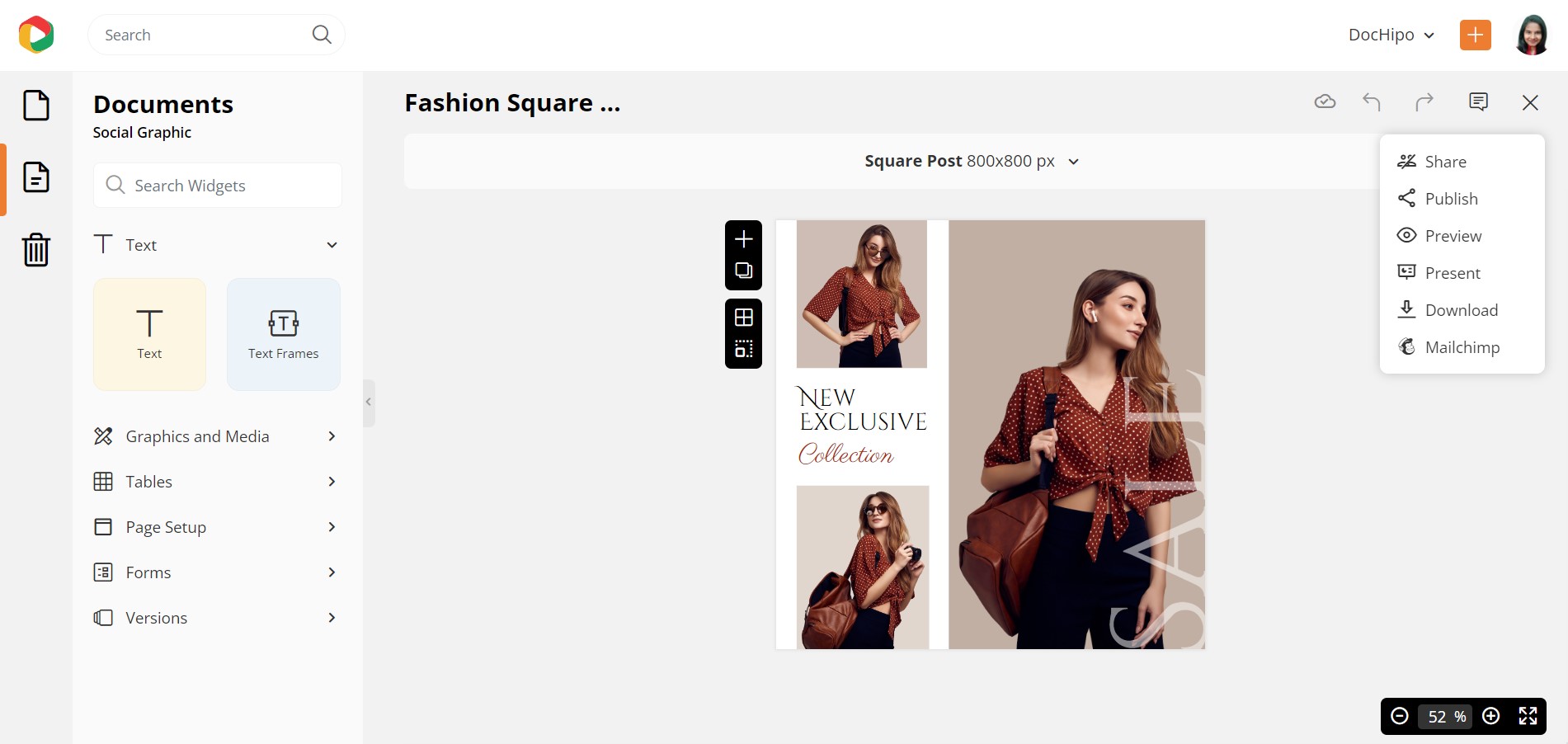
Once you have completed designing the document, you can share the document with your team members through the Share option. You can select this option by clicking the three-dotted button, which will slide down various other options.
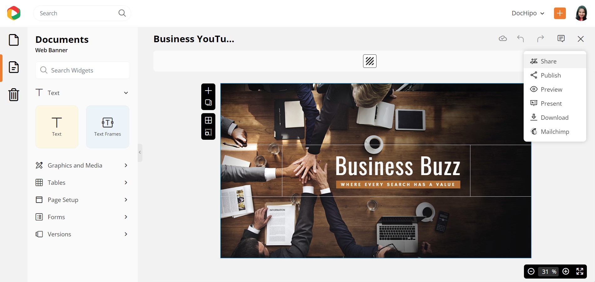
A box will appear where you have to provide the name/names of the team members/members with whom you want to collaborate. You can also determine the access level of that member within the document.
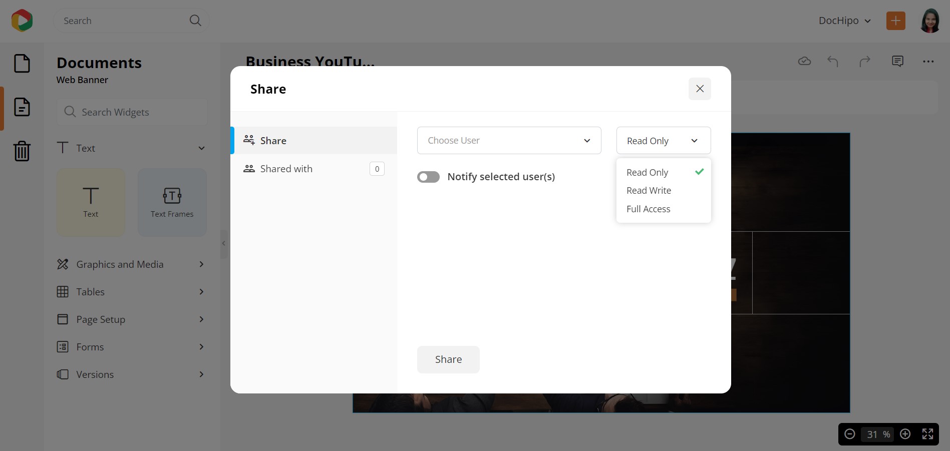
To learn more about team collaboration, check out this video:
Downloading Your Document
After you feel your design is ready to be showcased outside the real world, it is time to download that document.
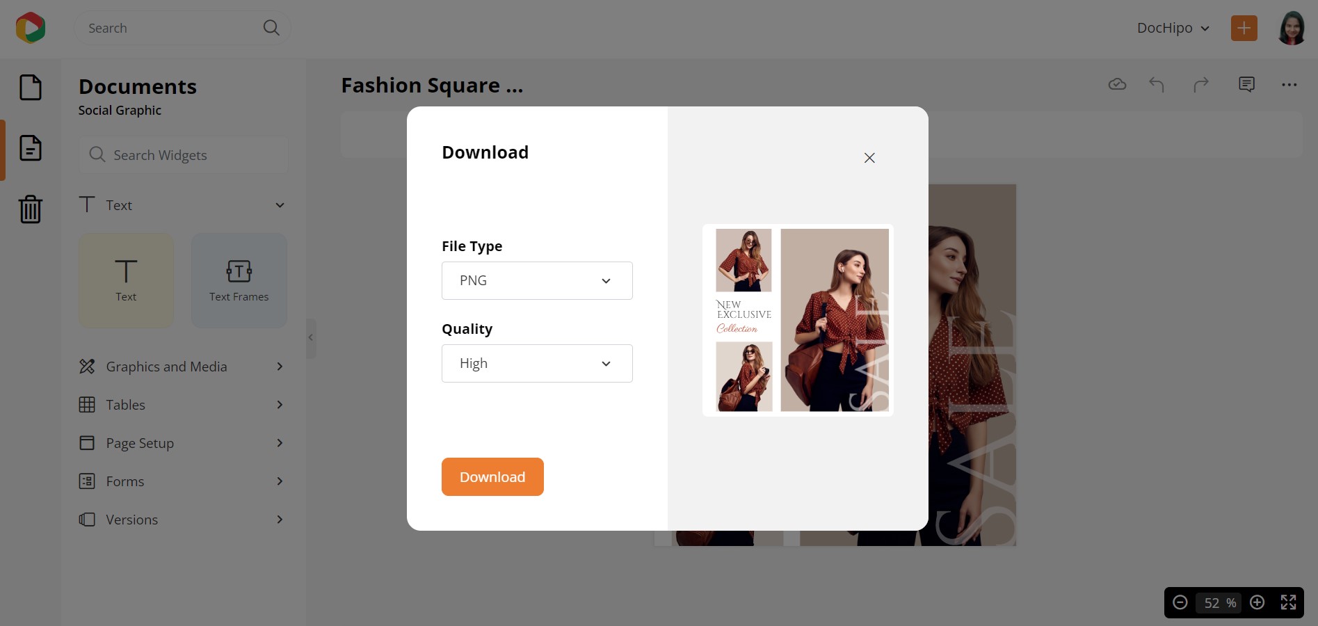
To download the document, click the three-dotted button on the top-right corner of the editor. As the options slide down, choose the Download option.
A box will flash up, from where you can select your file type (JPG/PNG/PDF/ GIF/ MP4) and the Quality (Normal/Medium/High). If you wish to print the document, then it is recommended that you print it in High Quality.
Refer to the following video while downloading your designs in DocHipo.
If your document has multiple pages and you wish to download only specific ones, leverage DocHipo’s page-wise download option.
The three-dotted button is an interesting aspect of the editor because it gives you many more options, making DocHipo editor a fun platform. Apart from Team Collaboration and Download option, this button also gives you options to Publish the document on social media platforms (Facebook, X/Twitter, LinkedIn). You can also Preview the document to check how it looks when downloaded or published. You can Present the document on this platform as well.
Conclusion
Using DocHipo editor is convenient, user-friendly, and gives you features that enhance flexibility. Hence, you might also witness features and widgets on the editor specifically introduced for a particular document.
Be always ready to be surprised by DocHipo’s editor, that is committed to making your design experience pleasant.
You can design your documents online via this platform and explore your creative side. You can design your document all you want, as this platform will never judge you and deems all artwork special.
If you need a document urgently for your marketing or any promotional reasons, you can also download the document templates from here. DocHipo has a rich repository of charming document templates for any purpose.
Whether for a social media post, or an advertisement visual, DocHipo has got you covered. So, hurry and Sign up Now!


