How to Design a Cover Photo for Facebook to Enhance Your Business Page Appeal

Need to design a cover photo for Facebook for your business page?
How to Design a Cover Photo for Facebook
- Proper Dimensions: 820×312 pixels PC, 640×360 pixels mobile.
- Follow Guidelines: Avoid misleading or copyright violations.
- Seasonal Updates: Refresh with festive or event themes.
- Effective CTA: Place clear, visible call-to-action.
- Modern Fonts: Use Sans Serif or Helvetica for readability.
- Negative Space: Avoid clutter; use ample negative space.
‘The first impression is the last impression,’ a saying you might have heard a million times. Whether it an interview or a meeting with an acquaintance, first impressions are important as they create an image and shape future interactions. You might be wondering what ‘first impression’ has to do with documents. Well, the documents you create during your business’s sales cycle leave behind an impression – good or bad – of your brand on the viewer’s mind.
Business pages on Facebook are marketing tools. Maintaining a good business page is important if you do not want to drive people away. The first prominent feature of a Facebook page is the cover photo, aka header. It is the first thing customers notice when they land on your page. They tend to associate it with your brand image. However, creating Facebook covers from scratch becomes overwhelming, especially if you’re new to design.
In this blog post, you’ll learn some of the best practices for an impactful Facebook cover design and learn how DocHipo makes it easy.
Table of Contents
How to Make a Cover Photo for Facebook
Here are a few important tips to follow while you design a cover photo for Facebook that captivates and maximizes your brand impact :
1. Create Facebook Covers with Proper Dimensions
The ideal size of a Facebook cover is
- 820 pixels wide and 312 pixels tall for a PC
- 640 pixels wide and 360 pixels tall for smartphones
If you use a smaller photo, Facebook will stretch the image, making it appear blurry and distorted.
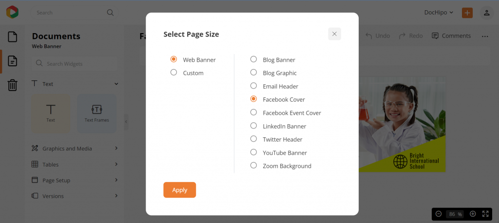
With DocHipo, you don’t need to remember these dimensions. You can choose “Facebook Cover” inside Page Setup, as the dimensions are pre-set on its templates.
2. Abide by the Facebook Guidelines
Facebook has included in its community standard that the cover photos should not mislead the audience or violate copyrights. Never deceive your audience.
3. Change is the Only Constant
This does not mean that you must change or modify your cover photo every now and then. However, seasonal and festive themes can be introduced. Avoid being tedious and dull. Even if you are sharing real estate Facebook posts or something business-related, you can still come up with a cover photo that is topic-centered, stylish, and attention-grabbing.
For example, you can use the Christmas Facebook Cover Templates to spread your warm wishes and thoughts to your viewers.

Get This Template and More

Get This Template and More
Here are DocHipo Facebook Event Cover Templates you can use to declare any special events.

Get This Template and More

Get This Template and More
By changing your Facebook Cover photo, you can inform your audience about any new product arrival or special offers. For example, check out the Beauty Facebook Cover Templates below.

Get This Template and More

Get This Template and More
4. Create Facebook Cover Photo with Appropriate CTA
While you make a cover for Facebook, place the call-to-action (CTA) correctly so that it’s easily visible to the visitors. Including CTA is vital because it tells people to act accordingly. Your audience will not know what you want if you are unclear about it. With CTA, you can ask them to visit your site, sign up for free, or shop with you.

Get This Template and More

Get This Template and More
Here’s a quick demo of creating buttons in DocHipo.
Give your cover an intriguing center point and align the elements with your brand’s color palette. Visitors must be able to identify your brand right away by looking at the cover.
5. Choose Contemporary Fonts
Facebook cover photos must be attractive and quirky, but using Goth fonts won’t help! Fonts affect the perception of people. Goth, comic, and cursive fonts will make people have an unpleasant experience. They are less likely to return to your page. The ideal font to use is Sans Serif or Helvetica. Minimalistic modern contemporary fonts are the most appropriate. DocHipo offers a wide range of fonts to make documents look professional and beautiful.

Get This Template and More

Get This Template and More
Furthermore, you can also use custom fonts to design a Facebook cover in DocHipo.
6. Keep Negative Space in your Facebook Cover Design
Cluttering is a big NO when it comes to designing.
You would want to run away if stuck in an overcrowded room with no breathing space. Isn’t it?
Similarly, overcrowding your design with every other element will overwhelm your audience, who would want to stay away. Here stands the importance of negative space.

Get This Template and More
Look at the image above. Does it look pleasing? You bet! The template has a minimum approach but includes the important elements for the viewers. The blue space here is the ‘negative’ space. It gives room for the important elements to breathe. This template aims to get people’s attention to the important notice. Including other course details will seem like a desperate and failed attempt at getting people interested.
A Brooklyn-based designer and writer, Frank Chimero, says, “People ignore design that ignores people.”
In designing, the unused space devoid of any element is called negative space. Negative space prevents people from getting distracted from the key elements. It makes the process of conveying messages comparatively easier. Usually, negative space is a colored background.
Look at the DocHipo Beauty Facebook Cover template below.

Get This Template and More
In this template, the message is the specific service provided, and the model is used to show the nature of the commodity. The negative space, i.e., the greyish-blue background, is free of unnecessary design elements that let the audience focus on the only important key object.
How to Design a Cover Photo for Facebook with DocHipo
In this part, we’ll walk you through a three-step simple process to design a cover photo for Facebook. If you’re a new explorer of DocHipo, sign up only with your email address and password. Otherwise, you can log in and be on the ‘All Templates’ page.
STEP 1: Choose a Facebook Cover Template
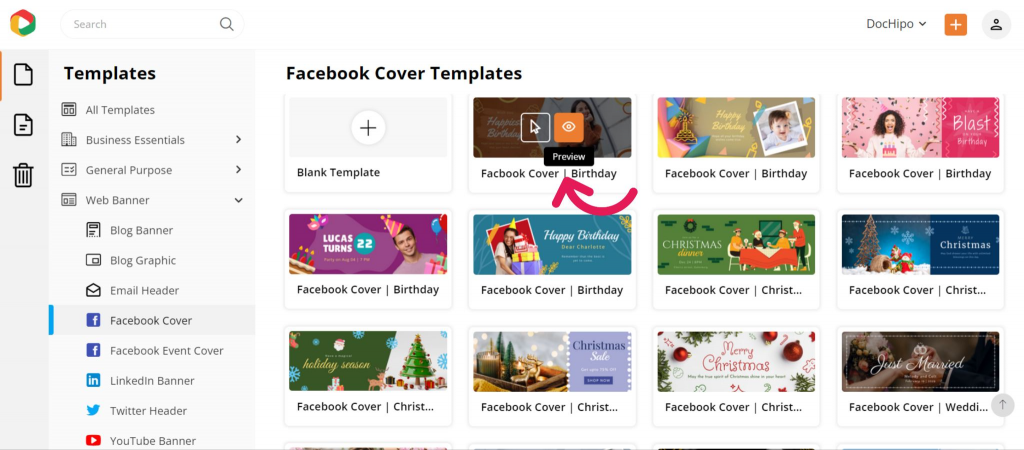
Click on ‘Web Banner’ on the left sidebar and select the sub-category ‘Facebook Cover.’ Alternatively, start typing ‘Facebook Cover’ on the search bar and click on your desired result to proceed.
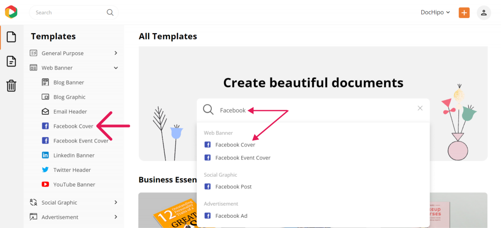
You can search for your desired document for easy access.
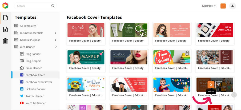
As you can see below, the Facebook Cover Templates in DocHipo are presently categorized into beauty, birthday, Christmas, education, and wedding.
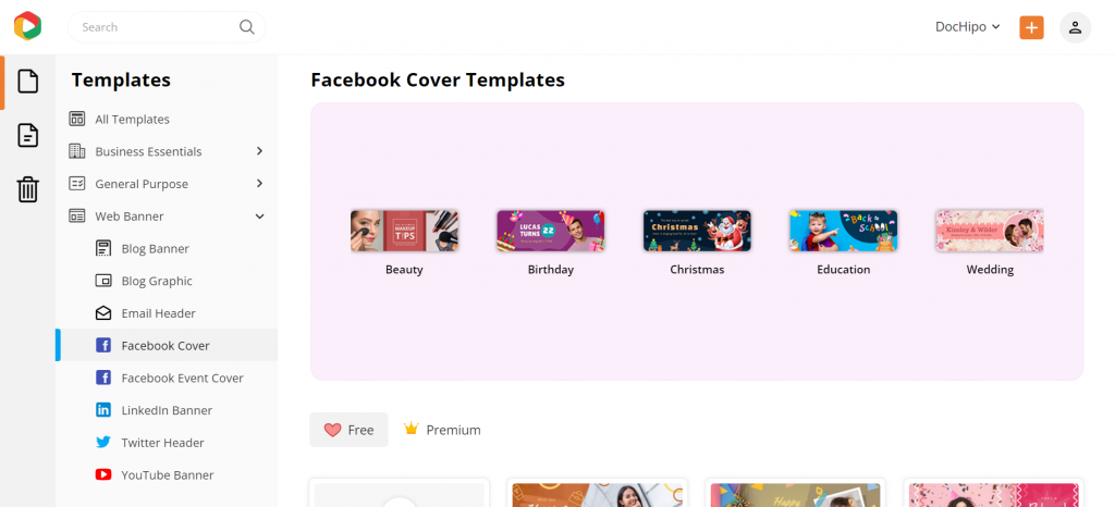
If you wish to create a Facebook Cover for your business page from scratch, select the blank template. You’ll get text and other visual elements in the DocHipo editor. However, choosing a template that aligns with your needs is the simplest and fastest way to achieve effective results. Hover over a template that you would love to preview or select.
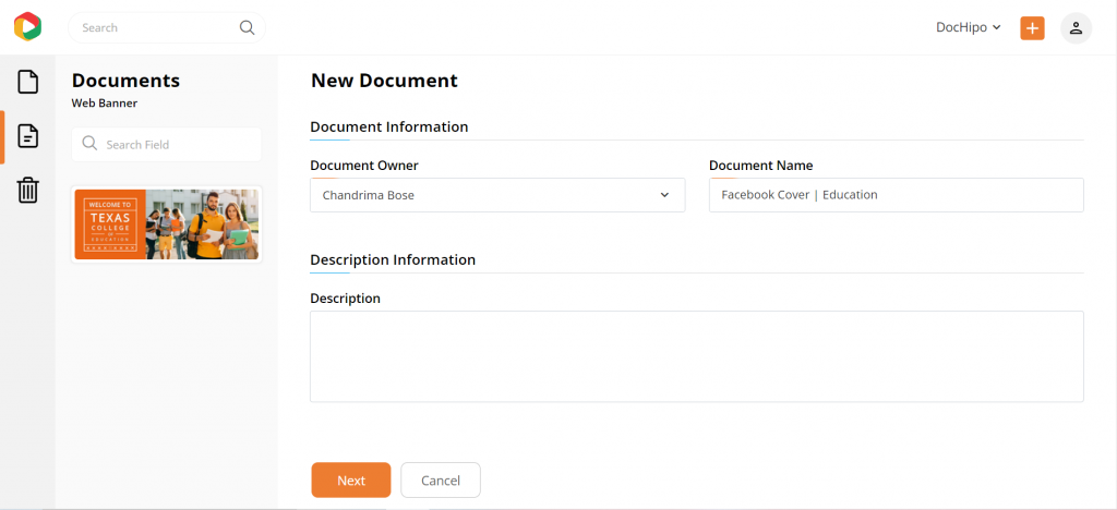
Add document details such as name and a brief description to access it quickly whenever needed.
STEP 2: Customize Your Chosen Facebook Cover Template
DocHipo’s Facebook Cover Maker lets you customize your design aspects. Pick your desired design widgets from the left sidebar and edit them as you like. Let’s explore them.
Edit the Text
To edit an existing text in the template, select it and replace it with your text. If you need to add additional text, select the text widget from the left sidebar and choose from the three text types: heading, subheading, and body text.
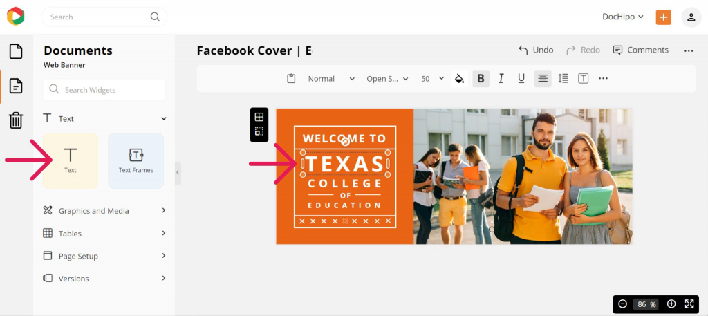
After adding all your text, edit them with the editing options in the above panel, such as changing the font, color, format, alignment, spacing, border, shadow, etc.
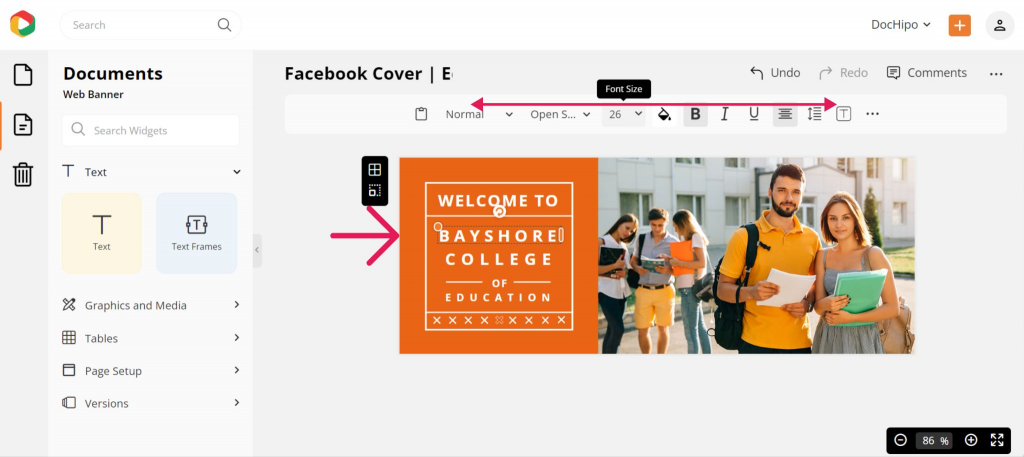
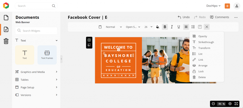
Click the three horizontal dots in the panel for more options, such as changing the text opacity, adding a bullet list, and creating clickable links.
You can always refer to the video below for adding, editing, and deleting text in DocHipo.
Replace the Picture
You can use stock images from DocHipo’s library in your design to ensure high-quality visuals. Otherwise, choose the ‘Uploads’ widget under the ‘Graphics and Media’ section to upload professionally shot pictures from your device.
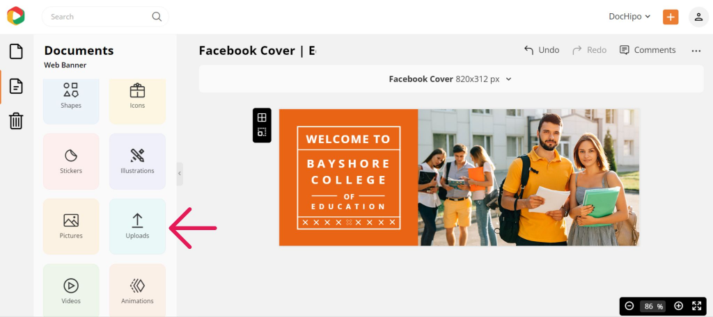
Upload your picture in JPG, PNG, GIF, or SVG format with a maximum file size of 5 MB.
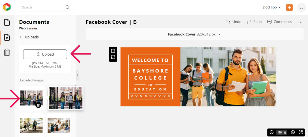
Drag and drop your uploaded image into the editor, which will automatically adjust.
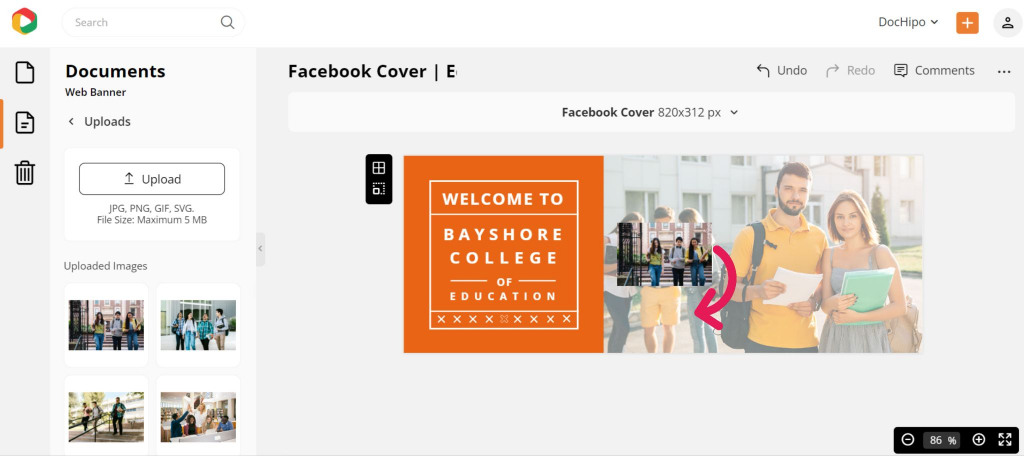
You can resize and reposition your picture with the drag-and-drop tool if needed. Here’s how the Facebook Cover design looks now.
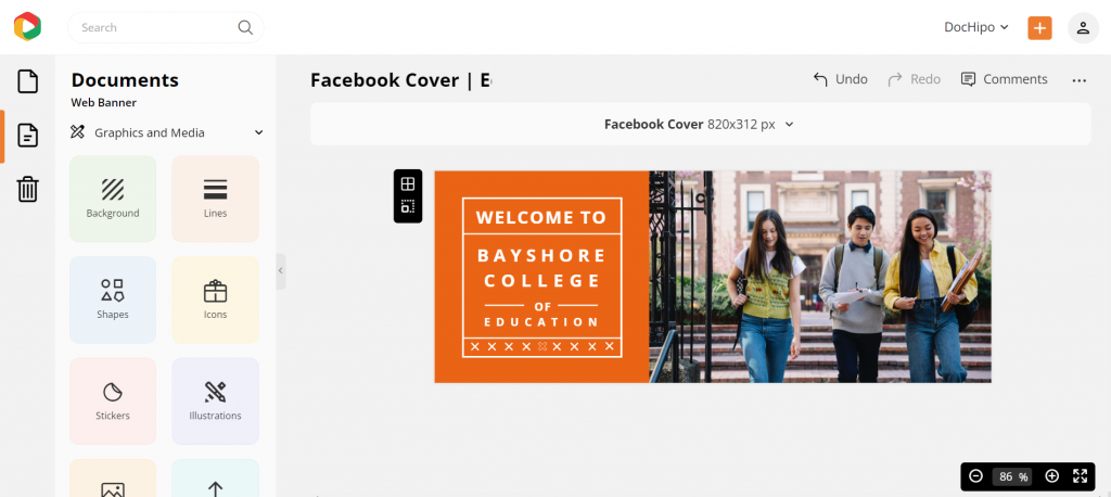
Watch our quick tutorial below while uploading your images in DocHipo.
Enhance images to make them more eye-catching and attract more viewers.
Here’s our quick demo on enhancing your picture with DocHipo filters.
Customize the Color
You can create a stunning background by clicking on the background widget and choosing one from its categories, such as color, gradient, and pattern. Here’s how:
To change the color of any other design element, select it and click on the color icon in the above panel.
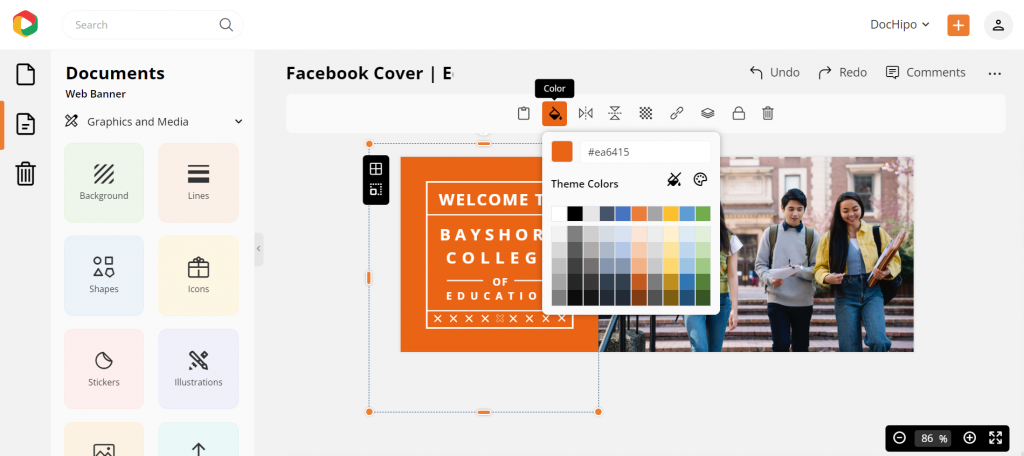
You can choose from the theme colors or directly put the color hex code in the space provided. Click on the color palette icon to experiment with colors further.
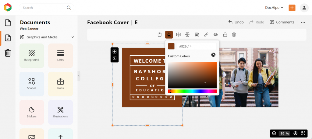
Moreover, apply color themes to fail-proof your color combinations.
To make your design stand out, include additional design elements, such as illustrations, icons, text frames, shapes, etc.,
Find design widgets easily in the DocHipo editor.
STEP 3: Download Your Facebook Cover Design
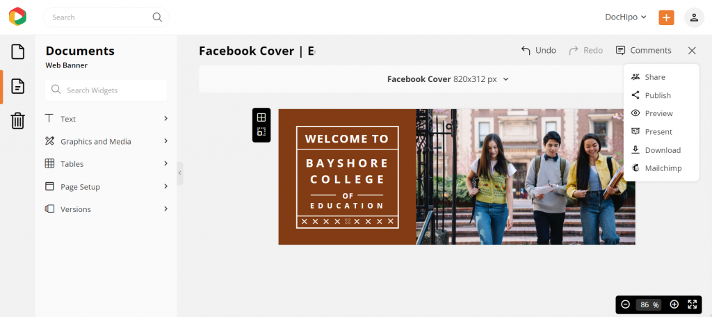
Once your Facebook Cover design perfectly reflects your brand, click on the three horizontal dots to preview and download it.
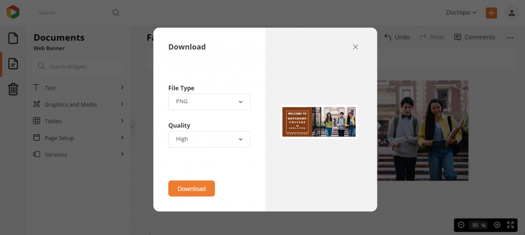
Choose your preferred file type and quality to download your design without any watermark.
Facebook Cover Photo before Customization:

Facebook Cover Photo after Customization:

Refer to the video below to download the designs in DocHipo.
If you’re new to DocHipo, here’s how to get started for an awesome design journey with DocHipo.
Create an Impact with Your Facebook Cover Using DocHipo
As you have already seen, DocHipo has tons of Facebook Covers in store to make your designing experience pleasant and easy!
Select your template choice, edit according to your wish, and you are ready.
With DocHipo, you can save time and money yet design beautiful Facebook covers in a jiffy.
With that being said, remember to keep it simple. You can showcase your creativity while designing, but do not think you can make a potpourri! Your cover photo must be subtle and aesthetic to ensure conversion.
Concluding words
Your Facebook page cover is not an independent identity. Whatever design you choose, let people know what you want to convey and what your brand stands for. With DocHipo, you can access multiple free templates to liven up your Facebook page hassle-free. As an introductory offer, DocHipo is free to get started. So, what are you waiting for? Sign-up for DocHipo and design a cover photo for Facebook right away!


